Limited Time Offer: 50% OFF on All Plans for 6 months. New Customers Only.


Tally
Tally's hero centres a simple headline, one "Create a free form" button and a "No signup required" note, flanked by playful floating faces and followed by a usage stat and customer logos.
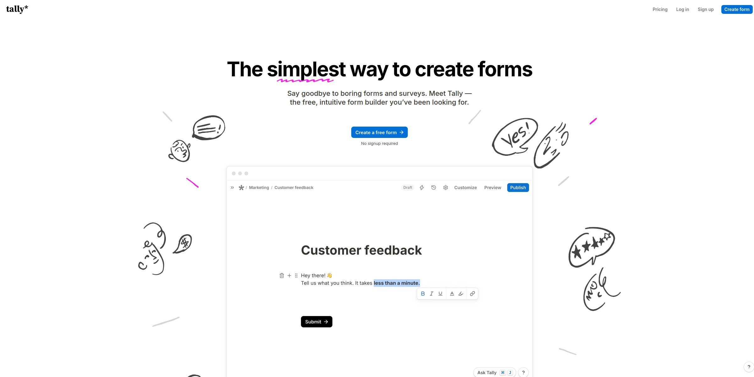
This Tally hero section wins visitors over with a playful, low-friction pitch that makes building a form feel effortless.
Here’s why it stands out:
1. Simple, Category-Owning Headline
The headline “The simplest way to create forms” stakes a clear claim in a crowded category. It tells visitors exactly what Tally does and why it is different in just six words, and a decorative highlight graphic draws the eye to the message.
2. Subheadline That Names the Pain
“Say goodbye to boring forms and surveys” calls out a frustration most users already feel, then introduces the answer: “Meet Tally – the free, intuitive form builder you’ve been looking for.” The words “free” and “intuitive” handle the two biggest objections up front.
3. One Focused Call-to-Action
Instead of competing buttons, the hero offers a single CTA: “Create a free form.” The action-based label describes what happens next, which makes the click feel like the start of the work rather than a sales step.
4. Friction Removed Right Under the Button
The microcopy “No signup required” sits directly beneath the CTA, removing the last reason to hesitate. Letting people build before they register is a strong conversion lever for a self-serve tool.
5. Playful, Human Visuals
Rather than a dense product screenshot, the hero uses floating faces with different expressions on either side of the copy. This gives the brand personality, reinforces the “no more boring forms” promise, and keeps the focus on the headline.
6. Social Proof at Scale
Directly below the CTA, “Powering 2,500,000+ teams at the world’s best companies” pairs a large usage number with logos such as Notion, Make, Ghost, Brevo and Granola. It quickly reassures visitors that a free tool is trusted by well-known teams.
7. Minimal, Uncluttered Layout
With no badges, feature lists or secondary buttons competing for attention, the hero reads in seconds. The restraint mirrors the product’s own promise of simplicity.