Limited Time Offer: 50% OFF on All Plans for 6 months. New Customers Only.


Datadog
Datadog's hero moves from a Gartner announcement bar to a five-word AI observability headline, a rhythmic "any stack, any app" subheadline, two CTAs and a customer logo row.
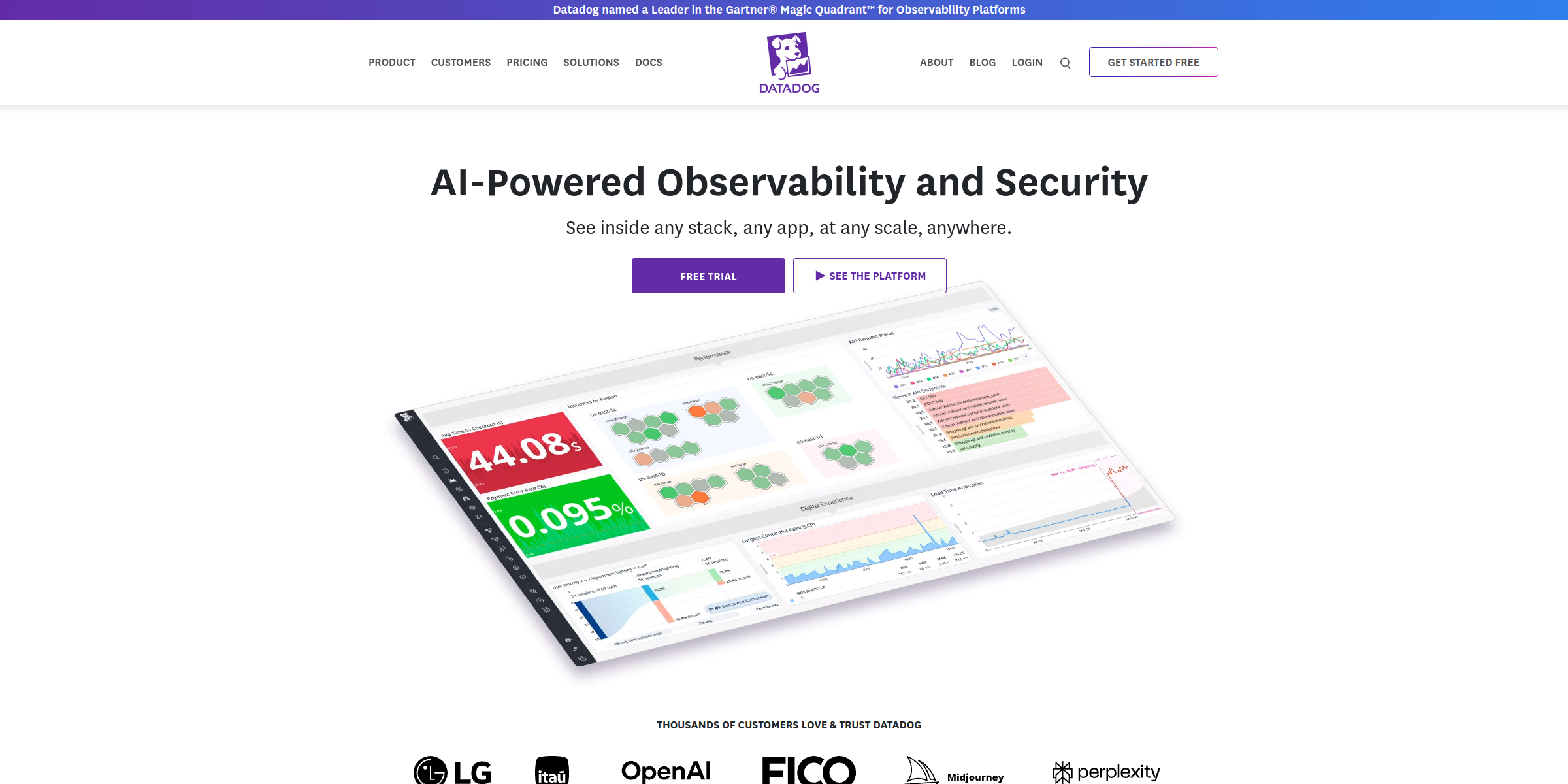
This Datadog hero section packs a broad enterprise platform into a few tight lines of copy, making a confident first impression on engineering and security teams.
Here’s why it stands out:
1. Category-Defining Headline
The headline “AI-Powered Observability and Security” names exactly what Datadog does in five words. It pairs the timely “AI-Powered” angle with the two categories buyers search for, so visitors instantly know they are in the right place.
2. Rhythmic, Expansive Subheadline
The subheadline “See inside any stack, any app, at any scale, anywhere.” uses repetition of “any” to signal total coverage. It speaks to the core fear of engineering teams (blind spots) without listing a single product, keeping the message clean.
3. Dual CTAs for Different Buyers
The “Free trial” button gives hands-on engineers a direct path to try the product, while “SEE THE PLATFORM” serves evaluators who want to understand the full offering first. Two clear paths reduce friction for both audiences.
4. Analyst Credibility Up Front
The announcement bar above the navigation, “Datadog named a Leader in the Gartner® Magic Quadrant™ for Observability Platforms,” adds third-party validation before visitors even read the headline, which matters for enterprise buyers.
5. Immediate Social Proof
Directly beneath the CTAs, the line “Thousands of customers love & trust Datadog” introduces a row of customer logos. Placing this proof right next to the buttons reassures visitors at the moment they decide whether to click.
6. Concise Copy for a Complex Product
Datadog offers a large suite of monitoring and security products, yet the hero avoids feature lists entirely. Keeping the message to a headline, one sentence and two buttons makes a complex platform feel approachable.
7. Clear Visual Hierarchy
The layout moves naturally from credibility (announcement bar) to value proposition (headline and subheadline) to action (CTAs) to reassurance (customer logos), guiding the eye down the page in a logical order.