Limited Time Offer: 50% OFF on All Plans for 6 months. New Customers Only.


Clay
Clay's hero sets a revenue-focused headline and two CTAs above a colourful illustration of tubes, balls and a funnel on green hills, a playful metaphor for data moving through a GTM pipeline.
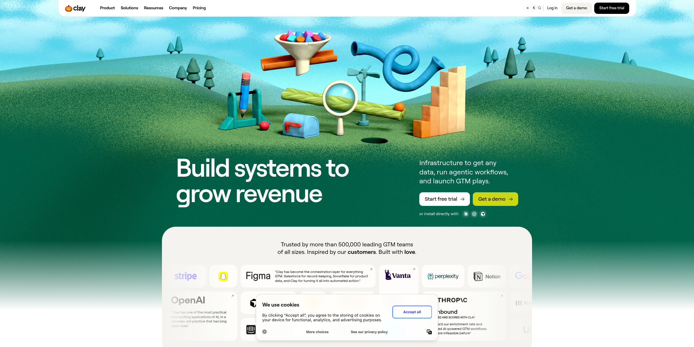
This Clay hero section pairs a bold, outcome-focused promise with a playful illustration, making a technical GTM platform feel approachable from the first glance.
Here’s why it stands out:
1. Outcome-Driven Headline
The headline “Build systems to grow revenue” speaks directly to what go-to-market teams care about most. Instead of listing features, it frames Clay as the way to build repeatable systems that drive growth.
2. Precise Subheadline
The subtext “Infrastructure to get any data, run agentic workflows, and launch GTM plays” breaks the promise into three concrete capabilities. Calling Clay “infrastructure” positions it as a foundational layer rather than just another sales tool.
3. Clear Dual CTAs
“Start free trial” and “Get a demo” sit side by side, giving self-serve users and larger teams who want a guided walkthrough an obvious next step. Both paths are offered without making visitors hunt for them.
4. Developer-Friendly Install Option
Below the buttons, an “or install directly with” line and a “Paste in your coding agent” box with a “Copy” button let technical users set up the Clay plugin right away. It is an unusual hero element that signals Clay is built for the agentic, AI-assisted way teams work today.
5. Memorable, Playful Visual
The hero illustration shows a colorful contraption of tubes, balls, magnets and a funnel on green hills under a blue sky. It is a clever metaphor for data flowing through a pipeline, and it makes the brand instantly recognizable.
6. Strong Social Proof
The line “Trusted by more than 500,000 leading GTM teams of all sizes” adds scale and credibility right in the hero, reassuring visitors that the platform is proven before they scroll.
7. Focused, Uncluttered Layout
With a short headline, one supporting sentence, two buttons and a single illustration, the hero keeps attention on the core message. The simplicity makes a powerful, complex product feel easy to start with.