Limited Time Offer: 50% OFF on All Plans for 6 months. New Customers Only.


Resend
Resend's dark, cinematic hero uses a three-word headline, a deliverability-focused subheadline, side-by-side sign-up and documentation buttons, and a soft light-ray background effect.
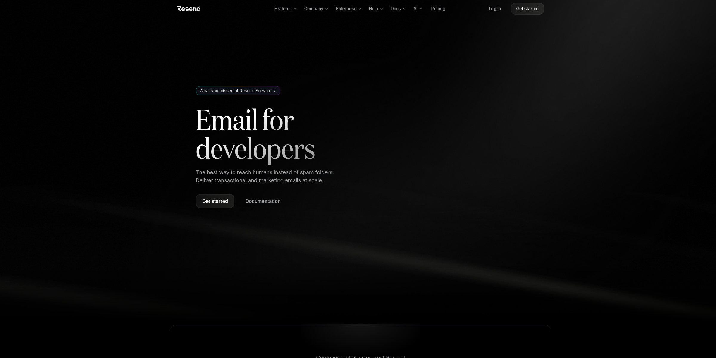
This Resend hero section shows how a developer-focused product can make a strong first impression with very few words.
Here’s why it stands out:
1. Three-Word Headline That Defines the Audience
The headline “Email for developers” states the category and the target user in one line. Developers instantly know the product is built for them, and everyone else knows it isn’t trying to be a generic marketing tool.
2. Subheadline That Names the Real Pain Point
“The best way to reach humans instead of spam folders” speaks to deliverability, the problem every team sending email worries about. The follow-up line, “Deliver transactional and marketing emails at scale,” then spells out exactly what Resend handles.
3. Dual CTAs Matched to How Developers Evaluate Tools
The “Get started” button leads straight to sign-up, while “Documentation” sits right beside it. Putting the docs at the same level as sign-up respects how developers make decisions: many want to read the API before creating an account.
4. Announcement Pill for Fresh Momentum
A small pill above the headline, “What you missed at Resend Forward,” links to the event recap. It signals that the product is actively evolving and gives returning visitors a reason to click without competing with the main message.
5. Dark, Atmospheric Visual Style
The hero uses a black theme with a floor backdrop and a light-ray background effect behind the text. The result feels cinematic and premium, which helps an infrastructure product stand out from typical bright SaaS pages.
6. Minimal Copy, Maximum Clarity
There are no feature lists, stats or dense paragraphs above the fold, only a headline, two short lines and two buttons. The restraint keeps attention on the core promise and makes the page feel fast and confident.
7. Trust Line Right After the Fold
Just below the hero, the line “Companies of all sizes trust Resend to deliver their most important emails” with an “Explore Enterprise” link reassures larger teams that the developer-first tool also scales to serious workloads.