Limited Time Offer: 50% OFF on All Plans for 6 months. New Customers Only.


Mercury
Mercury's hero pairs the bold headline "Radically different banking" with an inline email field, open-account and demo CTAs, and a full-bleed cinematic background visual.
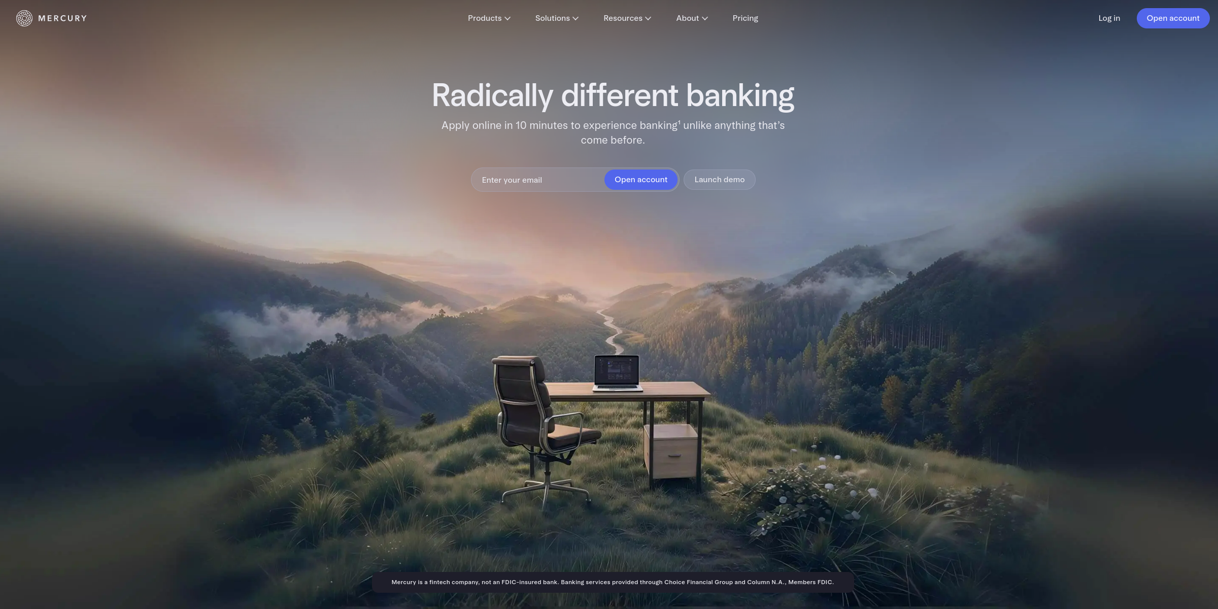
This Mercury hero section makes a bold, confident first impression and gets visitors to sign up with very little effort.
Here’s why it stands out:
1. A Bold, Category-Defining Headline
The headline “Radically different banking” is just three words, but it immediately sets Mercury apart from traditional banks. It doesn’t list features; it makes a confident claim that invites visitors to find out what “different” means.
2. A Subheadline That Removes Friction
“Apply online in 10 minutes to experience banking unlike anything that’s come before” turns the bold promise into something concrete. The “10 minutes” detail tackles the biggest fear people have about opening a business bank account: a slow, paperwork-heavy process.
3. Inline Email Capture
An “Enter your email” field sits right next to the “Open account” button, so signing up starts in the hero itself. Visitors can begin with one field instead of clicking through to a long form, which keeps momentum high.
4. Dual CTAs for Different Intent
The primary “Open account” CTA serves visitors who are ready to act, while the secondary “Launch demo” button lets cautious visitors try the dashboard before committing. Offering a hands-on demo instead of a generic “Learn more” link is a confident move that lets the product sell itself.
5. Trust Built Into the Fold
The short disclaimer explaining that Mercury is a fintech company and that banking services come from FDIC-member partner banks is placed right in the hero. For a financial product, this kind of upfront transparency builds credibility instead of hiding key details in the footer.
6. Cinematic, Full-Bleed Visuals
The hero uses a large background visual that transitions from a start frame to an end frame, giving the section a premium, almost cinematic feel. It reinforces the “radically different” message visually without needing extra copy.
7. Focused, Uncluttered Layout
With a short headline, one supporting line, a single form and two buttons, there is nothing competing for attention. The navigation repeats the “Open account” CTA, so the conversion path is always one click away.