Limited Time Offer: 50% OFF on All Plans for 6 months. New Customers Only.


Railway
Railway's hero sets the calm headline "Ship software peacefully" over train-themed day and dusk scenes, with Deploy and Agents buttons and a product mockup on a deep purple-black background.
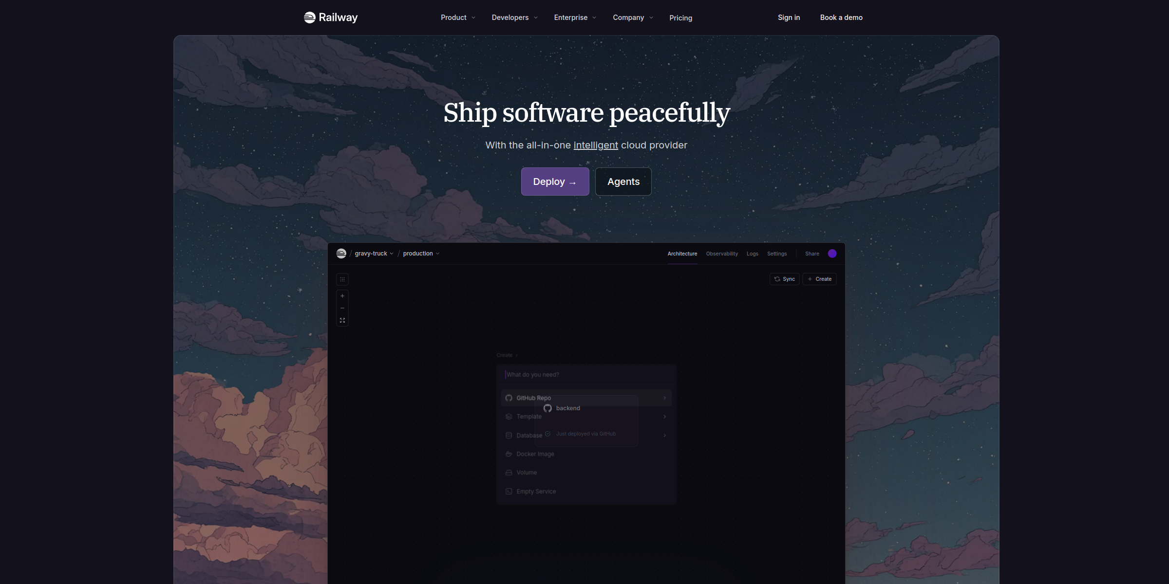
This Railway hero section pairs a calm, confident message with a clear path to deployment, making a strong first impression on developers.
Here’s why it stands out:
1. Memorable, Emotion-Led Headline
The headline “Ship software peacefully” stands apart from typical feature-driven cloud copy. It speaks to the stress developers feel around deployments and promises the opposite: a calm, low-friction experience.
2. Concise Positioning in the Subheadline
The line “With the all-in-one intelligent cloud provider” tells visitors exactly what Railway is in a single sentence. Linking the word “intelligent” to the Agents page quietly surfaces its newer AI capabilities without crowding the message.
3. Action-Oriented Primary CTA
The “Deploy →” button uses the exact action developers came to take, sending them straight to a new project instead of a generic sign-up form. The arrow adds momentum and signals an immediate next step.
4. Secondary CTA for a Growing Product Line
The “Agents” button sits alongside the primary CTA, giving curious visitors a second path to explore Railway’s agent features while keeping deployment as the main focus.
5. Distinctive Train-Themed Visuals
Day and dusk background scenes with a train motif reinforce the Railway brand name and give the hero a warm, memorable personality that most infrastructure sites lack.
6. Product UI That Shows the Workflow
A product mockup with “New Project” and “Dashboard” views, headed by “Deploy your app to production effortlessly”, plus tabs for Deploy, Network, Scale, Monitor and Evolve, lets users see the full lifecycle the platform covers at a glance.
7. Clean Dark Design with Built-in Trust
The deep purple-black theme keeps the layout minimal and developer-friendly, while the row of customer and partner logos beneath the mockup adds social proof right where visitors decide whether to try it.