Limited Time Offer: 50% OFF on All Plans for 6 months. New Customers Only.


Beehiiv
beehiiv's hero uses a punchy all-caps headline listing newsletters, podcasts and community, with Google and email sign-up buttons, a no-card note and a 4.9/5 rating badge over a soft gradient.
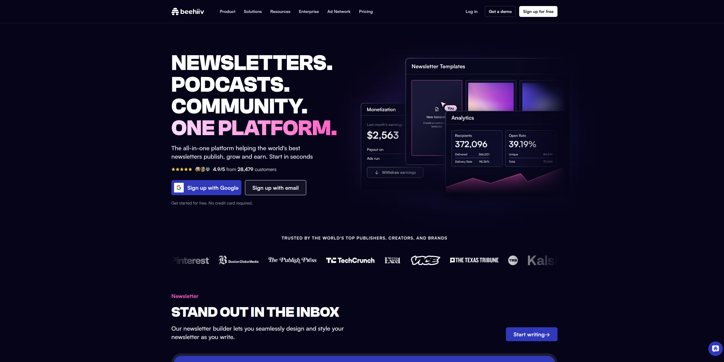
This beehiiv hero section makes a bold, confident pitch that tells creators exactly what the platform does before they scroll an inch.
Here’s why it stands out:
1. A Punchy, All-Caps Headline
The headline “NEWSLETTERS. PODCASTS. COMMUNITY. ONE PLATFORM.” works like a rhythmic checklist. Three short product categories followed by “ONE PLATFORM” instantly frames beehiiv as a consolidated home for everything a modern creator publishes.
2. Subheadline Focused on Outcomes
The subtext “The all-in-one platform helping the world’s best newsletters publish, grow and earn” maps neatly to the three things creators care about most. Ending with “Start in seconds” adds a sense of speed and low effort.
3. Frictionless Dual Sign-Up CTAs
Instead of a single generic button, the hero offers “Sign up with Google” and “Sign up with email” side by side. Giving visitors their preferred route right in the hero removes a step and keeps momentum high.
4. Risk-Reversal Microcopy
The line “Get started for free. No credit card required.” sits directly under the buttons, answering the two biggest objections (cost and commitment) at the exact moment a visitor is deciding whether to click.
5. Strong Social Proof Badge
A row of user avatars paired with “4.9/5 from 28,479 customers” adds credibility through a specific, believable number rather than a vague claim, reassuring new users that thousands of publishers already rely on the product.
6. Product Visuals That Show the Output
The hero imagery pairs a newsletter preview with product visuals set against a soft gradient background, letting visitors see what they’ll actually create and manage instead of just reading about it.
7. A Focused, Uncluttered Header
The navigation is kept lean (“Sign up”, “Log in”, “Get a demo” and “Sign up for free”), so attention stays on the headline and sign-up options. The “TRUSTED BY THE WORLD’S TOP PUBLISHERS, CREATORS, AND BRANDS” strip right below reinforces the message as visitors begin to scroll.