Advertising through Pop Art is one of the world’s largest art movements and is still used in design to this day. In this article, we will learn from one of the most recognizable styles of modern art and learn how to use pop art using famous pop art examples.
We at draftss provide our clients with numerous graphic designs, landing pages UI/UX with code, and various other features for website development. If we are working with UX designs then it is useful to understand these terms. Draftss provides premium UX designs to its clients at a minimum cost.
Pop Art emerged in the mid-1950s and 60s in Britain and America. When artists created works inspired by the realities of everyday life—of popular culture, hence the name. Artists such as Andy Warhol, Roy Lichtenstein, and Richard Hamilton questioned elitist culture and fine art traditions and instead used imagery and techniques drawn from mass media and mass culture.
Here are 10 pop art examples and 10 ways to apply them to your design.
01. Play on the themes of consumption and materialism
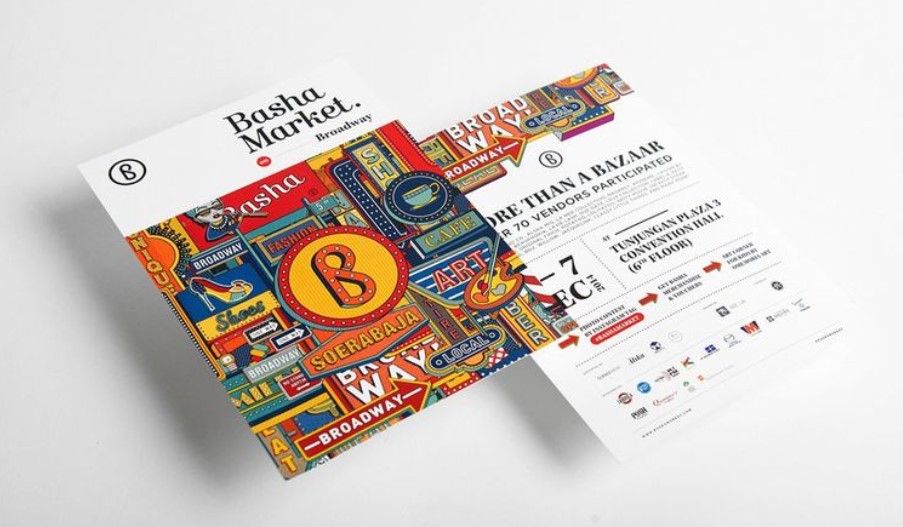
First up, let’s lay down a couple of the central themes of Pop Art. Whether it was an endorsement or critique of capitalism, artists depicted the affluence and abundance of postwar society with imagery that celebrated materialism. Consequently, Pop Artworks have imagery drawn from advertising and consumerism with prominent brand names and recognizable packaging. Sciencewerk’s visual identity for Basha Market draws on ‘Broadway’. And its array of colorful typographic and symbolic signs. Each one advertising a popular product or service for consumption.
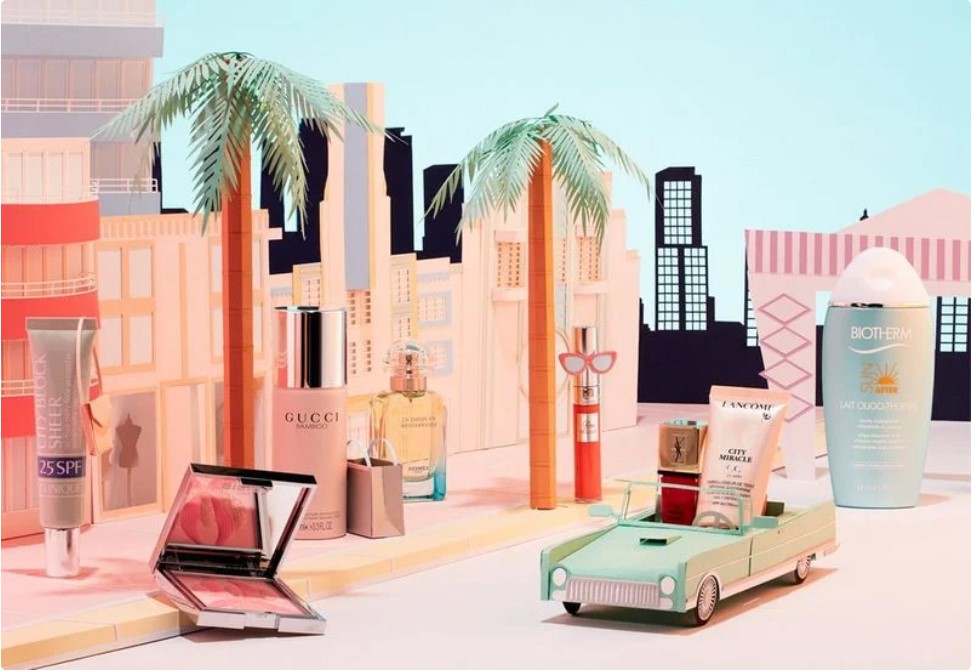
This set design by Adrian & Gidi has a cool Miami vibe and advertises a selection of cosmetics on offer at perfume shop Ici Paris XL. However, packaging and brand names are all recognizable. And elevates to protagonist status, sporting handbags, sunglasses, and shopping bags.
02. Use fame and celebrity culture
The second theme of Pop Art is the obsession with fame and celebrity culture. And surely little has changed today. Hollywood, movies, television, magazines, and newspapers were booming, and as Andy Warhol declared, “In the future, everybody will be world-famous for fifteen minutes.” Certainly fame and celebrities, like everything else in the 1950s and 1960s, were something to be consumed. However, it’s evident in the Pop Art representations of celebrities like Marilyn Monroe and Elvis Presley.
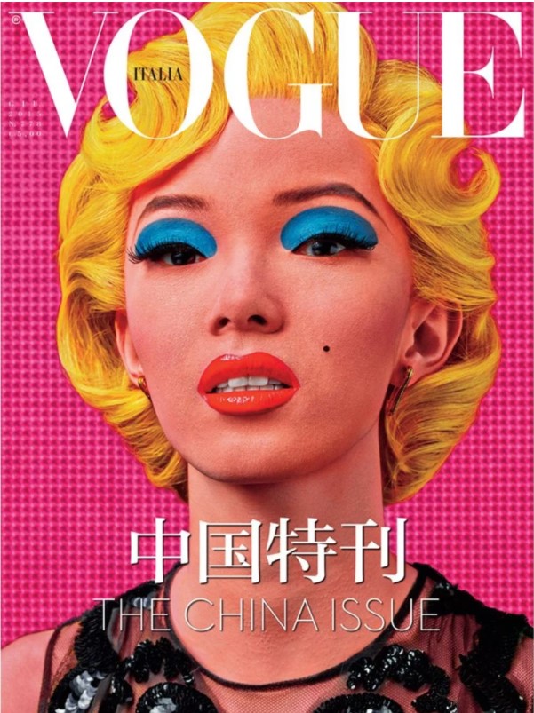
East meets West on this cover of Vogue Italia. It’s clear to see where Steven Klein got his inspiration from, reinterpreting. And almost recreating—Warhol’s iconic image of Marilyn Monroe. Warhol’s Marilyn Monroe series also inspired this cover of Tatler magazine, which features four images of Kate Middleton in bright, saturated colors. Is that because the public just can’t get enough of the Duchess of Cambridge?
03. Borrow from mass media
With fame and consumption so heavily promoted in the postwar mass media, artists turned to them for inspiration and reference. They borrowed physically and aesthetically from visual sources such as television, magazines, and comic strips, and created work that incorporated magazine pages, were rendered like comic strips, and featured images of recognizable products and people.
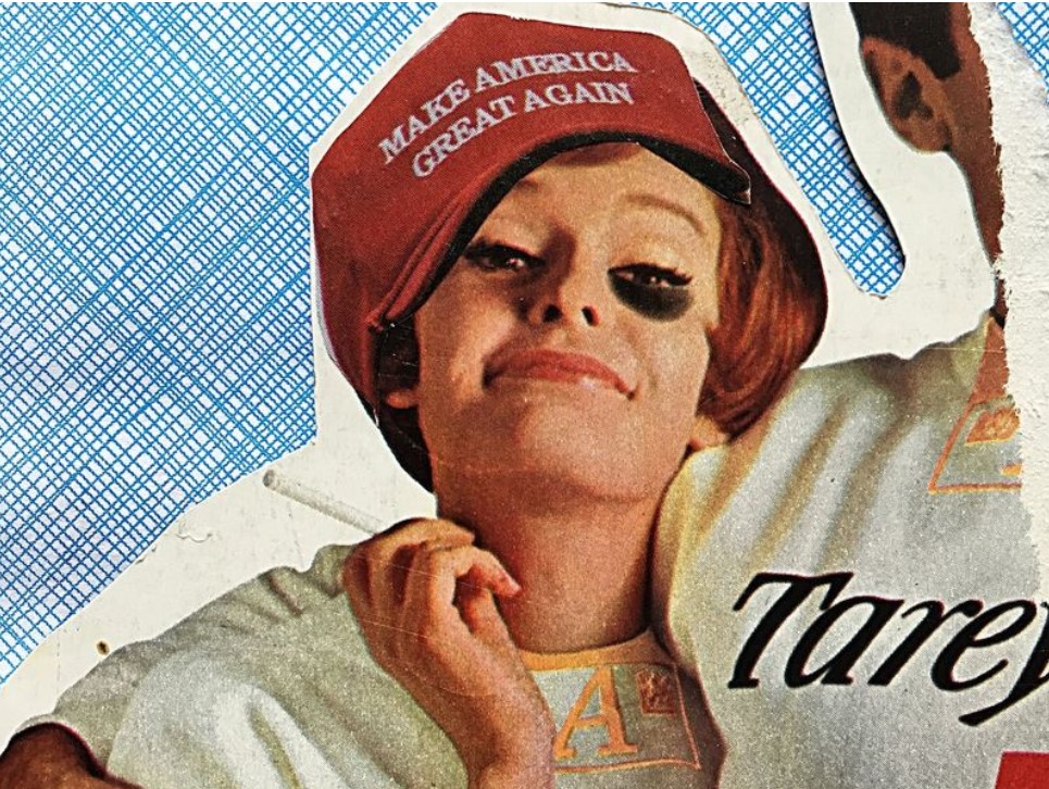
This political poster by Michael Hendrix uses an image from a magazine or newspaper—its grain visible—overlaid with a ‘Make America Great Again’ hat, the catchcry of Donald Trump.
It’s certainly not the picture of “Hope,” Shepard Fairey’s portrait of Barack Obama, which also draws on some Pop Art conventions.
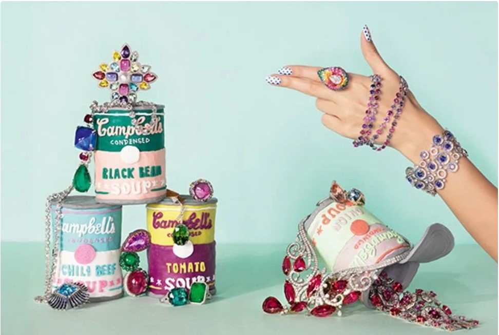
Alexandra Bruel was commissioned by the British version of Vogue to create a pop art-inspired jewelry setup. Alexandra Bruel also borrows from mass media visual sources, and in this case, it’s Pop Art. This set design for British Vogue features models of Warhol’s Campbell’s Soup Cans to showcase the glittering jewelry. This serves to break down the barriers between high culture and low culture.
04. Showcase ordinary objects
Artists incorporated and created images of objects that were banal, commonplace, and ubiquitous: Items on people’s weekly shopping list, products found in the back of a pantry, and tools stored in a cleaning cupboard. This elevation of everyday objects to high art status subverted cultural hierarchy and commented on art’s role as a commodity. In doing so, artists like Andy Warhol elevated everyday objects to museum status.
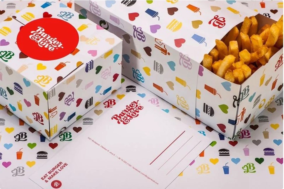
The commonplace burger has become a gourmet offering in recent years. However, this visual identity by Kissmiklos captures that transformation as well as contrasting high culture and low culture references. It has everyday images of burgers and soft drinks, plus a logo rendered in the style of Louis Vuitton, laid out in a pattern à la LV.
Erin McGuire transforms a can of Coke Zero into a piece of pixel art by borrowing aesthetically from two visual sources. The first is the popular 1980s video game Space Invaders. The second is pixel artist Invader who leaves his mark on spaces throughout Paris.
05. Enlarge and repeat objects
Andy Warhol is famous for taking familiar objects and turning them into pop art, like this Campbell’s soup cans
To drive home the theme of consumption and the point that art may borrow from any source, artists satirized everyday objects. The result was commonplace objects enlarged to gigantic proportions and repeated for visual effect.
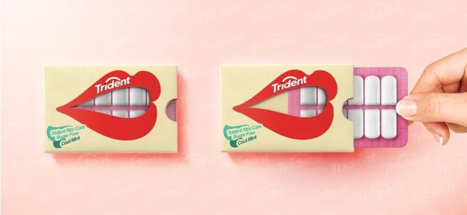
This playful and interactive packaging for sugar-free chewing gum by Hani Douaji has a mouth that takes center stage. And it’s large enough for the individual pieces of gum to appear like teeth.
Wei Yi Boo’s campaign for Chupa Chups not only repeats the image of the iconic lollipop, like Warhol’s Marilyn Monroe series. But it also draws on characters from popular culture. Each Chupa Chup represents a different cartoon including Mickey and Minnie Mouse, Where’s Waldo, and the Super Mario Bros.
Conclusion
With saturated colors and bold outlines. Their vivid representations of everyday objects and everyday people reflected the optimism, affluence, materialism, leisure, and consumption of postwar society. Pop art is known for its bold features and can help you grab the attention of your audience instantly. Whether you are creating a poster or a social media graphic.
You can try out draftss for premium quality services on unlimited graphic designs, WordPress, Webflow, HTML, Illustrations, Websites, Landing pages, Dashboards, App UI/UX, and many more. Here we provide our clients with 73+ types of design and code services.
