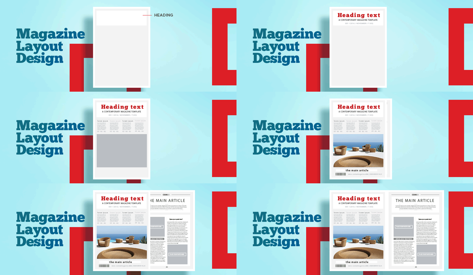
Headline
An introductory paragraph
Often referred to as the intro, deck, or stand-first, this paragraph bridges the headline and the main body of the article. It provides a snapshot of what the article entails and helps maintain the reader’s interest. An effective introductory paragraph sets the tone, summarizing the content while creating a seamless transition to the main article. It is typically written in a slightly smaller font size than the headline but may be bold or larger than the body text to ensure it captures attention. When you’re short on time or need a spark of inspiration, using a paragraph generator can be a smart way to draft relevant and engaging openings quickly
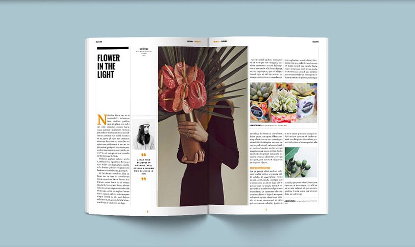
Bylines
Subheadline / subheading
Pull Quotes
Captions for Images
Section head or running head
Folio
Box copy
Table of Contents and Navigation Aids
The table of contents is often the first thing readers see. It should be visually appealing, concise, and offer a clear roadmap for the magazine. In longer magazines, navigation aids such as tabs or section dividers can further enhance the user experience.
Image Placement and Photojournalism
Expand on how to strategically place images for storytelling. Discuss how to use photojournalism effectively to complement the text and evoke emotion. Mention technical tips like using high-resolution images and maintaining proper aspect ratios.
Infographics and Data Visualization
For articles involving data, including infographics is a great way to make the content visually appealing and easier to understand. These can range from pie charts to creative diagrams tailored to the magazine’s aesthetic.
Visual Hierarchy
Establishing a clear visual hierarchy is essential in magazine design. This involves using size, color, and placement to guide readers’ attention to the most important elements. From the headline to pull quotes and images, every component should flow logically and harmoniously.
Typography
Typography is a cornerstone of effective magazine design. It sets the tone and reflects the brand’s personality. Use a combination of font styles, such as serif for body text and sans-serif for headings, to create contrast and maintain readability. Ensure consistency in font usage across the magazine to establish a professional and cohesive look.
Negative Space
Negative space, or white space, is the area left unmarked in a design. It plays a crucial role in balancing the layout and preventing it from appearing cluttered. Skillful use of negative space can enhance readability, draw attention to key elements, and add a sense of sophistication to the design.
Innovative Trends in 2026
In 2026, magazine design is embracing new trends. Here are some additions to consider:
Interactive Elements: Incorporate QR codes or augmented reality (AR) features to make your magazine interactive and immersive.
Sustainable Design: Use eco-friendly materials and digital formats to cater to environmentally conscious audiences.
Personalization: Leverage data-driven design to create content tailored to specific reader segments, enhancing engagement and loyalty.
Minimalism: Simplify layouts with minimalist designs, focusing on essential elements to convey a clear and impactful message.
Motion Graphics: Introduce subtle animations or motion graphics in digital magazine formats to add a dynamic touch.
By integrating these elements and staying updated on emerging trends, you can create a magazine design layout that not only captures readers’ attention but also leaves a lasting impression. Whether you are designing for print or digital formats, remember that a well-thought-out layout is key to delivering a memorable reading experience.
Draftss specializes in delivering outstanding magazine design layouts tailored to your business needs. With our expertise in design and creativity, we ensure your magazine not only looks professional but also resonates with your audience. Let Draftss be your partner in creating impactful magazine designs that stand out in a competitive market.
Drop your thoughts in the comments below.
Your email address will not be published. Required fields are marked *

