

January’s work shifted toward momentum-driven execution across branding, conversion-focused web design, and high-volume social graphics. The mix reflects a strong start to the year: refreshed brand identities rolling out, performance landing pages optimized for Q1 growth, and campaign creatives supporting early-year launches. The output this month shows range without dilution, with each category staying focused on practical, deployment-ready design.
Business Card Design
This section includes a single but detailed identity piece: a premium real estate business card designed with a refined color palette, elegant typography, and strong visual hierarchy. The layout balances script and serif elements with structured information placement, keeping the design polished and functional across print and personal branding touchpoints.
Across this type of work, the focus remains on clarity, contrast, and brand positioning rather than decorative excess.
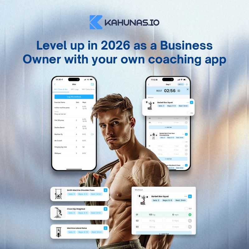
Landing Page & UI Design
Landing pages formed a strong share of shipped work this month, spanning healthcare services, ecommerce retail, and mission-driven housing. While each project serves a different audience, all three follow a structured long-scroll layout designed to guide users from first impression to clear action.
Common patterns include:
- Strong hero sections with immediate positioning and clear calls to action
- Trust-building blocks such as testimonials, credentials, or founder introductions
- Structured service or product sections with supporting visuals
- Conversion-focused endings with consultation forms, category navigation, or direct purchase prompts
The healthcare page prioritizes clarity and reassurance, pairing service explanations with consultation CTAs and location credibility. The ecommerce layout leans into product discovery, featured collections, and guided shopping paths. The housing homepage blends storytelling with process transparency, moving from purpose-driven messaging into practical ownership details.
Visual styles vary from clean and clinical to dark and product-focused to warm and community-oriented, showing range while maintaining structural discipline. Across all three, the emphasis remains on hierarchy, usability, and conversion clarity rather than decorative experimentation.
This work aligns with Draftss unlimited custom landing pages offering, where repeatable structure, speed of execution, and strategic layout decisions drive performance.
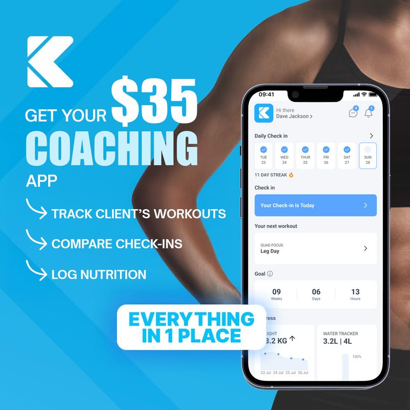
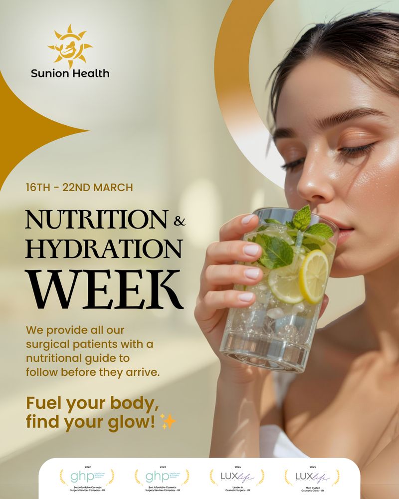
Graphics and Social Media Design
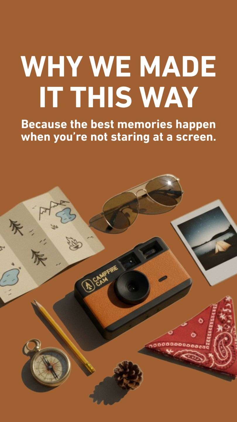
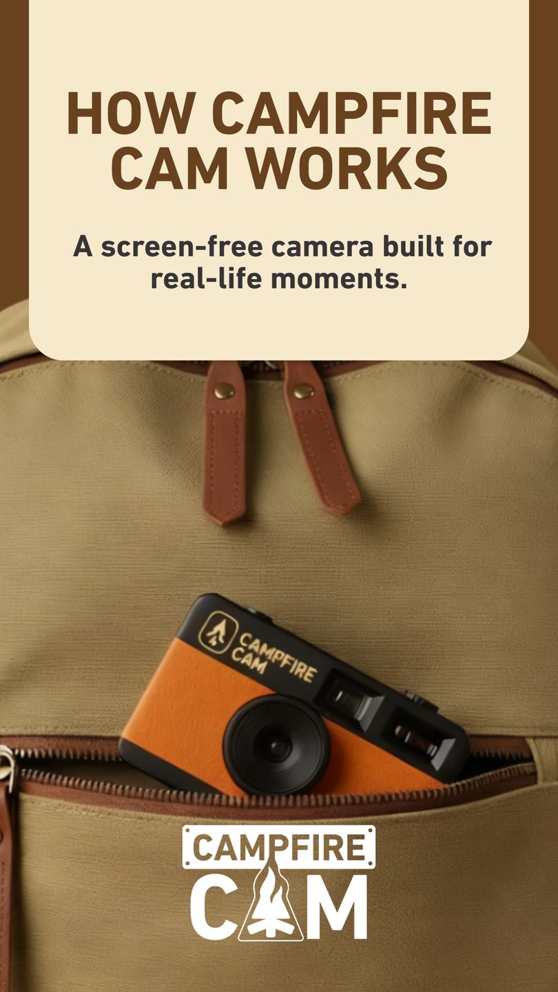
The graphic output this month spans product storytelling, promotional campaigns, and structured social ads across consumer, SaaS, and healthcare brands. Product-focused creatives lean into warm, lifestyle-driven compositions with minimal UI distractions, allowing the object or interface to remain the focal point. Promotional ads favor bold headline placement, high-contrast color blocks, and direct offer framing built for fast scroll environments.
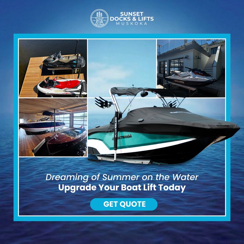
Campaign graphics show clarity in hierarchy and intent. Marine and outdoor visuals emphasize aspirational imagery with concise calls to action, balancing lifestyle appeal with service positioning. Fitness SaaS posts combine app interface mockups with benefit-driven copy, highlighting usability and outcome rather than feature overload. Healthcare creatives adopt softer palettes, controlled typography, and trust-building badges to reinforce credibility while maintaining visual calm.
Across all assets, the focus remains on structured composition, readable typography, and scalable brand consistency, ensuring each post functions as part of a broader content system rather than a one-off visual.

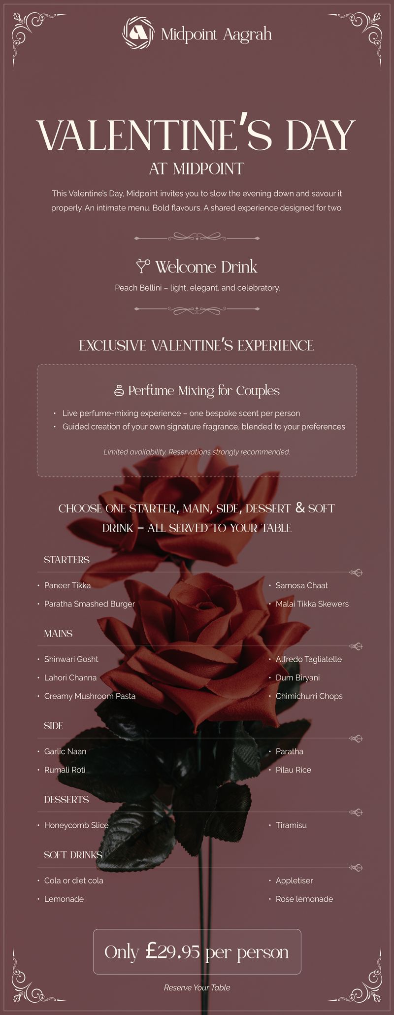
Email Newsletter Design
This month’s emailer focuses on event-led hospitality campaigns built around experience and atmosphere. The layout combines elegant typography with structured menu breakdowns, guiding readers from occasion framing into detailed inclusions and pricing clarity. Visual styling leans into rich, romantic tones with layered imagery to reinforce mood without overpowering readability.
Experience highlights are positioned as premium add-ons, while menu sections are organized with clear category hierarchy for easy scanning. Pricing and reservation prompts are placed prominently at the end, ensuring the emotional build-up transitions naturally into action.
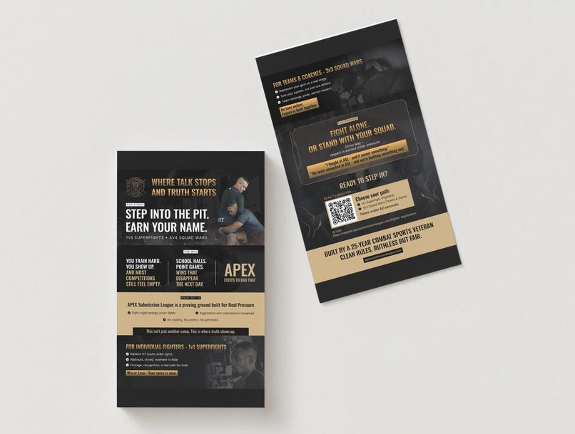
Flyer Design
Flyer output this month spans sports promotion, product handouts, and personalized event graphics. Flyers use strong hierarchy, bold headlines, and clear contrast to guide attention from positioning into features and calls to action, with dual-sided layouts balancing impact and detail.
Looking for steady design execution like this each month?
If you’re assessing how Draftss manages ongoing output across landing pages, marketing assets, print materials, and social systems, this month reflects the kind of structured, delivery-focused work shipped consistently behind the scenes. Teams that need reliable execution rather than one-off campaign bursts typically begin by reviewing the portfolio or exploring plan options on the pricing page before moving forward.
Drop your thoughts in the comments below.
Your email address will not be published. Required fields are marked *