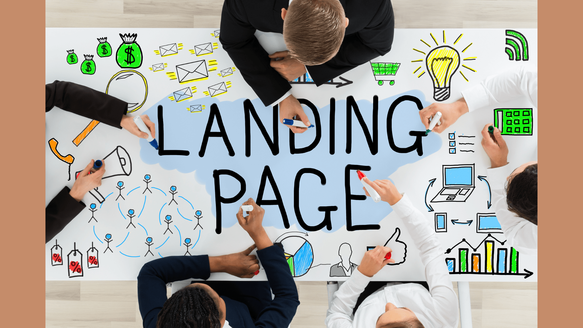
Are you finding it difficult to get more clicks to your website & boost your conversions? If that’s the case, you need to make landing pages that your audience wants.
In this article, we’ve explained what a landing page is, the benefits of creating a good landing page & how to build your own high-converting landing page.
There’s more to a landing page than looks, so let’s get started!
What is a Landing Page?
The primary objective of a solid landing page is to increase your conversion rate to maximize your business growth. There may be different types of landing pages for businesses. They vary from a homepage, another page of a website, or even a standalone page that is specifically created for a campaign or for sales.
In short, your landing page serves as your virtual elevator pitch.
Benefits of an Effective Landing Page that Converts
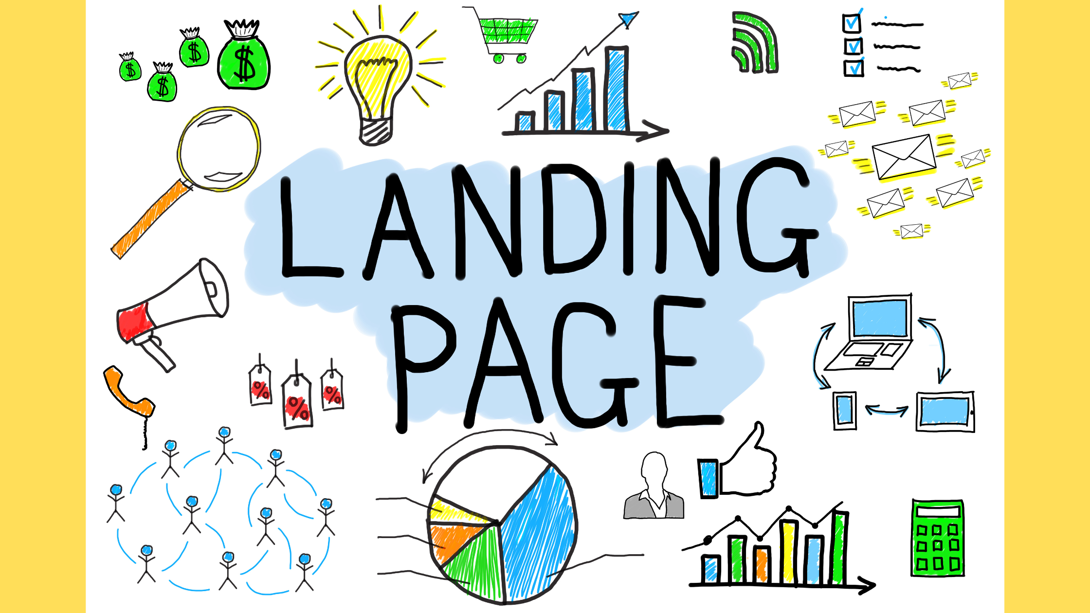
The following are the key benefits of making a good landing page.
Improves SEO Rankings
Landing pages should be promoted via Google Ads, or other paid boosting services. Also, when users type specific keywords, your landing page might appear in the search engine. The idea is when your landing page is visible to a lot of people, the higher web traffic you’ll have. Remember that all of this depends on your SEO score. The higher your score is, the higher you rank. Both organic & paid SEO activities increase your rankings.
Promotes Upcoming Products or Sale
A landing page is created for promotion, product showcases, or sales. When users land on that page, they get to see any upcoming products or sales that you have. This can persuade visitors to check out your products & even purchase them.
Making the Customer Journey Smooth
When you build a solid landing page that converts, it acts as a portal for your website visitors to convert into clients. Instead of spending time finding what to do, a good landing page will have clear CTAs, directing users toward specific actions hassle-free. The most commonly used CTAs are to subscribe, sign up, join or buy.
This eliminates the risk of your visitors being confused, as the objectives & messages are crystal clear for them to follow.
How to Build a Badass Landing Page that Converts?
Let’s find out what elements you require to build a full-proof landing page that converts.
A Killer Headline
Everything starts with a headline. A badass landing page that converts has an exciting & attention-grabbing headline with a clear message. After all, a headline is what compels a web visitor to stay on your landing page & not bounce off.
You should keep your headline crisp & clear. No one wants to read big sentences, especially not in the headline.
Here are a few ways to write a killer headline:
-Headlines that clearly state benefits & offer a solution
-Headlines that focus on a unique selling point
-Headlines that have an offer
-Headlines that have pain points/FOMO
Neil Patel, the co-founder of Ubersuggest, in his blog has widely explained how to write headlines that convert.
Now that we’ve understood how to write killer headlines – let’s move on to the next steps of building a landing page.
Persuasive Subheadings
After the headline comes the next part of the landing page, the subheading. Your landing page must be planned carefully to have a smooth journey for the visitors, from just visiting to buying. For that, you need to persuade your website’s visitors.
So, if your headline attracts visitors, your subheading should be a nice follow-up to your headlines. Typically consisting of persuasive 1-2 lines to add a punch to your landing page.
Ideally, you should write a subheading that compliments your headline & also state the benefits your visitors get from your product/service.
Eye-Catchy Imagery
Visuals play an important role in our lives as humans. We understand more about a particular thing if our eyes see that via imagery. This is why images are an excellent way to add a slice of life to your landing page.
When using images on your landing page, you should ask yourself the following questions:
-Will the image resonate with my audience?
-Does the image match with my message?
-How does it make my audience feel?
Remember that your images must be eye-catchy, big & compressed. If you don’t compress it, it may increase your landing page’s loading time. Also, the images must have a clear message that goes hand in hand with your objective.
Clear Explanation
When building a solid landing page, you must make sure that your message is clear & straightforward. Your visitors must know clearly what you are offering to them. Because if you don’t, they’ll just bounce off.
Your explanation does not need to be completely separated from your headline or subheading. You can include your explanation in the headline & subheading, as we’ve previously discussed.
Try to make your entire body copy a fun & engaging experience for users. Avoid writing dull & boring texts. Instead, come up with great copies to drive more sales & not just website visits.
Engaging Videos
More & more people are losing their attention span these days. Most people don’t even read an entire landing page’s copy. They instead prefer to watch short videos. Therefore, it is crucial that you use short videos on your landing pages to maximize conversions.
You can include your product details or any other objective you want to achieve in your video. You can also use animation tools to create background videos to draw attention.
Videos are important assets that should not be disregarded. You can create different types of videos such as explainers, demos, promotional, testimonials, etc.
One more thing…Always include the CTA in your video so that your visitors don’t forget why they are on your website for.
Means of Communication
People usually trust a business more when they provide contact information. This shows that the business is legitimate & users can contact you for any concerns. Your contact information can be an email, a physical address, a phone number, or a contact form. You also can use chatbots to message your landing page visitors in real-time.
Strong Call to Action
One of the most important elements of your landing page is your call to action. Every good landing page has one & you should have it too. After all, it is how you will convert your visitors into customers. Without a clear call to action, you leave your visitors nowhere.
Avoid cliche CTAs such as ‘Submit’ or ‘Click Here.’ Rather, try using phrases such as ‘Hurry,’ ‘Offer Ends,’ & ‘Exclusive.’ They create a sense of urgency or scarcity, which drives more action.
Your CTA button should be highlighted in a contrasting color to make it stand out. This encourages more clicks.
Product Guarantees
Product guarantees are a great way to reassure people that their money will not go down the drain. Emphasize this idea on your landing page by placing it closer to your CTA.
A few examples of product guarantees are:
- 100% satisfaction
- Money-back guarantee
- Free trial
- Best price
Social Proof
People often tend to buy a product if it’s recommended online. Social proofs, such as the number of likes, shares, subscribers, tweets, etc., play an important role in customers’ purchasing behavior.
Hence, you should definitely include a few social proofs on your landing page to win your web visitors over.
A few examples of social proofs include:
- Awards
- Trust seals
- Customer reviews
- Expert opinions
- Testimonials
Final Words
We tried to give you an overall idea of how to build a badass landing page that converts. Try incorporating the mentioned techniques in your landing page design to see jaw-dropping results.
Before you go, we’d like to tell you that you could get your landing page designed by some expert designers. To do that, subscribe to Draftss & get unlimited graphic designing, video & coding services for a flat fee.
Lastly, we’d love to hear from you if any of these landing page design elements were of help to you. Drop a comment down below & we’d happily respond.
Drop your thoughts in the comments below.
Your email address will not be published. Required fields are marked *

