




Fifty games. One week. One storefront.
Between October 26 and 31, Xbox is rolling out roughly 50 new games to console players, according to Xbox’s own release roundups. Some are blockbusters with giant marketing budgets. Most aren’t. A lot of them are tiny indie titles built by teams you could fit around a kitchen table.
Now ask yourself: how does a tiny studio get a stranger to click on its game when 49 others are shouting for the same attention?
Here’s the uncomfortable part. Your startup is in the exact same position. Your “release week” is every single day. Your prospects are scrolling past dozens of products, ads and landing pages before lunch.
The studios that win this fight don’t win it with bigger budgets. They win it with sharper branding. Let’s break down exactly how they do it, and how you can copy the playbook.
The Attention Problem Is Bigger Than You Think
Game discovery is a brutal numbers game. According to SteamDB data reported by MP1st, more than 18,000 games had launched on Steam by late November 2025. Roughly 49% of them had fewer than 10 reviews, and over 2,000 had none at all.
Zoom out and it gets wilder. Steam saw about 20,000 new releases in 2025, its highest year on record, based on figures compiled by How To Market A Game (trackers differ slightly because Valve sometimes removes titles).
And yet, indie games still earned about $4.4 billion of the $17.7 billion Steam players spent through December 19, 2025, roughly a quarter of all revenue, according to Alinea Analytics as reported by Game World Observer.
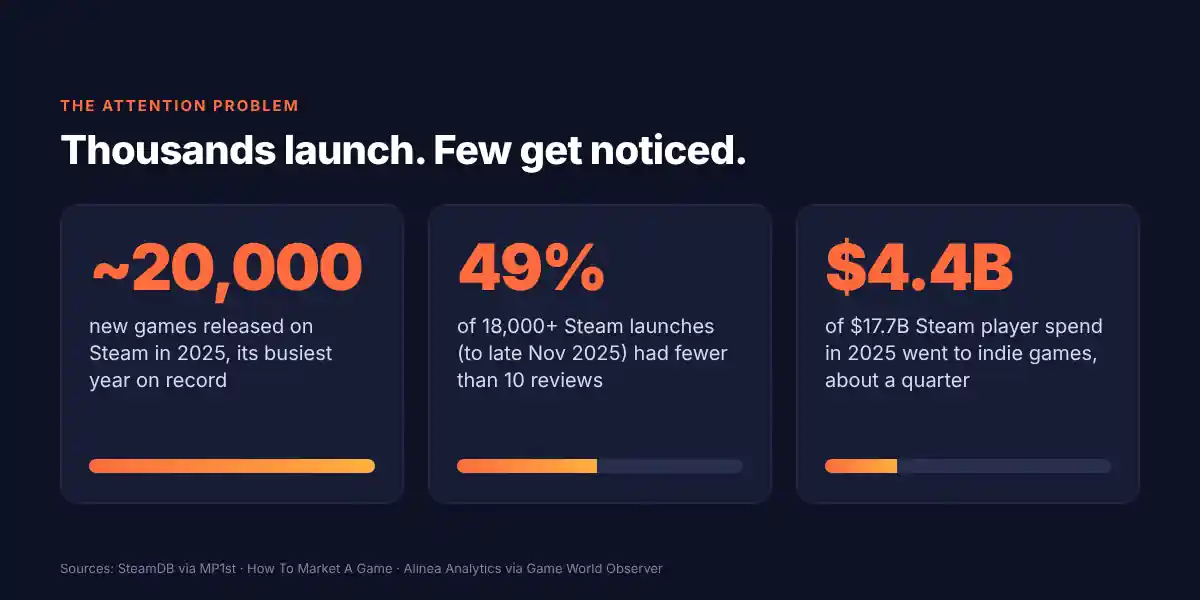
Read those numbers together. Thousands of games disappear without a trace. A small group breaks through and takes a huge slice of the money. Sound familiar? That’s the startup landscape too.
The difference between those two groups is rarely “better product” alone. It’s whether anyone noticed the product in the first place.
The 50-Millisecond Rule (Yes, Really)
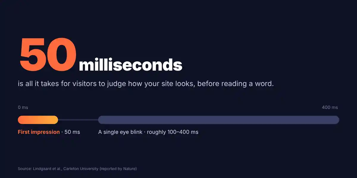
Researchers at Carleton University found that people form a lasting opinion of a website’s visual appeal in as little as 50 milliseconds. That research, led by Gitte Lindgaard and covered by Nature, is old but still one of the most quoted findings in design.
Fifty milliseconds is faster than a blink. Your visitor decides whether you look credible before reading a single word.
Game stores are basically a 50-millisecond arena. A player scrolls a grid of small images. The ones that look interesting get a hover or a click. The rest are invisible.
Chris Zukowski, an indie developer who ran screen-share sessions with Steam shoppers, described eye-catching capsule art as the thing that gets the cursor to hover in the first place, as he wrote in Game Developer. It was a small qualitative study (seven participants), so treat it as a signal and not a law. But it matches what every store-page designer will tell you.
Your logo, your colors and your hero image are your capsule art. They do the first job. If they fail, nothing else you built matters.
What Indie Studios Do Differently (And Why It Works)
Small studios can’t outspend anyone. So they get ruthless about three things: the logo, the art style, and the thumbnail. Let’s take each one.
1. The Logo: Readable at Thumbnail Size or Don’t Bother
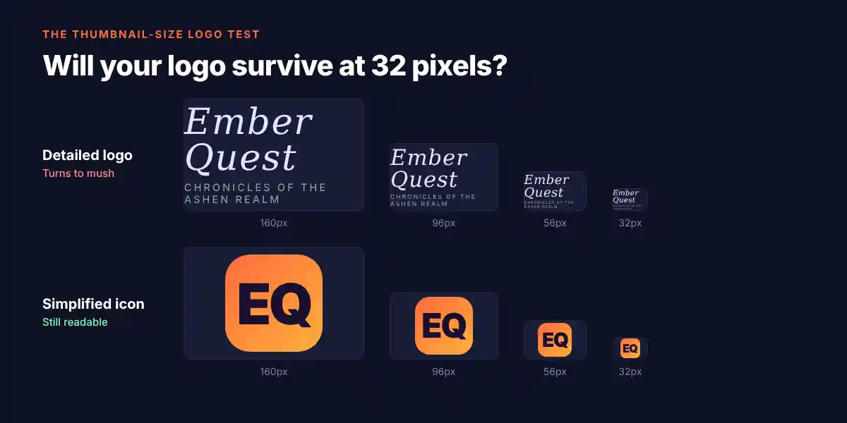
A game logo has to survive being shrunk to the size of a postage stamp. Fancy flourishes, thin lines and long subtitles turn into mush.
The strongest indie logos share a few traits:
- Short, bold lettering. One or two words with heavy strokes beat a long title with delicate type.
- A shape you can recognize in silhouette. If you blur your eyes, you should still tell it apart from the logo next to it.
- High contrast against the background. The logo sits on busy art, so it needs to pop.
- Genre signals baked in. A horror game’s lettering looks nothing like a cozy farming sim’s, and that’s the point.
Startup takeaway: Test your logo at 32 pixels wide. That’s the size of a browser tab, a social avatar or an app icon. If it falls apart, simplify it.
2. The Art Style: Be Instantly Categorizable, Then Be Distinct
Notice how players decide in seconds whether a game is “for them.” Pixel art says one thing. Hand-painted watercolor says another. Chunky low-poly says a third.
Indie studios use a consistent art style as a shortcut. A single screenshot tells you the mood, the genre and roughly the experience. That’s branding doing its job without a single word of copy.
The smart ones go one step further. They pick a style that’s recognizable and slightly different from the pack. A limited color palette, an unusual texture, or an offbeat character design becomes the thing people remember.
Consistency is what makes the style stick. A Lucidpress report cited by Bulldog Reporter found that consistent brand presentation can lift revenue by an average of 33%. The report surveyed more than 200 organizations and is a few years old, and it’s a self-reported figure, so don’t promise your CFO exactly 33%. The direction, though, is clear: scattered branding costs you money.
Startup takeaway: Pick a visual lane and stay in it. Same illustration style, same color palette, same typography across your site, ads, decks and socials. Boring consistency beats clever inconsistency every time.
2.5. The “Squint Test”
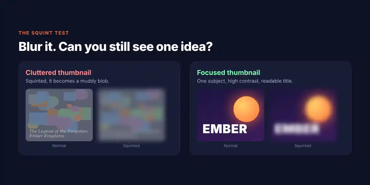
Here’s a quick trick game artists use. Squint at your screen until everything blurs. Can you still tell what the image is about? Is there one clear focal point?
If you see a muddy blob, your thumbnail won’t win a crowded grid. Fix the contrast and the focal point before you touch anything else.
3. The Thumbnail: One Idea, One Focal Point
The capsule or thumbnail is the single most important marketing asset a game has. It has to communicate genre, tone and a reason to care in a tiny rectangle.
Great ones follow a simple formula:
- One clear subject. A character, an object or a scene. Not seventeen things.
- Readable title. The name should be legible without squinting.
- A distinct color mood. Many thumbnails in a grid look alike. A standout palette breaks the pattern.
- Zero clutter. Leave breathing room. Empty space is a design choice.
Zukowski also noted that the first few screenshots show up in the hover tooltip, so the images right behind your capsule carry real weight. Your second and third impressions need to be just as strong as the first.
Startup takeaway: Your “thumbnail” is your Open Graph image, your LinkedIn banner, your Product Hunt cover and your ad creative. Design them as a family, with one idea each.
Game Branding vs. Startup Branding: A Side-by-Side
The parallels are almost one-to-one. Here’s how the game world maps onto yours:
| Game Release Asset | What It Does | Your Startup Equivalent | Quick Win |
|---|---|---|---|
| Capsule art / thumbnail | Earns the first click in a crowded grid | Ad creative, OG image, social cover | One subject, high contrast, readable text |
| Game logo | Identifies the title at tiny sizes | Company logo and app icon | Test it at 32px wide |
| Art style | Signals genre and mood instantly | Illustration, photography and color system | Lock a palette and style guide |
| First 4 screenshots | Show the core experience fast | Hero section and above-the-fold visuals | Show the product, not a stock photo |
| Tags and genre keywords | Help the right players find the game | Positioning and category language | Say what you are in plain words |
| Trailer | Builds desire in seconds | Demo video or product tour | Lead with the payoff in 5 seconds |
7 Branding Moves to Steal From Indie Studios
1. Win the thumbnail before you win the pitch
Before you write another blog post, audit your thumbnails. Look at your site’s social share image, your top ad creative and your profile banners. Would any of them earn a click next to a competitor’s?
2. Choose a single memorable visual hook
One color, one mascot, one illustration style, one odd shape. Pick one thing to be known for and repeat it everywhere.
3. Be obvious about what you are
Indie games that tag themselves with precise genres get found by the right players. Vague labels like “innovative platform for modern teams” get found by nobody. Name your category, then differentiate inside it.
4. Make your logo small-screen proof
Build a simplified icon version of your logo. Use it for favicons, avatars and app icons. A full wordmark is great on a website and terrible in a 32px square.
5. Build a one-page brand guide
You don’t need a 60-page brand style guide. You need colors (with hex codes), two fonts, logo usage rules and an example of the illustration style. Share it with every freelancer and teammate.
6. Show the product early and often
Studios put gameplay in their first screenshots because players want proof. Put your real product UI in your hero section. Real beats abstract.
7. Make launch week one of many moments
A release window is crowded, so smart studios build awareness before and after it. Treat every launch, feature drop and campaign as a chance to reinforce the same brand, not reinvent it.
Common Branding Mistakes That Get You Skipped
- Copying the category leader. If you look like everyone else, you’re invisible. Similar is not safe, it’s forgettable.
- Too many fonts and colors. Every extra element dilutes recognition.
- Design by committee. A logo nobody hates is usually a logo nobody remembers.
- Ignoring small sizes. Beautiful on a billboard, unreadable in a feed.
- Changing everything every quarter. Brand equity builds through repetition.
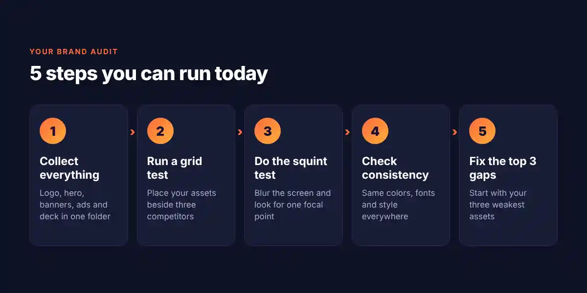
A Simple 5-Step Brand Audit You Can Run Today
- Collect everything. Pull your logo, website hero, social banners, ad creatives and pitch deck into one folder.
- Print a “grid test.” Place your assets next to three competitors in a thumbnail grid. Which one would you click?
- Run the squint test. Blur your screen. Is there a clear focal point?
- Check consistency. Same colors, same fonts, same style across all assets?
- Fix the top three gaps. Don’t redo everything. Fix the three weakest assets first.
The Bottom Line
Fifty games launching in one week is a reminder that attention is the scarcest resource in any market. The studios that break through don’t just build great products. They package them so well that a stranger understands, feels and clicks in under a second.
Your startup lives in that same grid. Your logo, your art style and your thumbnails decide whether people stop scrolling.
The good news? Branding is learnable, repeatable and fixable. You don’t need a giant budget. You need a sharp visual identity and the discipline to use it consistently.
Need a Brand That Stops the Scroll?
At Draftss, our unlimited design subscription gives startups a dedicated team for logos, brand identities, ad creatives, social graphics and landing pages, all at a flat monthly price. Get the thumbnail-ready visuals your launch deserves, without hiring a full in-house team.
Start your Draftss subscription and make your next “release week” the one people remember.
Drop your thoughts in the comments below.
Your email address will not be published. Required fields are marked *