Limited Time Offer: 50% OFF on All Plans for 6 months. New Customers Only.

WunderKind
Wunderkind is a performance marketing channel that delivers one-to-one messages across email and text at an unmatched scale.
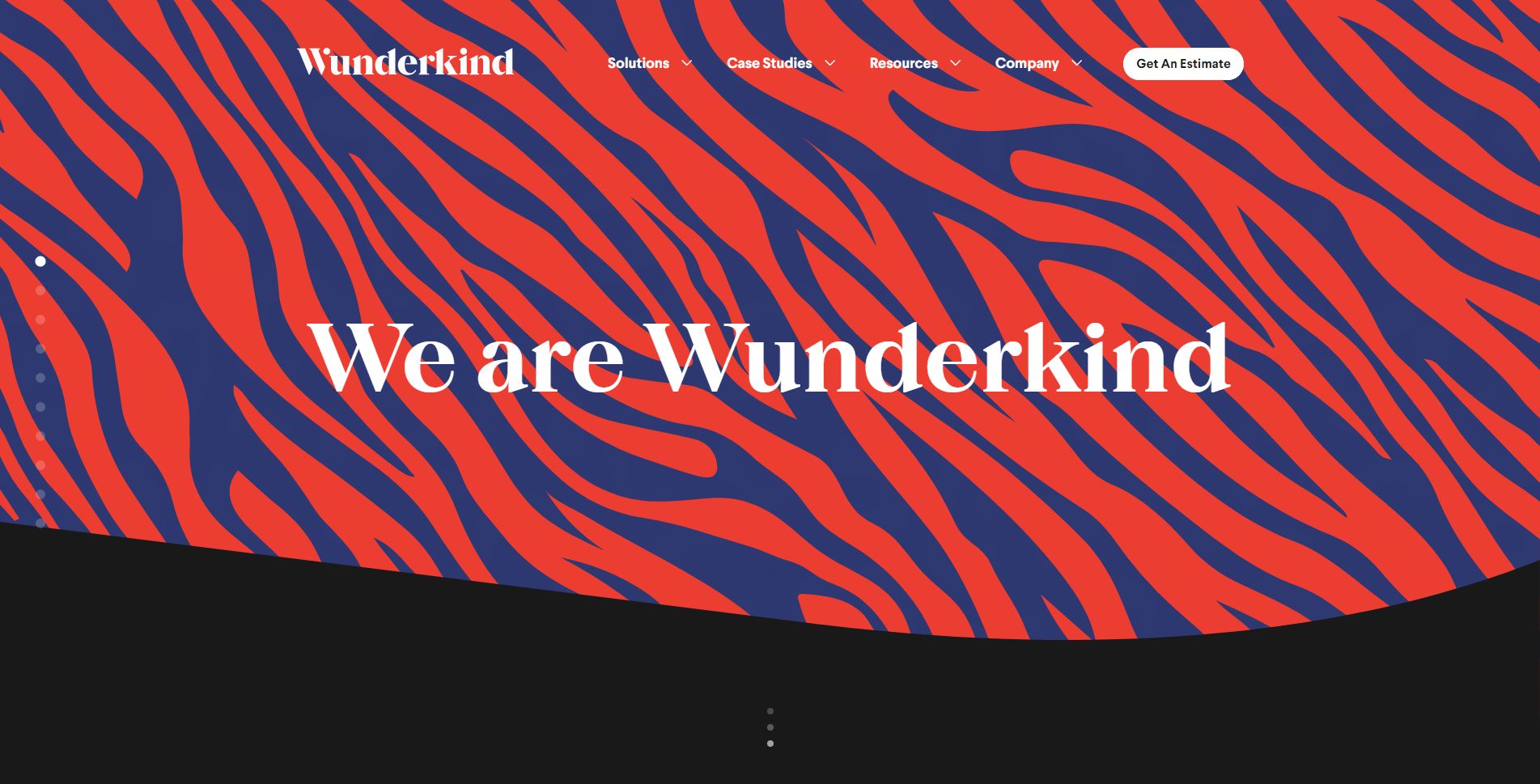
The hero section of Wunderkind stands out for several reasons, making it an effective design:
1. Bold Visual Design:
- The tiger-stripe pattern in vibrant red and blue creates a strong visual impact, grabbing the viewer’s attention immediately.
- The use of contrasting colors ensures readability while maintaining a unique and memorable design.
2. Clear and Concise Messaging:
- The simple, authoritative headline, “We are Wunderkind,” conveys confidence and establishes the brand identity instantly.
- It avoids jargon, focusing on brand recognition rather than overwhelming users with details upfront.
3. Minimal Distraction:
- The hero section keeps the focus on the brand name and identity, with no cluttered elements or excessive text.
- The clean layout ensures that the message is delivered effectively without unnecessary distractions.
4. Strategic Navigation Placement:
- The top navigation is well-structured and subtle, allowing the hero section to take center stage while still giving users easy access to other sections of the website.
5. Call-to-Action (CTA):
- The “Get An Estimate” button stands out in white with a clear purpose, encouraging users to take action immediately.
- Its placement makes it easily noticeable without disrupting the design flow.
6. Dynamic Appeal:
- The visual design, combined with a straightforward headline, evokes curiosity, making visitors want to explore further.
- The abstract and artistic elements give the brand a creative and innovative perception.
This hero section exemplifies how simplicity, bold design, and clear messaging can create a memorable and effective first impression.