Limited Time Offer: 50% OFF on All Plans for 6 months. New Customers Only.


Vercel
Vercel's minimal hero sets the two-word headline "Agentic Infrastructure" and two CTAs on the left, a large black triangle in the centre and three short audience lines on the right, above a strip of big-name customer logos.
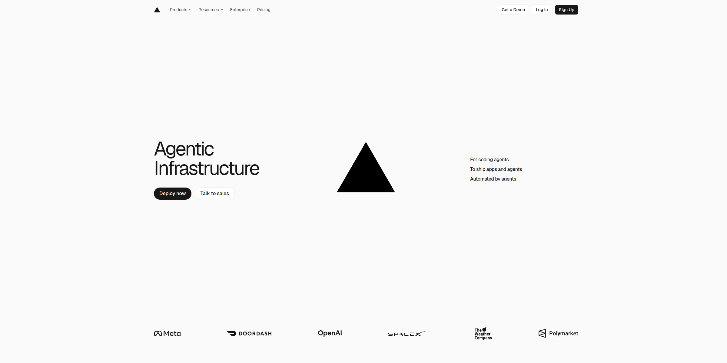
This Vercel hero section makes a bold, minimal statement that repositions the platform for the age of AI agents.
Here’s why it stands out:
1. A Two-Word Category Claim
The headline “Agentic Infrastructure” is as short as a headline can get. Instead of listing features, it names a category and puts Vercel at the center of it, signalling a clear shift from frontend hosting to infrastructure built for agents.
2. Three Short Lines That Frame the Audience
To the right of the visual, three lines read “For coding agents”, “To ship apps and agents” and “Automated by agents”. The page copy expands these into fuller statements, such as “To ship apps and agents in Sandboxed VMs, with durable backends, powered by 400+ models,” so one compact block speaks to several audiences.
3. The Brand Mark as the Hero Visual
A large black triangle, Vercel’s logo, sits in the centre of the section. Using the brand mark itself instead of a product screenshot makes the hero instantly recognisable and confident.
4. Dual CTAs for Self-Serve and Enterprise
“Deploy now” sends developers straight to building, while “Talk to sales” gives larger teams a direct path to a conversation. “Get a Demo”, “Log In” and “Sign Up” in the navigation cover every other visitor.
5. Logo Strip as Instant Proof
A row of customer logos including Meta, DoorDash, OpenAI, SpaceX, The Weather Company and Polymarket sits at the bottom of the hero, backing the big category claim with recognisable names.
6. A Balanced Three-Column Layout
Headline and buttons on the left, the triangle in the middle and the supporting lines on the right create a balanced composition. Generous white space keeps it calm and easy to scan.
7. Restraint as a Design Choice
The light, monochrome palette, thin typography and absence of busy illustrations let a few words and one shape carry the message. That restraint conveys confidence and keeps the focus on a single idea.