Limited Time Offer: 50% OFF on All Plans for 6 months. New Customers Only.


Todoist
Todoist's centred hero pairs the headline "The task system you'll actually stick with" with one red "Start for free" button and a warm peach panel showing a real task list with Write, Attach and Speak options.
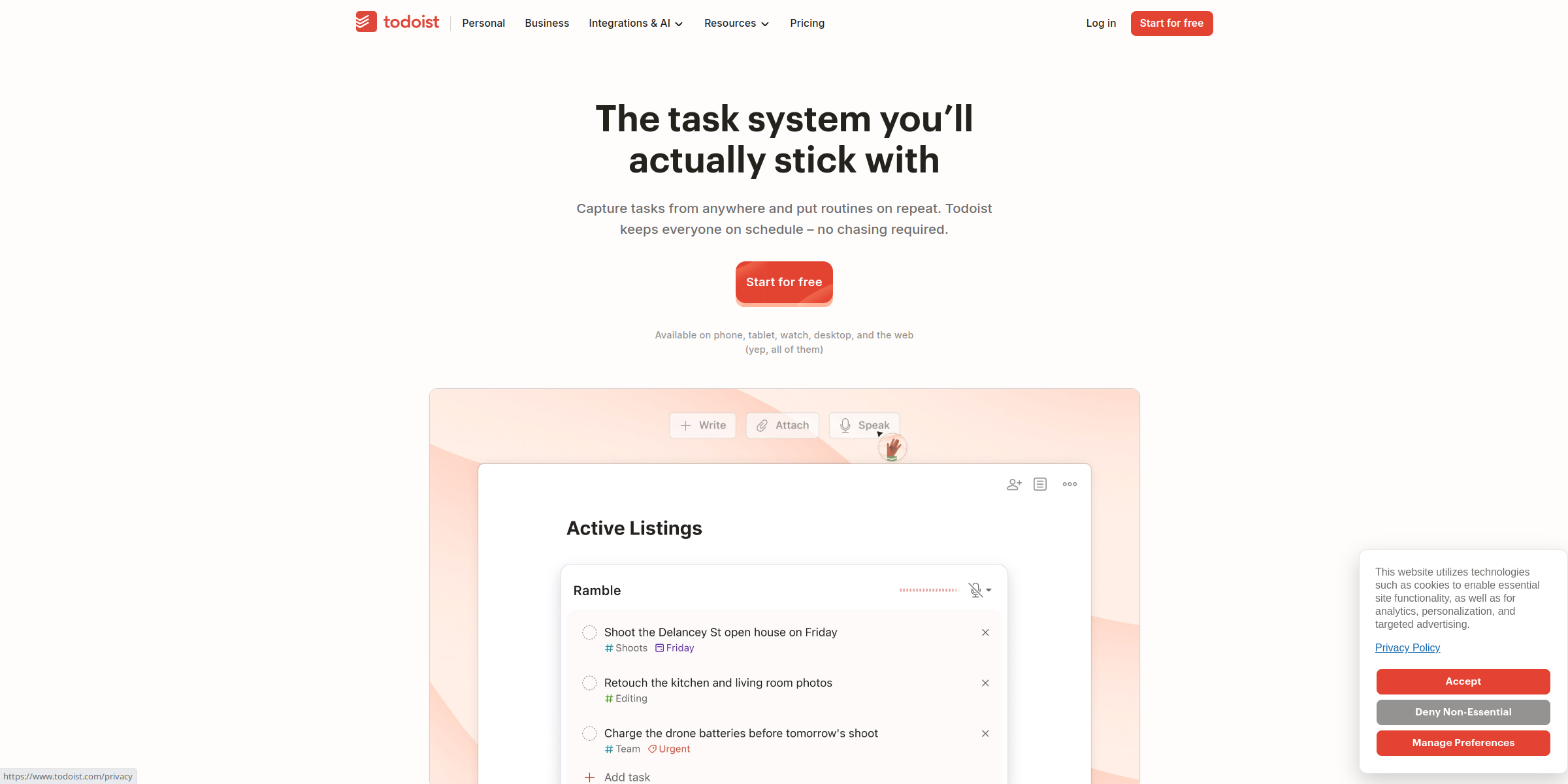
This Todoist hero section trades big claims for a calm, practical promise and lets a real task list do the convincing.
Here’s why it stands out:
1. A Headline About Sticking With It
The headline “The task system you’ll actually stick with” speaks to anyone who has tried and abandoned to-do apps before. The word “actually” admits that common frustration and promises a tool that lasts beyond the first week.
2. Subheadline That Covers Capture and Routines
“Capture tasks from anywhere and put routines on repeat. Todoist keeps everyone on schedule – no chasing required.” moves from personal capture to recurring work to team follow-up in two short sentences, widening the audience from individuals to teams.
3. One Clear Call-to-Action
A single red “Start for free” button sits centred under the copy and is repeated in the top navigation. With no competing button in the hero, the next step is obvious and the free entry point removes hesitation.
4. Friendly Platform Microcopy
The line “Available on phone, tablet, watch, desktop, and the web (yep, all of them)” answers the device question right under the CTA, and the playful aside keeps the brand voice light.
5. A Realistic Product Preview
Below the CTA, the app window shows an “Active Listings” project with tasks such as “Shoot the Delancey St open house on Friday” and “Retouch the kitchen and living room photos,” each tagged with labels and dates. Concrete, everyday tasks make it easy for visitors to picture their own work in the app.
6. Capture Options Shown in the Interface
A small toolbar with Write, Attach and Speak options sits above the task list, showing the “capture tasks from anywhere” promise in action instead of listing features.
7. Soft, Centred Layout
The white background, warm peach panel behind the product and Todoist’s signature red buttons create a calm, uncluttered composition. Everything is centred, so the eye moves naturally from headline to CTA to product.