Limited Time Offer: 50% OFF on All Plans for 6 months. New Customers Only.


Cal.com
Cal.com's hero uses a simple comparative headline, Google and email sign-up buttons with a no-card note, and a working booking widget mockup as its main visual.
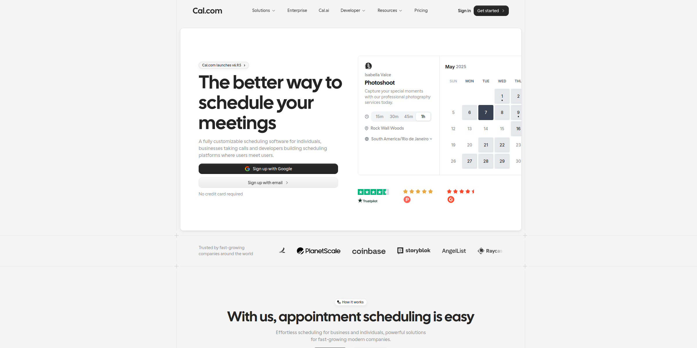
This Cal.com hero section turns a simple promise into an instant, hands-on demo of the product, making scheduling feel effortless from the first glance.
Here’s why it stands out:
1. Confident, Comparative Headline
The headline “The better way to schedule your meetings” is short and direct. By positioning Cal.com as “the better way,” it speaks to anyone already frustrated with back-and-forth emails or rigid booking tools, without needing to name a competitor.
2. Subheadline That Names Every Audience
The subtext, “A fully customizable scheduling software for individuals, businesses taking calls and developers building scheduling platforms where users meet users,” clearly calls out three distinct segments. Visitors immediately see themselves in the message, whether they are a freelancer or an engineering team.
3. Low-Friction Sign-Up CTAs
Instead of a generic “Get started” button, the hero offers “Sign up with Google” and “Sign up with email” side by side. One-click Google sign-up removes form-filling, while the email option keeps a path open for everyone else.
4. Risk-Reducing Microcopy
The small “No credit card required” note beneath the buttons answers the most common objection before it is raised, making it easier for visitors to try the product right away.
5. Product-as-Hero Visual
The booking widget mockup for a “Partnerships Meeting” shows the real booking experience: duration options (15m, 30m, 45m, 1h), a Cal Video label, a time zone selector and a monthly calendar grid. Visitors see exactly what their invitees will see, which is more persuasive than an abstract illustration.
6. Freshness Signal with a Release Badge
The “Cal.com launches v6.9.5” badge above the headline signals an actively shipped product. For a developer-friendly, open platform, this hint of constant iteration builds credibility.
7. Clean, Focused Layout
The stacked flow of badge, headline, subheadline, sign-up buttons and booking mockup keeps the visitor’s attention on one goal: signing up. With social proof saved for the “Trusted by fast-growing companies around the world” section below, the hero stays uncluttered and easy to scan.