Graphic Design Trends have hit a significant milestone in the year 2020. It’s the dawn of a new era, and as designers start to define the era, graphic design is poised to hit new heights. There is a sensation in the air that anything can happen-that as we know it; we are about to see the next evolution of graphic design.
Designers are already giving us glimmers of what is to come, but it might take a few years for the 20s to reach their stride. Let’s take a look at the latest 2020 trends in graphic design that are already beginning to define this new decade.
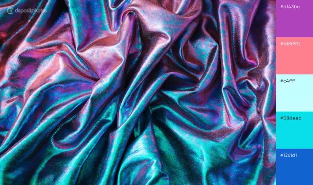
Cyberpunk Color Schemes for Graphic Design
Cyberpunk color schemes in practice create surreal environments for viewers, such as the picture below, that they are unable to witness in real life. Despite the fact that they are shamelessly drawing attention to themselves, their light often makes models feel friendly and welcoming.
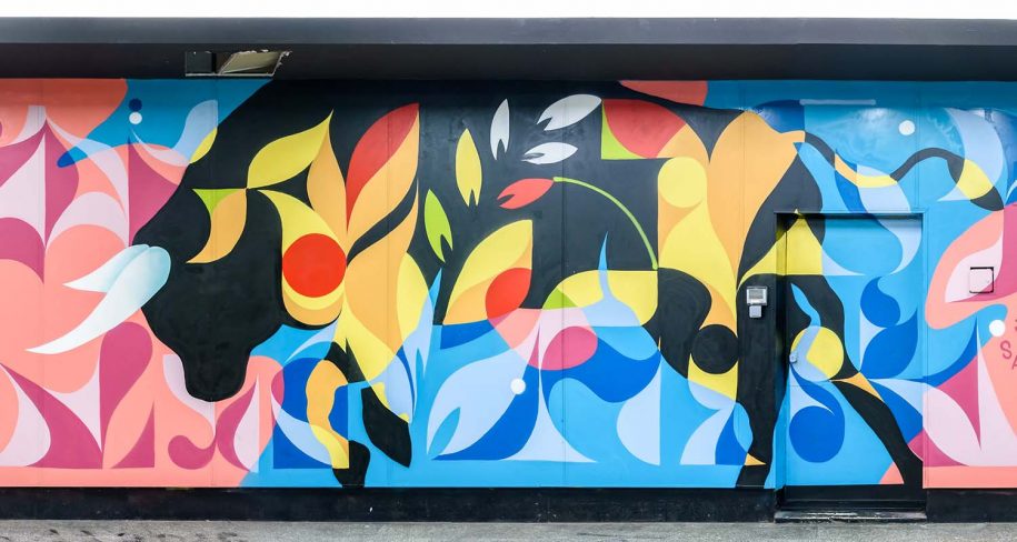
Street Art Styles
Graffiti and street art methods cater to them in a nostalgic way, conjuring up memories of the punk scene of the 70s, the 80s neon, and the 90s grungy. But this trend is more than the usual comeback in the year 2020. For our unique moment in time, street art’s return to graphic design is ripe. Learning design has been more available than ever over the past decade. Graffiti is also a movement of jubilance and independence, of breaking ties and protesting tradition, with its inherent edginess (given its connexion with vandalism). The street art trend, all in all, is the ideal aesthetic to make us feel like the future is in our hands.
Ultra-thin Geometry for Graphic Design
Lines express the shape and nature of an entity as a basic aspect of graphic design. Geometric lines depict objects that are man-made and technical, while more natural and organic forms are depicted by curved lines. We see designers combining these line types in 2020 in order to achieve impossible shapes. Such models are based on stable geometry but still manage to feel transient and ethereal.
They look metallic, but like smoke, they drift. Ultra-thin geometry without computer help is sleek, abstract, and difficult to pull off, which is probably why it is popular in technology and industrial branding. This style seems to convey the future of technology, something less and less physical the further we go into the “internet” and talk about the enigmatic possibilities in the coming years that await us.
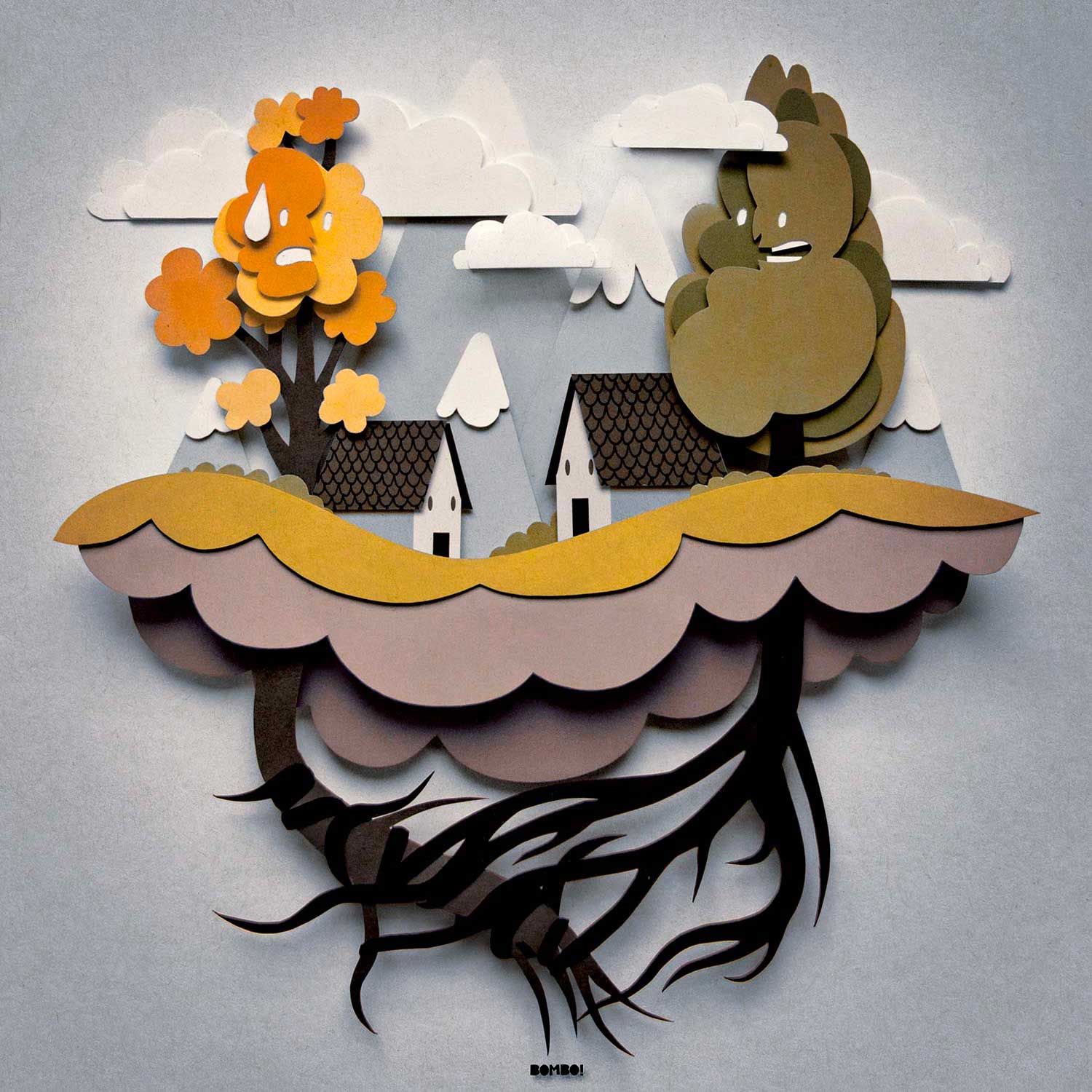
Paper Cut-out Collages
Many collages tend to trick the viewer into seeing a single coherent picture when there are several. But there’s nothing to hide from the 2020 colleges. Designers combine pictures, such as drawings and photos, that simply do not belong to the same universe. They leave pictures with angular edges and white outlines that come from fast-and-dirty cutting and pasting, ditching smooth photo editing. The result is that the line between contrast and harmony is straddled, putting these disparate elements together in a sort of asynchronous elegance. Collages are largely on the artsier side though they are visually striking, making them perfect for editorial drawings, posters, and book covers.
Hand Lettering in Graphic Design With a Big Personality
A vital aspect of graphic design has always been typography. When everything has to make immediate sense to new users in the digital age, typography has become very functional by necessity. But in recent years, in ways we haven’t seen since print advertising and days gone by magazines, the form has become bigger, bolder, and more experimental.
Designers show that with bold typographic styles, even a composition that restricts itself to white space and text can still be adventurous. The larger-than-life theme will begin in 2020 but in a more compassionate direction. Custom hand-lettering is already very common, and it will follow branded typography by becoming more colorful, imprecise, and eccentric.
Like the examples above, this can be done with lettering that comes alive. In order to give a sense of the individuals behind the brand, lettering can personify its subject matter or be offbeat and non-identical. Consumers will be craving designs designed by human hands in the years to come, and it is up to designers to provide the form that will appeal to them.
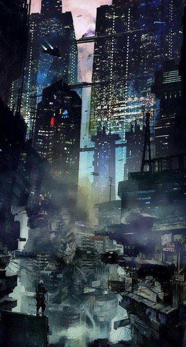
Dystopian Aesthetic in Graphic Design
Dystopia is searching for a voice in every medium imaginable, thanks to our cultural obsession with shows like “Black Mirror” and “The Handmaid’s Tale.” In general, dystopia (the opposite of utopia) refers to imaginary, dystopian worlds where somewhere in their history has taken a wrong turn. From a design point of view, dystopia seeks expression through cold color schemes, mechanized typography, techniques of glitch art, and imagery that merges tech with organic matter or totally removes people from the scene.
Although the genre primarily portrays a future that has gone wrong, things are not always as bleak as they seem. A cautionary tale also takes the form of Dystopia, reminding us to keep our eyes open and vigilant. This pattern is mainly noticeable in illustrative media, such as album covers and t-shirts, so far. These styles are ways to get viewers to pause and reexamine the world around them.
Dystopia is a movement with something to tell, and its success means that the microphone is being taken by designers in 2020.
Hyper-pastiche
Without a vintage influenced look making some sort of comeback, no graphic design trends list will be complete. Hyper-pastiche is what makes 2020 unique: designers will not recreate one particular era, but almost all of them. Whether it’s Victorian or Renaissance, Art Deco or Art Nouveau, in one huge chronological collage, past art trends blend with new designs. On one level, the 2020 trends in graphic design pay homage to their forebears.
They are looking for ways of redefining the digital aesthetic, and who better than the old masters to turn to? This is why what might be a simple letter mark for Madeline Jordan Photography is turned into something extraordinary by an Art Nouveau flourish. Pastiche’s challenge is to make these disparate aesthetics feel like each one contributes to a coherent piece equally. When done well, the result is to erase, perhaps for good, the distinction between analog and digital.
Continuous Animation Sequences
The animation is one of the most effective ways to bring a brand to life. But it can be a steep investment, and it has become increasingly commonplace online. Usually, this is in the form of micro-interactions and explanatory motion graphics. If there are individuals who want to push the boundaries beyond the ordinary and the usual, they are designers.
Continuous animation sequences improve immersion with seamless transitions in 2020. They create each scene from the elements of the current frame in real-time. For brands who want to take their audiences on a trip, this is helpful. This makes them feel as if they are traveling across an ever-morphing universe. The animation is magical already, and complex transformations such as these prevent the spell from cracking.
Bevels and Chisels in Graphic Design
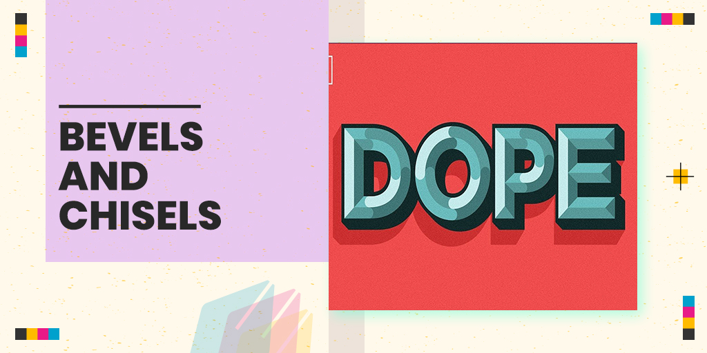
The trend of bevels and chisels harkens back to the classic battle between skeuomorphism and flat design by constructing 3D shapes from hard lines. Designers have also come up with a solution that combines both. These designs subtly imitate real-life objects. Such as raised buttons, etched coins, or beveled stone on the skeuomorphic side, but they are made of flat colors. The end result is a flat picture that looks real enough to touch, tantalizingly. In designs for digital scenarios, like app icons and buttons, 3D stone-cutting methods are particularly helpful. They create a tactile user interface and mitigate the constant flatness that dominates the display’s visual aesthetic.
Live Data Visualization in Graphic Design
Complex live data will become even more readily accessible in 2020. Dashboard stats, and designers will need to view the information in a way that adapts to changes and dynamically animates. The idea is not unlike the visualizations that translate soundwaves into abstract graphics on music apps like Windows Media Player.
Designers are aiming for a distinctly digital look from a stylistic viewpoint, with dark interfaces, heavy blues, and typography reminiscent of VHS technology. This is information that comes from a computer and does not attempt to conceal it.
This style is also a marriage of neon color schemes, organic geometry, and kinetic animations of many of the graphic design trends mentioned above. The result is to feel like you have been transported straight through a mainframe where in real time, you can witness all this magic of the machine happening.

