For companies getting started, or even just going through a revamp, establishing an aesthetic development for your brand can be a creative process. But also a source of stress. Your brand is the first touchpoint consumers will make with your product or service, and putting your best face forward is important.
Draftss has also helped its clients to develop substantial e-commerce platforms with unlimited graphics designs, illustrations, WordPress, HTML, and more for building your website, brand, etc. You can check on our website at draftss.
Once you have a good idea of what you’d like your brand to convey, the next step is to translate these ideas into a look and voice. While it can seem intimidating at first, establishing a design aesthetic for your brand can be broken down into 6 easy steps:
1. Go to the drawing board
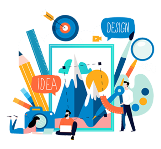
The first idea you have may not be the best, but it doesn’t make it any less valid. When starting your branding or rebranding process, an ideation phase is a necessity. In the old days, you may have created a vision board. However, sites like Pinterest bring brainstorming into the modern age.
Think about your business and what you want customers to think and feel when they learn about you. Next, translate these thoughts and feelings into visual cues that resonate with you and your brand personality. Then throw a search Pinterest board (or, if you’re old school, flip through magazines with your scissors handy).
Search for things that matter to your business. This can include:
- Other businesses in the space
- Influential figures or brands you care about
- Moods or feelings you’d like to evoke with your brand
You may also consider ColourBoard. This site allows you to create color boards and palettes to find the best combination for your brand. Color can be an important first touch with your brand or business, and making sure you have a combination that sends a message is vital.
This phase allows the creative juices to flow and opens your mind to ideas around branding you may have never considered before. This exercise is not about narrowing anything down or making decisions but instead should be about exploration.
2. Build a persona
You should now have a long list of ideas! Time to start narrowing it down. But where to start? Your audience—i.e. the people you’re trying to sell to—should be the main driver behind choosing your aesthetic.
If you haven’t already, now is the time to build out a marketing persona to help you understand the ideal person you’ll be working with in the future. Ask yourself questions about that person: Where do they live? Where do they work? Where do they go for information? What excites them?
When you have a comprehensive view of that information, you can begin to link these values to a specific look, which means you’ll need to…
3. Understand design styles
Design aesthetics are constantly changing, but brands who find the right fit rarely have to re-brand down the line. Think about some of your favorite brands—how many logo changes (other than a slight refresh) have they undergone during the company’s history?
There are many styles to consider, including:
- Classic: Think brands like Coca-Cola or Goodyear. While recent trends may seem exciting and fresh, they also have the most potential to become outdated quickly. By establishing a classic design aesthetic for your brand, you could have something with serious staying power and the ability to reach a wide audience.
- Retro: Starbuck’s badge logo is a good example of retro done right. Retro designs are great for brands that fit the aesthetic. Hip coffee shops and throwback hair salons are taking advantage of this look and updating it for 2016. While some may think of retro as old-hat, it’s experiencing a resurgence in popularity that your brand could take advantage of.
- Material: Google’s simple logo is a great example of this—probably because they invented it! This innovative and modern technique (the evolution of flat design) uses grids, light, and shadow to create modern graphics. This may be the right design for someone in a web-based space or whose brand exists in a lot of online properties.
- Handcrafted: A newer trend, these logos look like they’ve been drawn or chalked. This technique doesn’t quite work for traditional or even tech companies, but smaller brands that maybe have a handcrafted product can take advantage of this low-key style.
- Modern/Minimalist: Think Apple. Simple design, but everyone knows what it stands for. Minimal styles have the most room for enhancement and changes (like how Apple’s apple went from a rainbow to white without changing shape). They tend to work in a variety of sectors, allowing for growth.

4. Strike a balance
In the process of brainstorming, you may have discovered you have some favorites. We all have our favorite brand logos and campaigns, and it can be easy to try to replicate those for our use. While taking inspiration from other brands is warranted, make sure your choice doesn’t copy someone else.
Your brand standards should be unique enough to identify your company without causing someone to think of another brand, especially if they’re in the same space. If you’re selling antiques, and all of your competitors are using handcrafted, vintage designs, what can you do to stand out? That may mean going a completely different direction (a minimalist logo could set you apart) or choosing a small, but key, differentiator (they all have black logos, but you know purple can be just as luxurious and is used less often).
5. Make it work everywhere
With digital media becoming more and more prevalent, branding has taken on a whole new look. No longer is your name, look, and motto is seen primarily on your storefront or in a print brochure. Instead, you’ll have to consider a whole range of places where your aesthetic will have to fit, including:
- Your website
- Social media profiles
- Online advertisements
- Blogs
Keep this in mind when picking elements like color and shapes. If people will be spending a lot of time on your website, you might want to consider colors that are a little easier on the eye. Classic design problems like white space and edges come even more into place when taking into account social media banner sizes and placements. Think about where your audience will be interacting with your brand online, and how you want them to feel every time they interact.
Use social media image template guides to create your whole suite of images before you upload or even create the pages. You can also work on a dummy version of your website and blogs to establish that the aesthetic works before launching or switching out. If you have customers or confidants you trust, send your look and get honest feedback.
6. Get feedback
Branding can be a terrifying task for anyone. The thought of anything being so tied to your brand identity and success is overwhelming. Whether you’re looking for advice on font placements, colors to choose from, or are just trying to decide if your design is likable. It’s worth your time to seek out advice from others. Not everyone may agree on what you’ve chosen (people love to have opinions on things). One negative review shouldn’t mean you change everything. But if you ask enough people, and patterns start to appear. You may want to take a step back and decide if there is anything you need to change. And if you send it to enough people, hopefully, one of them will be able to point out if you’ve accidentally committed a branding failure.
Conclusion
It may take weeks, months, or even years to determine the look and feel for your company. But starting from the ground up will help you settle into a design aesthetic and establish the perfect look and feel for your brand. Finding that balance between inspiration and copycatting can be difficult, but injecting your personality into your design can help you or your designers create something 100 percent unique.
You can try out Draftss for an excellent experience and increase your product marketing. We provide premium quality services on unlimited graphic designs, WordPress, Webflow, HTML, Illustrations, Websites, Landing pages, Dashboards, App UI/UX, and many more. Here we provide our clients with 73+ types of design and code services.


