

Before starting with the topic of Symbolism to create brands. I will give a short review from one of my colleagues. “I am starting to get back into the work groove following my eye surgery. My vision isn’t back to normal. It appears my left eye was overcorrected, which means it’s slightly out of focus. Most things are clear. I can drive, watch TV, and I am getting back to the gym. But I find myself covering my left eye to read. As a result, I am finding myself drawn to pictures over words. This slight shift in perspective is making me see just how prolific and important symbols are to brand communications.
For example, when I look at my iPhone I don’t need to see the words. The icons tell the story.
On my home screen, I have my most-used apps. Each app is represented by a small symbol — an icon. Mailchimp has Freddie the monkey. Twitter is represented by a singing bird. Facebook uses its stylized F, and Instagram has a retro-looking camera.”
And here goes the main point of our today’s topic.
Draftss has also helped its clients to develop substantial e-commerce platforms with unlimited graphics designs, illustrations, WordPress, HTML, and more for building your website, brand, etc. you can check on our website at draftss.
Without any words, we know what these symbols represent. What they mean, and where they fit in our lives. They help us navigate the world — especially online.
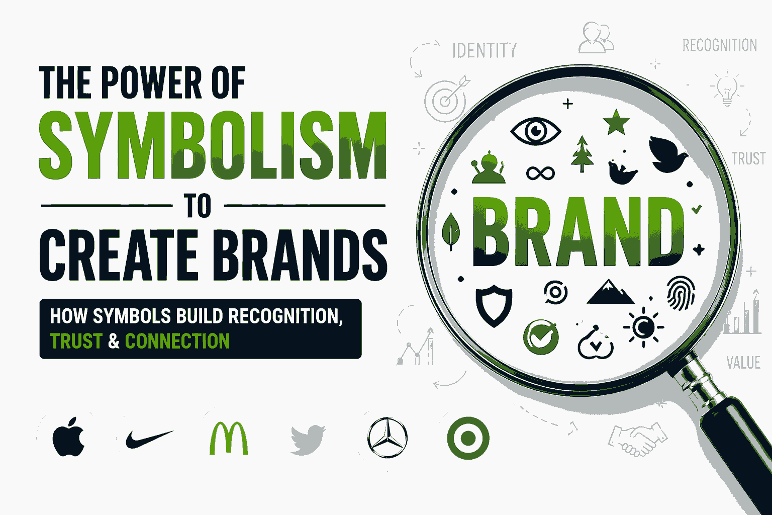
Symbols are a powerful element of your brand identity system that extends beyond your logo. The goal of brand builders is to create a visual shorthand using symbols to connect and engage your customers.
THE ROOTS OF SYMBOLISM
Symbols are as old as humans. They’re even older than the written word.
Symbols primarily originated with established religions: the cross, the Star of David, the laughing Buddha. These symbols are markers. They help people demonstrate their beliefs, find like-minded people, and identify specific people and things. Dan Redding writes, “We perceive, understand, and negotiate the world around us by investing meaning in all manner of signs and symbols.”
Over the past 150 or so years, symbols have become far more prolific.
With the rise of the industrial era companies gravitated towards using logos, mascots, and symbols to differentiate their brands. Naomi Klein writes in No Logo, “In the 1880s, corporate logos were introduced to mass-produced products like Campbell’s Soup, H.J. Heinz pickles, and Quaker Oats cereal.”
The logos were designed to evoke familiarity and connection and to replace shopkeepers and grocers from being the primary interface between products and consumers. The logo was a symbol to signal to consumers a certain level of quality, experience, and trust.
This concept has only grown. From the 1960s onwards, logos and symbols of brands have shifted from packaging to pop culture. The brands you use, wear and display all tell little stories. They help you express your personality and beliefs, and they help others identify with you.
This creates an opportunity for brands. We live in a world of choice, options, and information. There’s no shortage of products to select from. To stand out and connect with customers you need to draw on a very old and very well-established tool, symbols, to effectively connect with your customers.
SYMBOLS GO BEYOND LOGOS
The most common symbol a company develops is its logo. But let’s push beyond the logo.
Logos can function as a symbol, but most logos are not designed to fit that purpose. Logos are crafted to present the company name in an attractive, functional way. Symbols, on the other hand, are mini-billboards. Their job is to connect the tribe and convey meaning.
A great example of modern brands developing symbols is in the app market for mobile devices. A mobile device has limited room to convey information. As a result, app makers have embraced icons to represent their brands.

The icon is the modern-day symbol for most brands. It’s small yet functional. Icons have to be clear at 32×32 pixels, which is a box less than half an inch. Try cramming your logo into such a small space and see how good it looks.
Facebook’s logo is its wordmark, but most people identify the product by its F icon. Twitter’s icon plays on its metaphor of a singing bird. These icons are deliberately designed to function as symbols versus logos. They’re containers of what the brand represents, as well as navigation devices of how to use them.
MANAGE YOUR BRAND SYMBOLS
Any company and I would argue almost every company, has an opportunity to develop brand symbols. Some symbols will be digital assets like icons, and others may be physical symbols like the Coca-Cola bottle.
The hourglass lines of the Coca-Cola bottle are one of the most famous shapes in the world. And it was deliberately designed that way.
In the early 1900’s Coca-Cola was already a powerful brand with a distinctive logo. But the company was concerned the logo was not enough. At the time the soda was packaged in a standard straight bottle that was either brown or clear.
![]()
According to Ted Ryan, the company wanted to protect its business by developing more symbols that would resonate with consumers. In 1914, Harold Hirsch, the lead attorney for the Coca-Cola Company, made an impassioned plea to his company to change its bottle. He said, “We are not building Coca-Cola alone for today. We are building Coca-Cola forever, and we hope that Coca-Cola will remain the National drink to the end of time.”
Coca-Cola took deliberate steps to convert its bottle into a symbol. To create a brand that would last through the generations the company developed a design challenge: create a “bottle so distinct that you would recognize if by feel in the dark or lying broken on the ground.”
The result is the Coca-Cola bottle that we all know and recognize.
Coca-Cola’s desire to express its brand led to the development of a powerful symbol.
PACK MEANING INTO YOUR BRAND
The Coke bottle story is a classic one. But the lesson is relevant for almost every brand. Coca-Cola recognized it couldn’t defend and grow its brand on a logo alone. They needed tangible symbols that embodied the brand. And you can do this too.
What areas of your brand can you distill and express through a simple visual shorthand?.
The key to developing your brand symbols is to focus on function. Coke challenged itself to create a bottle that was recognizable “by feel in the dark or lying broken on the ground.” The company’s focus on function led to an iconic design.
Douglas Atkins states in The Culting of Brands, “There are also dangers in creating a symbolic system that is, well, symbolic of nothing. Aesthetics are not enough. Icons are only icons because they communicate a world of meaning to the community that honors them.”
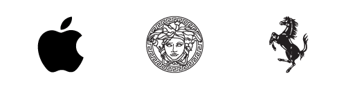
Developing symbols for your brand are deliberate, and they take many forms. Symbols can be navigational tools like Twitter and Facebook icons. It can be a differentiator like the Coca-Cola bottle. Symbols can be status symbols like Apple, Versace’s Medusa, and Ferrari’s prancing horse.
This is where I see a big shift from developing logos and symbols. A symbol is something you create to convey meaning.
SYMBOLS BUILD BRAND EQUITY
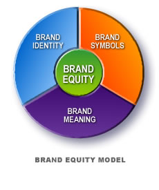
Every iconic brand has symbols because it enhances the economic value of the respective corporation.
David Aaker writes in Managing Brand Equity, “The reality is that most firms and products are fairly similar. However, the differences that do exist, such as service quality. Difficult to communicate effectively and credibly. When products and services are difficult to differentiate. a symbol can be the central element of brand equity, the key to differentiating characteristics of the brand. Moreover, the symbol can by itself create awareness, associations, and a liking or feelings which in turn can affect loyalty and perceived quality.”
The symbol isn’t an artistic expression of the brand. And it’s one of your most effective devices. To stand out in a highly competitive, information-rich marketplace. Hope you will find symbolism to create brands an effective measure for your brand.
CONCLUSION
A great product with a strong value proposition may not be enough. However, consumers don’t truly believe there is a huge difference between products. That’s why we need to connect with them at a deeper level.
I’ll ask it again. How are you going to visually convey your value proposition and beliefs in a short, concise way?
You can try out draftss for an excellent experience and increase your product marketing. We provide premium quality services on unlimited graphic designs, WordPress, Webflow, HTML, Illustrations, Websites, Landing pages, Dashboards, App UI/UX, and many more. Here we provide our clients with 73+ types of design and code services.
Drop your thoughts in the comments below.
Your email address will not be published. Required fields are marked *