

When you have two similar sides of a design with a central axis point, symmetrical equilibrium occurs. So if you split the design in half, the left & right are mirror images of each other. A concept has to have evenly weighted graphics on each side. It is then considered to be completely symmetrical.
Symmetrical nature enables you to similarly attract attention to all areas of an image. This style of design is typically very organized & rigid in nature & is known as formal balance.
For advertisers, a symmetrical design is suitable for projects such as invites to events or coupon sales. But if used on more innovative items, it may appear repetitive.
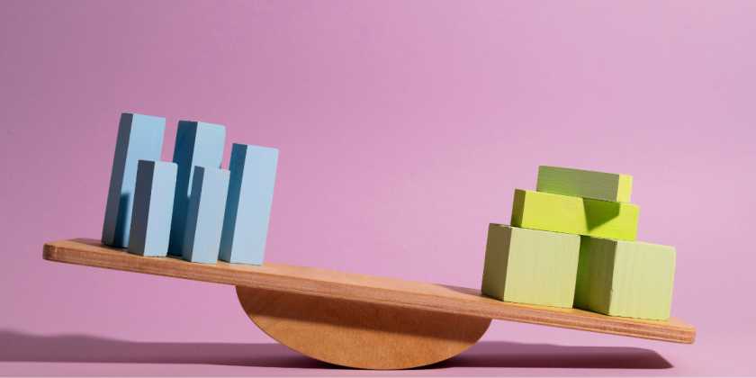
When you have separate visual representations on each side of the design, asymmetrical harmony happens & yet the image still looks balanced. A concept needs to have unequal visual weight on each side. It is then deemed asymmetrical. Also, those unequal visuals need to offset each other.
Asymmetrical designs can elicit sensations of movement & look more contemporary than symmetrical designs, but it can be harder & less simple to create associations between the different elements of the design.
It is important to note that asymmetrical equilibrium is still strategic—the haphazard placement of shapes around a page will not create a compelling composition. You will need to work out how to balance out the picture to make a good asymmetrical design.
For example, The Starry Night of Vincent van Gogh uses a prominent visual, the light, in the upper right. And contrasts it out with a dark cypress tree in the lower left. If Van Gogh put both the sun and the tree on the right side of the page. It would not be a successful asymmetrical balance.
Asymmetric balance is where you have two opposite sides of a pattern & have unequally positioned visual weight & yet you have always achieved a sense of balance. It stimulates a feeling of modernism & movement. Symmetric balance, on the other hand, is when, on either side of a central point of the axis, you have two identical sides of the design with equal weight. It evokes a sense of structure and formality.
Examples of Balance in Graphic Design
Airbnb – Example of Symmetry Logo Design
![]()
Google logo is one of the best examples Balanced Designs
![]()
Google is a great example of using spacing & colors to maintain the balance in the design.
The logo is super simple, just six letters in a clean font, but the very thoughtful use of white space with bright primary colors makes it feel approachable & iconic.
Each color, blue, red, yellow, and green, represents a playful, inclusive energy while maintaining a sense of professionalism. The way they’ve alternated the colors creates harmony and balance. It is not just about aesthetics. It subtly reflects Google’s brand values of diversity and innovation.
The spacing between the letters is another underrated genius move. It gives the logo room to breathe, keeping it clean and uncluttered. Even though the font is straightforward, the balance of spacing and color gives it a personality that’s both fun and trustworthy.
Google’s logo proves that great design doesn’t have to be complicated. Sometimes, getting the basics like spacing and color harmony just right is all you need to create something iconic.
BP logo example for symmetrical logo design
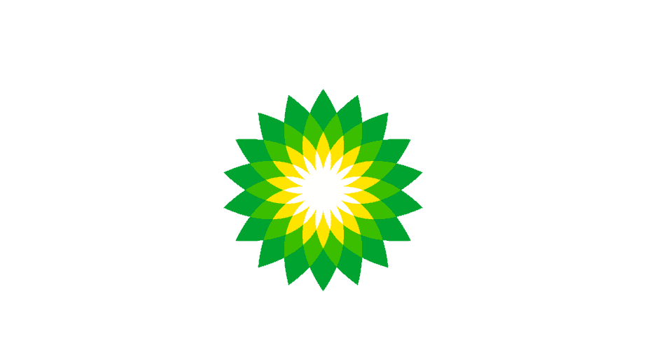
The BP logo is one of the best examples that follows all the balance, symmetry, and harmony principles of design. It is a perfectly symmetrical logo that uses color to create a sense of energy and freshness. The gradient shades of green and yellow not only reflect BP’s focus on sustainability and environmental consciousness but also add depth and vibrancy to the design.
The symmetrical sunburst pattern gives the logo a dynamic yet balanced look, symbolizing growth, energy, and optimism. The choice of colors works seamlessly together to convey harmony while standing out as bright and recognizable. It’s a logo that feels both natural and forward-thinking, aligning perfectly with BP’s brand values.
Darwin AI Logo for balanced & symmetrical design
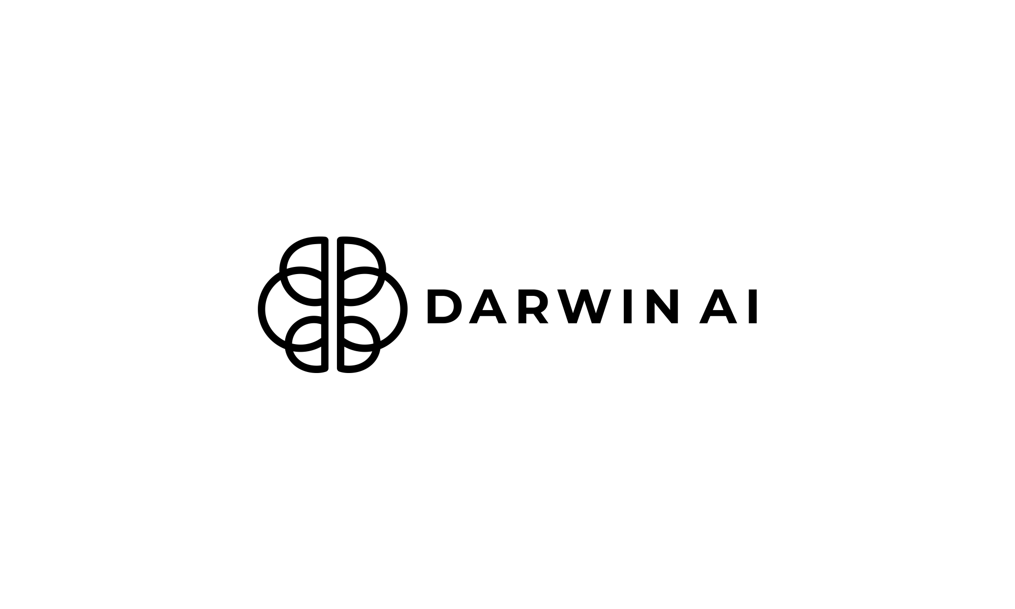
I personally like the Darwin AI logo for its balance & symmetry + the clever use of the alphabet D from their name to form an icon with the aesthetics of a brain while making sure the logo is simple and easily recreatable in smaller sizes and a single color.
Cursor AI Logo: a perfect example of balance between Asymmetry & Symmetry in Design
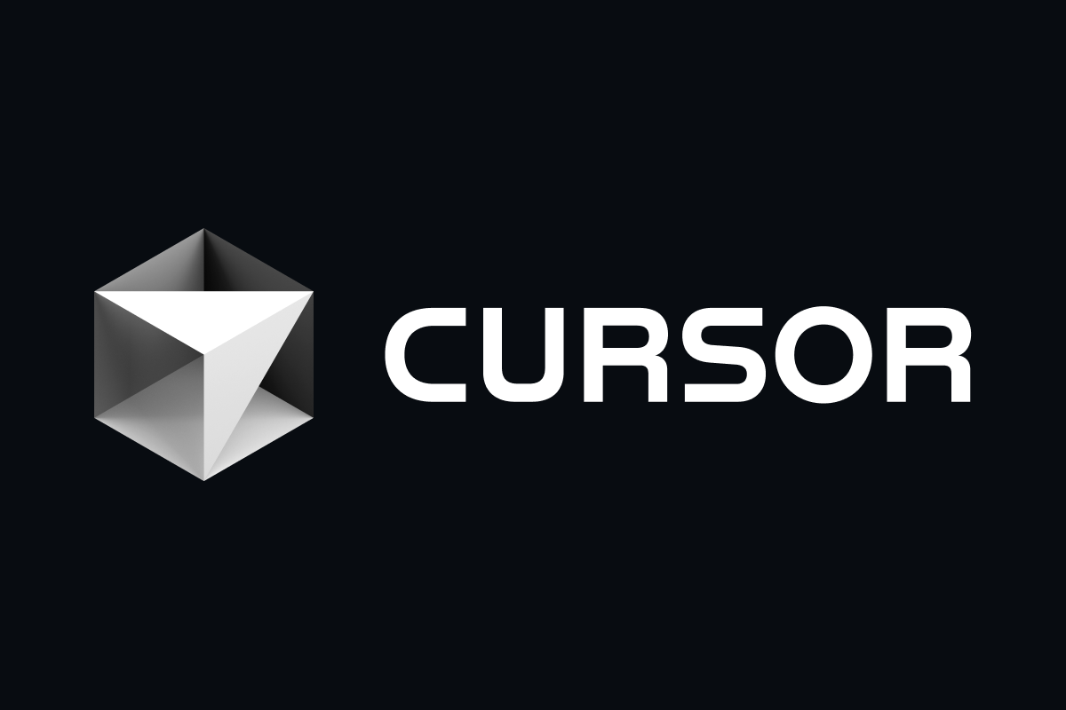
The logo of Cursor AI is a brilliant example of how symmetry and asymmetry can work together to create a visually balanced yet dynamic design. At first glance, the cube-like shape exudes symmetry through its geometric precision, conveying stability and order. However, when you look at the interplay of light and shadow, it introduces a subtle asymmetry, adding depth, dimension, and a sense of movement.
This contrast between structure and creativity prevents the design from feeling static or predictable, making it more engaging and memorable. By blending these elements, the logo achieves a perfect balance, demonstrating how symmetry can provide a solid foundation while asymmetry adds energy and visual interest—a lesson that can be applied to any design for a harmonious yet dynamic composition.
Lovable.dev logo
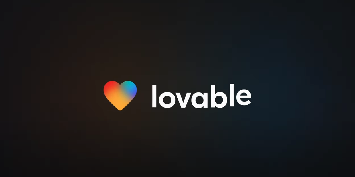
The logo for Lovable.dev is another example of how symmetry and asymmetry can come together to convey emotion and functionality in design. The heart icon is symmetrical, symbolizing love, balance, and unity, which aligns with the brand name “Lovable.” Its gradient color palette, however, introduces an element of asymmetry, creating depth, warmth, and visual interest.
This combination ensures the design feels approachable and vibrant without being overly rigid. The accompanying text, with its clean, minimalist typography, complements the heart by maintaining simplicity, while the tagline, “The last piece of software,” adds a compelling human touch. Together, these elements strike a balance between harmony and dynamism, making the logo memorable and emotionally engaging.
Bolt.new Logo
The logo of Bolt.new is a distinct study in visual balance as it shows how simplicity and contrast can work together to create an impactful design. The sharp, angular bolt symbol immediately captures attention with its symmetry, evoking a sense of speed, precision, and energy. This symmetrical form establishes a strong foundation, offering a feeling of order and predictability, which is important for reinforcing trust in a technology-focused brand.
What makes this logo even more intriguing is its clever use of negative space and bold contrast. The lightning bolt cuts through the design with dynamic asymmetry, introducing movement and breaking the monotony of rigid structure. This interplay between static symmetry and energetic asymmetry reflects the dual nature of modern tech, which is grounded yet innovative, reliable yet forward-thinking.
The typography accompanying the bolt seamlessly balances the composition, with its clean and modern aesthetic fitting together with the visual sharpness of the icon. Altogether, the logo demonstrates how the deliberate blending of symmetry and asymmetry can result in a design that feels both structured and alive, perfectly aligning with the fast-paced, innovative ethos of Bolt.new.
qodo.ai logo
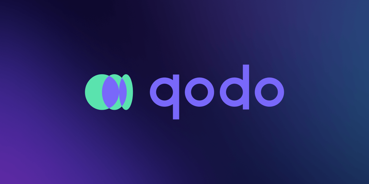
The Qodo.ai logo takes a unique approach to balance, utilizing a mirrored effect to create a sense of stability and unity. Imagine a developer peering into a code review mirror, where the reflection represents the platform’s ability to analyze and improve your code.
The two halves, though seemingly identical at first glance, could also be interpreted as different perspectives coming together to form a whole. This reflects Qodo’s potential to bridge the gap between human and AI in the code review process, combining the best of both worlds.
Overall, the mirrored design elements in the Qodo logo create a sense of balance while also hinting at the core functionality of the platform: providing a double-check on your code for enhanced quality.
Databricks logo
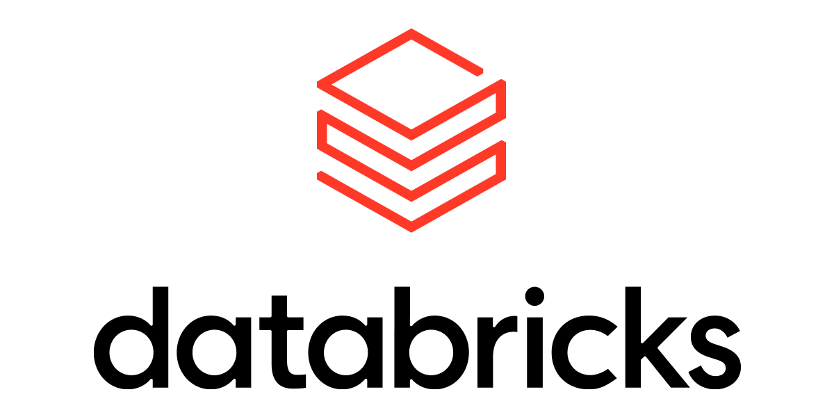
The Databricks logo uses a stacked cube design, and it’s a neat example of how symmetry can be used to create a sense of stability. Each layer of the cube mirrors the others, giving the logo a solid, dependable feel. It’s like looking at a perfectly constructed building – you know it’s not going to topple over. This symmetrical arrangement communicates reliability, which is definitely a good message for a data and AI company to send.
But here’s the cool part: while the overall structure is symmetrical, the individual lines within each cube introduce a subtle asymmetry. They’re not solid blocks, but rather outlines, creating a sense of lightness and openness. This prevents the logo from feeling too rigid or static. It’s a clever way of balancing stability with a touch of dynamism. The logo is not just a solid block, it has space and air within it, which is a nice touch.
Lindy.ai logo
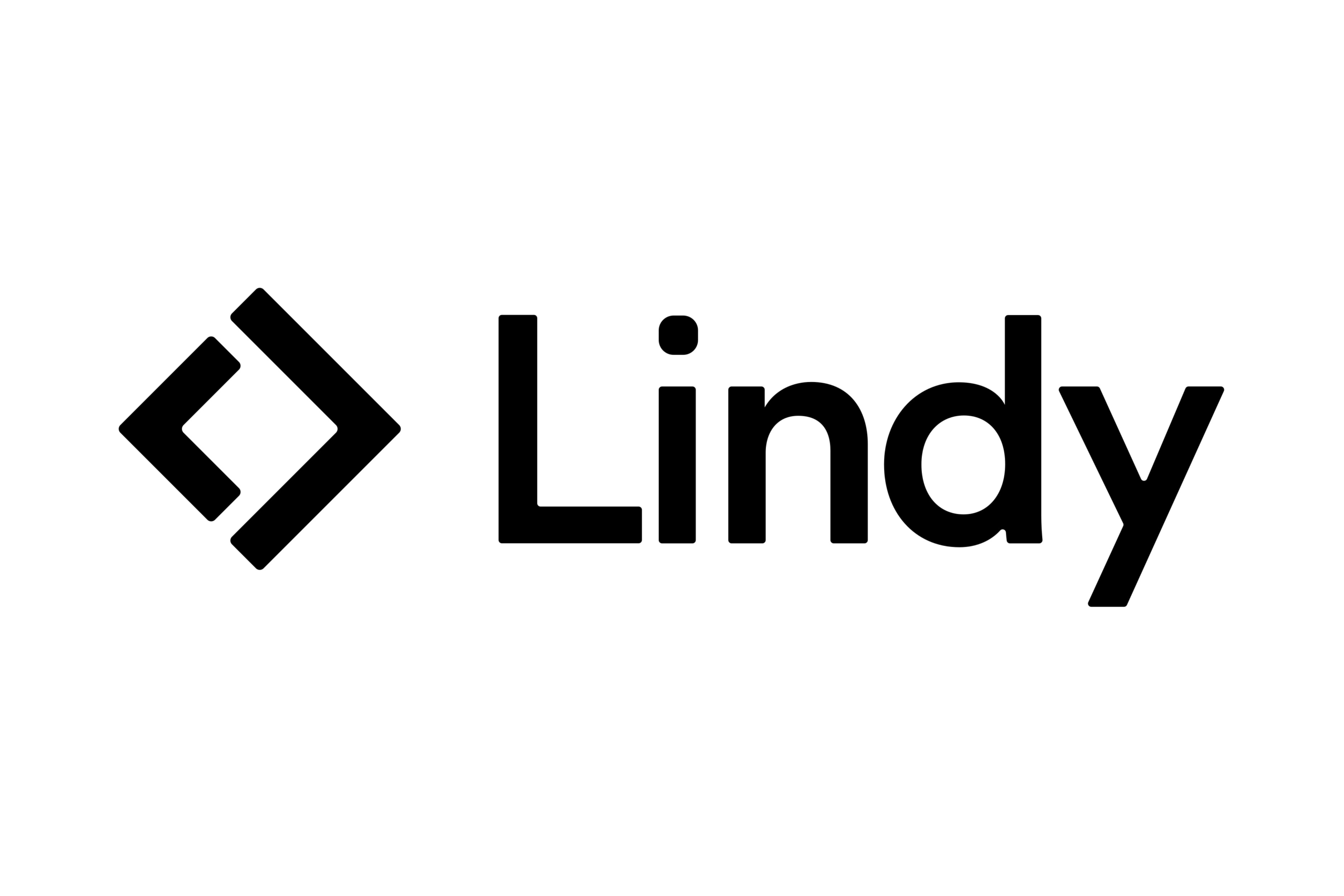
The Lindy.ai logo takes a playful approach to balance. It features the text “Lindy” in a bold, asymmetrical typeface. The letters seem to be leaning back, defying gravity with a touch of whimsy. This could represent the company’s innovative approach to AI, pushing the boundaries and challenging the status quo.
But here’s the twist: the “i” in “Lindy” acts as a balancing act. It’s a lowercase letter standing tall amidst the playful tilt of the others, grounding the design and bringing a touch of stability. This tiny “i” dot could represent the intelligence and structure that underpins Lindy.ai’s creativity, keeping things balanced and focused.
So, the Lindy.ai logo uses asymmetrical balance to create a sense of dynamism and innovation, balanced by a single element that represents stability and focus. It’s a clever way to visually represent what the company might do, that is: bringing a touch of fun and creativity to the world of AI.
Cohere logo
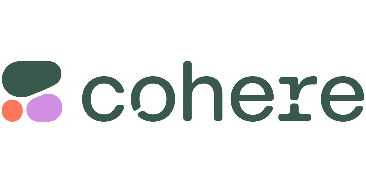
Its interesting to see the Cohere logo because it doesn’t rely on traditional symmetry. Instead, it uses a collection of organic shapes to create a sense of visual balance. On the left, you’ve got this cluster of rounded forms – a larger, darker green one anchoring the group, with smaller pops of lavender and orange adding a bit of playful contrast. This cluster immediately draws the eye.
Then, you have the word “cohere” in a friendly, rounded typeface. The weight of the text balances the visual weight of the shapes. It’s not a perfect mirror image, but the two elements work together to create a sense of equilibrium. It’s like a mobile – different parts hanging in space, but perfectly balanced so it doesn’t tip over. The varying sizes and colors of the shapes add a sense of dynamism, preventing the logo from feeling static.
So, the Cohere logo achieves balance not through symmetry, but through a thoughtful arrangement of shapes and text. It’s a more organic, free-flowing kind of balance, reflecting the idea of bringing different elements together (which, fittingly, is what “cohere” means).
Snyk logo
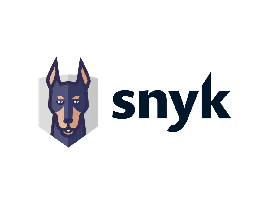
This an interesting one, on one side, we have the stylized dog’s head, contained within a shield-like shape and on the on the other side, we have the word “snyk.” which is decidedly asymmetrical. The stylized dog’s head is inherently symmetrical along a vertical axis where the ears, eyes, and snout are mirrored. This symmetry gives it a sense of stability and trustworthiness, almost like a heraldic emblem. It feels grounded and reliable, like a good guard dog.
The word “snyk.” with its varying heights and shapes of the letters create visual interest and prevent the logo from feeling too static. The “y” with its extended tail adds a dynamic flourish.
The balance here is achieved by the careful placement of these two distinct elements. The solid, symmetrical dog head anchors the design, while the more dynamic, asymmetrical wordmark adds a sense of movement and modernity. It’s a balance of stability and energy, reflecting the brand’s mission of proactively finding and fixing vulnerabilities. It’s like the dog is attentively watching for any “sneaky” problems
Weights & Biases Logo
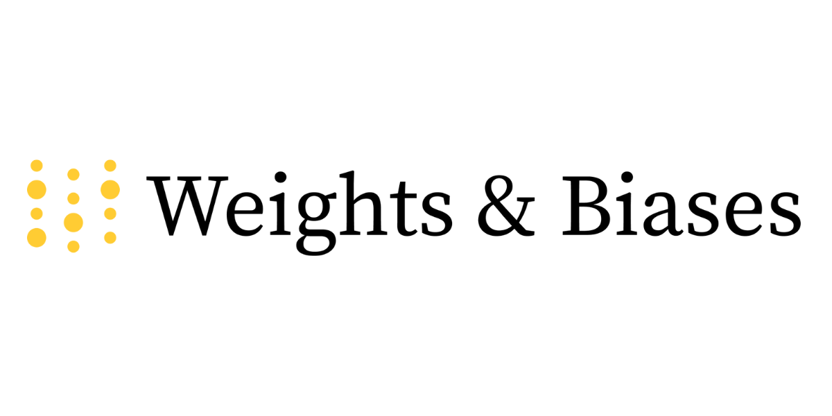
Here’s a logo that tells a visual story of balance through contrast. Notice the two distinct halves. On one side, a scattering of golden dots. Not neatly arranged, mind you, but clustered in a way that feels almost organic, like a handful of sand tossed onto a surface. This creates a sense of dynamism, of movement. It’s the visual representation of data points, perhaps, or the intricate connections within a neural network. It’s asymmetry in action.
Gazing to the right, the words “Weights & Biases” appear, solid and grounded in a classic typeface. This is where order steps in. The text provides an anchor, a sense of stability. It’s a clear counterpoint to the more free-flowing dots. The even spacing between the letters reinforces this feeling of control and precision.
It’s this interplay, this juxtaposition of seemingly opposing forces, that creates the logo’s overall balance. The chaotic energy of the dots is held in check by the structured clarity of the text. It’s a visual metaphor for the work Weights & Biases does: bringing order to the complex world of machine learning. A clever visual balance, indeed.
So, when it comes to design, getting that sweet spot between symmetry and asymmetry is super important. It’s how you make stuff that’s not just nice to look at, but also actually connects with people. Whether you’re designing a logo, building a website, or putting together a marketing campaign, knowing how to mix structure with a bit of creative spark can really take your work up a notch. It’s all about finding that right mix.
And that’s where we come in. At Draftss, we’re all about bringing these design principles to life. Our team of expert designers can help you create visuals that hit that perfect balance, making sure your designs not only look amazing but also stick in people’s minds.
Drop your thoughts in the comments below.
Your email address will not be published. Required fields are marked *