
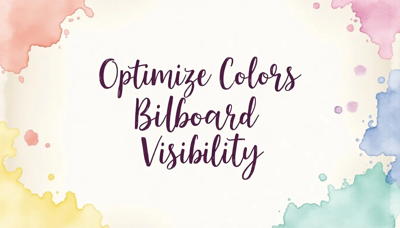


Optimizing colors for billboards can greatly improve visibility and effectiveness in advertising. First, understanding color psychology is crucial; for instance, red creates a sense of urgency while blue offers trust. The use of contrast enhances readability, so pairing light text with dark backgrounds works well. Limiting your palette to three colors keeps the message clear and focused. Conduct visibility tests from various distances to ensure the design stands out in different lighting conditions—bright colors during the day and darker tones at night are best. Lastly, keeping it simple with a clear message reinforces brand consistency and captivates viewers quickly.
1. Understanding Color Psychology for Billboards
Color psychology plays a crucial role in billboard advertising, as different colors can evoke specific emotions and reactions from viewers. For instance, red is known for stimulating energy and urgency, making it an excellent choice for promoting sales and time-sensitive offers. On the other hand, blue conveys trust and reliability, making it ideal for financial institutions looking to reassure potential customers. Yellow is another powerful color; its brightness grabs attention quickly and is associated with happiness and positivity, which can be effective for brands aiming to create a cheerful image.
Green represents nature and health, making it suitable for environmentally friendly brands or wellness products. Conversely, black denotes luxury and sophistication, often used for high-end products that want to convey exclusivity. Understanding these associations allows advertisers to select colors that not only attract attention but also align with the message they want to communicate.
Moreover, ensuring that the colors chosen maintain high contrast with the text enhances readability from a distance. For example, using light-colored text on a dark background or vice versa can significantly improve visibility. It’s also advisable to limit the color palette to a maximum of three colors to avoid overwhelming viewers and to keep the message clear and focused. Ultimately, testing billboard visibility from various distances and angles, considering lighting conditions, and maintaining brand consistency with the chosen colors can help ensure that the billboard effectively communicates its intended message.
| Color | Emotion/Message | Best Use |
|---|---|---|
| Red | Stimulates energy and urgency; great for sales and promotions. | Sales and promotions |
| Blue | Conveys trust and reliability; ideal for financial institutions. | Financial institutions |
| Yellow | Grabs attention quickly; associated with happiness and positivity. | General advertising |
| Green | Represents nature and health; suitable for environmental and wellness brands. | Environmental and health brands |
| Black | Denotes luxury and sophistication; effective for high-end products. | Luxury items |
2. The Power of Red: Urgency and Energy
Red is a color that demands attention. In advertising, it is often associated with urgency and energy, making it an ideal choice for billboards promoting sales, limited-time offers, or events that require immediate action. For instance, during a clearance sale, a billboard featuring bold red backgrounds can create a sense of excitement and compel viewers to act quickly. The psychological impact of red can stimulate quick decision-making, which is particularly valuable in a fast-paced environment where consumers are bombarded with information. Furthermore, using red effectively means ensuring there is a high contrast between the text and the background. For example, white or yellow text on a red background enhances readability, especially from a distance. However, it’s crucial to avoid combinations that can confuse the viewer, like red text on a red background. By leveraging the power of red, advertisers can create a visual experience that not only captures attention but also drives urgency, leading to higher engagement and conversions.
3. Trust and Reliability with Blue
Blue is a color that evokes a sense of trust and reliability, making it a popular choice for businesses looking to establish credibility. This is especially true for financial institutions, healthcare providers, and technology companies. For instance, banks often use blue in their branding to convey stability and security. When people see blue, they often associate it with calmness and professionalism, which can encourage them to feel more comfortable engaging with a brand.
In billboard advertising, using blue effectively can create a strong visual presence. Pairing blue with high-contrast colors, such as white or yellow, can enhance readability from a distance. For example, a billboard for a financial service with bold white text on a deep blue background can draw attention while simultaneously conveying a message of trust.
Moreover, it’s important to test the visibility of blue billboards under various lighting conditions, as the perception of color can change with light. Bright blue may stand out during the day, while a darker blue can be effective at night when illuminated properly. By integrating blue thoughtfully into billboard designs, advertisers can leverage its positive associations to enhance their brand’s message and encourage viewer engagement.
4. Bright and Happy: The Impact of Yellow
Yellow is one of the most attention-grabbing colors on the spectrum. Its brightness makes it stand out, especially in outdoor settings like billboards. Often associated with happiness and positivity, yellow can evoke feelings of cheerfulness and optimism. For instance, brands like McDonald’s effectively use yellow to create a welcoming atmosphere that draws in customers.
In terms of visibility, yellow works well in high-contrast scenarios. Pairing yellow text with a dark background, like black or navy, enhances readability from a distance. However, it’s essential to use yellow strategically; too much can create a sense of chaos or overwhelm. A limited palette, incorporating two additional colors, can help maintain clarity while allowing yellow to shine.
Testing visibility is crucial. Yellow can be particularly effective during daylight but may require additional consideration under different lighting conditions. Conducting tests to see how yellow performs at dusk or night can ensure it remains eye-catching no matter the time of day.
Lastly, yellow’s association with positivity can align well with campaigns focused on joy, celebrations, or special promotions. By incorporating yellow thoughtfully, advertisers can create engaging billboards that not only attract attention but also convey uplifting messages.
5. Green for Nature and Health Messaging

Green is a powerful color when it comes to conveying messages related to nature and health. It is often associated with growth, renewal, and tranquility. This makes it an ideal choice for brands that focus on environmental sustainability, organic products, or wellness. For instance, a billboard promoting a new line of eco-friendly cleaning products can use green to highlight its commitment to the environment. The color not only attracts attention but also resonates with consumers’ values regarding health and the planet.
When using green in billboard design, it’s essential to ensure high contrast for readability. A vibrant green text against a white or light background can make the message pop, while darker greens can provide a more sophisticated look when paired with rich, earthy tones. Limiting the color palette to two or three shades of green can reinforce the message without overwhelming viewers. Testing visibility from various distances is crucial, especially for billboards located in urban areas where the audience may be moving quickly. In these contexts, ensuring that the green stands out in different lighting conditions, such as bright sunlight or dusk, will enhance its effectiveness. By leveraging the emotional connection that green evokes, advertisers can create impactful billboards that draw attention and communicate their health and nature-focused messages clearly.
6. Black: Luxury and Sophistication in Design
Black is often associated with luxury, sophistication, and elegance. When used effectively in billboard advertising, it can convey a sense of exclusivity and high quality, making it particularly appealing for premium brands. For instance, luxury car manufacturers frequently use black in their marketing to emphasize the sleekness and high status of their vehicles.
The impact of black on consumer perception is significant. It can evoke feelings of power and prestige, which is why many designer brands incorporate black into their logos and advertising materials. However, to maximize visibility, it’s crucial to consider contrast. Pairing black backgrounds with vibrant, light-colored text—such as white or gold—can enhance readability from a distance, allowing the message to stand out clearly.
Additionally, black can be versatile across different lighting conditions. It maintains its sophistication during the day and can appear even more striking at night, especially when illuminated. This adaptability can be a powerful tool for advertisers, as it ensures that the billboard captures attention regardless of the time of day. Overall, when aiming for a luxurious feel in billboard design, black is a color that commands attention and communicates a strong brand message.
7. Contrast for Enhanced Readability
To ensure that your billboard messages are easily readable from a distance, contrast is crucial. High contrast between text and background colors allows viewers to quickly discern the message, even at high speeds. For instance, using white text on a deep blue background creates a striking combination that catches the eye. Conversely, avoid color pairings that can be difficult to distinguish, such as green text on a red background, which can be confusing.
It’s also wise to limit your color palette to a maximum of three colors. This keeps the design clear and focused, reducing visual clutter that might distract from the primary message.
Conducting visibility tests is essential. Examine how your colors look from different distances and angles to ensure they remain distinct. Additionally, consider how lighting conditions affect visibility; brighter colors may pop during daylight, while darker hues can stand out at night, especially with adequate lighting. By prioritizing contrast, you enhance readability and ensure your billboard effectively communicates its message.
- Improves visibility from a distance
- Helps highlight important information
- Makes text stand out against backgrounds
- Useful for layering colors effectively
- Aids in creating a focal point
- Assists in minimizing eye strain
- Enhances overall aesthetic appeal
8. Choosing a Limited Color Palette
Using a limited color palette is crucial for effective billboard design. Sticking to a maximum of three colors helps maintain clarity and focus. When too many colors are used, the message can become confusing, making it hard for viewers to quickly grasp the information. For instance, a billboard with a vibrant red background, white text, and yellow accents can create a striking visual without overwhelming the audience. Additionally, it’s important to consider how these colors represent your brand. Consistency in color usage not only strengthens brand recognition but also ensures that your billboard aligns with existing marketing materials. Testing these colors for visibility from different distances and angles is essential to ensure they remain distinct. A well-chosen limited palette enhances the overall impact of the advertisement, making it easier for viewers to understand the message within just a few seconds.
9. Testing Billboard Visibility from Different Angles
Testing billboard visibility from various angles is crucial for maximizing its impact. Billboards are often viewed from different distances and perspectives, depending on the location and the flow of traffic. To ensure your colors and text remain effective, conduct visibility tests where the billboard is observed from multiple viewpoints. This can help identify any issues with color combination or text legibility that might not be apparent from just one angle.
For instance, if a billboard is intended for drivers on a highway, it should be easy to read from a distance, such as 100 feet away. Colors that appear vibrant and distinct from the front may blend together when viewed from a side angle or further away. It’s important to ensure that the contrast remains high so that the message stands out regardless of the viewing angle.
Additionally, consider the height at which your billboard is placed. A billboard positioned high up may appear differently than one at eye level. Be sure to assess visibility during peak traffic times as well, when viewers are moving quickly. By testing visibility from various angles and distances, you can fine-tune your color choices and design to achieve the best results.
10. Adapting Colors to Lighting Conditions
Colors can look very different depending on the lighting conditions in which they are viewed. Billboards are often seen in varying lights—bright sunlight, soft twilight, or during the night with artificial lighting. Therefore, selecting colors that maintain visibility across these different conditions is crucial. For example, during the day, bright colors like yellow and orange tend to stand out better against the sky and are more eye-catching. In contrast, when the sun sets and darkness falls, deeper colors like navy blue or dark green may become more prominent if the billboard is illuminated properly.
It’s also important to test how the billboard appears at different times of the day. During daylight, lighter shades can enhance visibility, while at night, strong, saturated colors with good contrast can help the message pop. Using reflective materials or backlighting can further enhance visibility in low-light conditions. This adaptability ensures that your billboard continues to attract attention and convey its message effectively, regardless of the time of day.
11. Importance of Simplicity and Clarity
 Simplicity and clarity are essential for effective billboard advertising. Viewers often have only a few seconds to register a message, so it’s crucial that the design communicates clearly and quickly. Use large fonts and minimal text, focusing on a single, impactful message. For example, a billboard promoting a sale might simply state “50% OFF” in bold letters, accompanied by a striking image, rather than cluttering it with excessive information. This approach ensures that the viewer can grasp the message almost instantly. Additionally, simplicity extends to the color scheme; using a limited palette helps maintain focus. A billboard with a clean design and clear message not only captures attention but also enhances recall, making it easier for potential customers to remember the brand.
12. Maintaining Brand Consistency with Colors
To ensure your billboard stands out while still representing your brand accurately, it’s essential to maintain brand consistency with colors. Consistent use of your brand’s color palette strengthens recognition and recall among viewers. For instance, if your brand is known for its vibrant orange and blue, using these colors on your billboard helps reinforce your identity. This familiarity makes it easier for potential customers to connect the message with your brand, enhancing the overall impact of the advertisement.
Incorporating your brand colors not only creates a cohesive look across all marketing materials but also helps to evoke the right emotions associated with your brand. For example, a health-focused company might consistently use green to reinforce its commitment to wellness and sustainability.
It’s also important to check how these colors interact with other design elements. Ensure that the colors don’t clash with the text or images used, as this can distract from the message. Regularly reviewing your color usage against your brand guidelines can help keep your billboard designs aligned and effective.
13. Keeping Up with Color Trends in Advertising
Monitoring color trends in advertising is crucial for maintaining relevance and appeal. Colors can go in and out of fashion, influenced by cultural shifts, technological advancements, and even social media trends. For example, the rise of eco-consciousness has made greens and earth tones increasingly popular, aligning with brands that promote sustainability. Similarly, vibrant, bold colors may be favored during certain seasons or events, like the use of pastels during spring holidays or deep reds and greens during the winter holidays.
Incorporating trending colors into billboard designs can help capture consumer interest and convey a brand’s awareness of current styles. However, it’s essential to balance trendiness with brand identity. For instance, a financial institution might choose to stick with classic blues, which signify trust, even while integrating a trendy accent color for a campaign. Regularly researching design platforms, social media, and industry reports can provide insights into emerging color trends, enabling advertisers to adjust their strategies accordingly.
Frequently Asked Questions
1. What colors are best for making a billboard stand out?
Bright colors like red, yellow, and orange are great for grabbing attention. High contrast combinations, like black and white or dark blue and bright yellow, also work well.
2. How does distance affect the choice of colors for billboards?
The further away people are, the more vibrant and bold the colors need to be. Dark colors can get lost from a distance, while bright colors remain visible.
3. Are there certain colors that are easier to read from far away?
Yes, colors like white, yellow, and light blue on a dark background can be easier to read from greater distances than darker colors alone.
4. Can I use multiple colors on a billboard without making it confusing?
Using multiple colors can be effective, but it’s important to stick to a limited color palette. Make sure the colors work together and that the text remains clear and readable.
5. How does the lighting affect the visibility of billboard colors?
Natural and artificial lighting can change how colors look. Bright colors may pop in sunlight, while dark colors can become harder to see. Ensure your design considers how it will look in different lighting conditions.
TL;DR Optimize billboard visibility by understanding color psychology: use red for urgency, blue for trust, yellow for attention, green for health, and black for luxury. Ensure high contrast for readability, limit the color palette to three colors, and test visibility from different angles. Adapt to lighting conditions, prioritize simplicity and clarity, maintain brand consistency, and stay updated on color trends.
d
Draftss Team Drop your thoughts in the comments below.
Your email address will not be published. Required fields are marked *