Logos are a part of daily life. They are strategic tools used by businesses to establish their identity. For brands, there is nothing better than the logo that can give them appeal and bond with patrons.
Every famous logo is more than a mere symbol. It has a deep-rooted meaning to it.
Every logo undergoes a unique design process. The earliest origins of some of the most famous logos are just rough sketches. Sometimes the best ideas come from a simple background.
Check out the original sketches and stories behind some of the most classic brand icons.
Nike
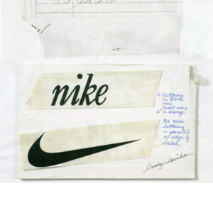
The Swoosh of Nike is one of the most widely recognized Logos ever.
The Nike logo was created in 1971 by a graphic design student Carolyn Davidson. She was a pupil of the Nike founder, Phil Knight. Though he was not satisfied with the logo, he locked it owing to deadlines he had to meet. She got a mere $35 for her work— $2 per hour for 17.5 hours of work.
The creation of the logo was a milestone for the company. The very next year, Blue Sports Ribbon was rebranded as Nike. Within a decade, the company had gained popularity.
In 1983, Phil invited Carolyn for a special dinner. He gifted her a Swoosh embedded diamond and 500 stocks as a gesture of gratitude.
Playboy
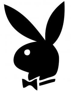
No magazine has a logo as famous as the Playboy. A bunny in a tuxedo bow is easily identified by many people across the world. The logo has been a part of various renowned apparel and accessories. Indeed, the Playboy Enterprise gets a fair share of income from merchandising the logo.
Hugh Hefner founded the magazine in 1953. The first edition featured Merlyn Monroe—the greatest stars of all-time.
Coming to the rabbit silhouette, it only featured in the second edition of the magazine. But, the logo hasn’t changed ever since. The logo was created by Art Paul, a graphic designer from the Institute of Design, at Illinois University.
Paul created this famous mascot in a matter of an hour. He chose a bunny because it was a symbol of sex in American native; also he felt it reflected a girl’s features: shy, vivacious, jumping. All he intended to do was an authentic work without commercial boundaries. Little did he know that it would turn out to be a great success. He went on to work with the company for three decades until 1983.
Virgin
Fonts play a crucial role in making the uniqueness of the logos. Do remember the stylish sign ‘virgin’ in white fonts amidst red background on the rudder of flights? Well, the original logo wasn’t as simple.
Virgin is a multinational conglomerate, originally known as Virgin Records by Richard Branson and Nik Powell in 1973.
The original logo was an art masterpiece by Roger Dean, a great English illustrator. It had two nude twins sitting under a dead tree with a dragon.
In 1977 when Richard strikes a deal with the punk band Sex Pistols, he realized that the logo was inappropriate. Therefore, a new design agency, Cooke Key Associates were assigned to the work. They counted on a young calligrapher Ray Kyte to do the job them.
Ray Kyte walked into the boathouse of Branson with the logo done on a napkin. Branson felt that it incorporated simplicity and boldness. Thus, the famous Virgin script came into existence.
Citi
The Citi Group is one of the highly reputed banking companies in the world.
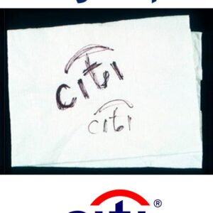
Based in New York, the company has established its presence across 160+ countries.
In 1998, the Citi Corp and the Travelers Group merged into Citi Group worth $140 billion. They required a corporate identity. They brought in Pentagram, a well-known design agency to help with their branding. During one of their initial meetings, Paula Scher, a designer from Pentagram came with the logo on a napkin. She took only 10 minutes to create the logo. The famous blue-tinted typeface with an umbrella connecting the two i’s originated there. The umbrella represents the Travelers Group. Thus the logo symbolized the merger.
I Love NY

Some logos just go out there and gain fame. The ‘I Love New York’ logo has claimed huge popularity as a merchandise symbol. People would find it difficult to believe that it is a trademark label.
The logo is owned by the Department of Economic Development, New York State.
In 1977, William S Doyle, the then Deputy Commissioner of New York State, hired Milton Glaser, a famous graphic designer in the city to design a logo for the ‘I love New York’ campaign. The campaign aimed at promoting tourism in NY.
Glaser simply wrote the campaign phrase with a heart symbol, instead of the word love, using red crayon on a scrap of paper while he was in a cab. He gave this to Doyle and finalized it. Then he used a variant of American Typewriter as a font and stacked I heart above NY. Boom! The campaign logo was ready.
On a serious note, Glaser didn’t even expect the campaign to last for two months. The man was so wrong. The logo is still persistent and impactful. The original drawing is available at the Manhattan Art Museum for display.