

Logos have been a very common part of our lives without us actually knowing or adhering to the fact that they decide most of our daily-life decisions. Whenever we go to the malls or surf online for something to buy, our focus mostly lies on the brand of the product we choose, but mostly not on the necessity. The term Logo was derived from the Greek word “Logos” which means “reason” or “motive” somewhere around 1300 AD. Ever since then, famous logos have been the deciding factor for most of our spending, one being why we have a cupboard filled with Nike Shirts! Here we’ll see a set of 10 famous logos- but here’s the catch. Every logo has a mistake, from the difficulty range of SPOTTABLE to NEEDS SUPER VISION. So, without further ado, let’s have a hunt for mistakes in these famous logos!
Google – SPOTTABLE
:format(jpeg)/cdn.vox-cdn.com/uploads/chorus_image/image/47070706/google2.0.0.jpg)
Google! Who doesn’t know one of the world’s best search engines, if not the best! Estimates suggest roughly 3.5 billion Google searches happen almost every day. Some stats like this can only say it’s not unlikely that the average person might go up to look at the Google logo anywhere from one to 30 times per day. But I hope you aren’t doubtful about something you’re bound to look to almost every day in your life! Can you find that small error in this logo? Here’s a small hint for you- “It’s in the colours”
If you told that the second letter “o” was meant to be red, then give yourselves a mark! That was indeed the right answer. Google’s very first logo, which has almost the same canvas as the current logo, was designed by Larry Page himself, while others say that Sergey Brin designed it with a free image editor called GIMP. Whomever it was, their design wasn’t the most polished. The choice of colours for the famous logos was an idealistic approach by Page to choose the primary colours. Yet, he wanted to show his peers during his university’s project submission that this duo doesn’t stick by rules and made the “L” in Google green, which is a secondary colour. Page also sneaked in an exclamation mark “!” at the end of the very first logo to show their presence to rivalling search engine “Yahoo!’ at that time.
Samsung – SPOTTABLE-ish
![]()
Samsung is a brand that we all know of. Starting from being a grocery store at a war-inflicted city following the production of black-and-white televisions. For the independent countrymen to enjoy, to becoming one of the world’s leading electronic applications company. Sam sung is a name almost everyone knows. You can have a look or two at your electronic appliances at home that are of Samsung. Let’s see that if you can crack this one! Here’s a hint for you yet again- “The letters don’t look familiar this time”. If you said that the letter “A” must not have the horizontal bar that connect the slanting sides. Then you got yourselves a point! Samsung’s first logo dated way back in 1938 where the company held a three-star famous logos!
For most of the company’s history, the differential element of that logo was a three-star pattern. It showed the origin of the brand’s name, Samsung which means “Tri-Star” in the Korean language. As time passed by, the name of the brand was quite necessary for any developing company to climb the ladders of success, which that initial logo lacked. Hence, they bought in a circle-shaped logo that held the three stars within it, placed beside the company’s name. Years later in 1993, the current Samsung logo was designed, but with the classic ellipse symbol. You could see the familiar bold Sans Serif letters in a blue ellipse. Even today, when you see the company’s logo, you will be taken aback to that classic audio emblem that plays along with the famous logos. The scales of the quad-tune were E♭, A♭ – D♭, E♭. (Tan-tanan-tan)
GitHub – UNLOCK THE LOST VISION
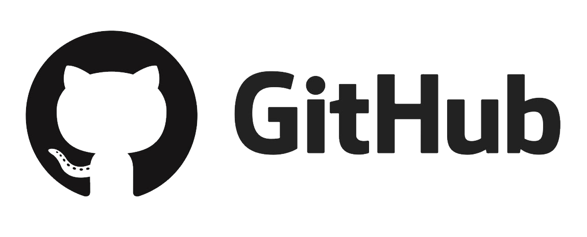
Almost every technically-sound person must have an idea about GitHub, or maybe even use it in their day-to-day life for their usual tasks. GitHub is an American-based corporation that uses its services for sharing and delivering codes and solutions for the software development sectors. One uses this website for finding reusable codes and datasets for the software/project they’re developing. If you use GitHub regularly, this can be easy for you. Have a look at the logo and find the error. Here’s the hint- “You must go hand in hand with the software, or should I say, TAIL in hand!” If you managed to find the missing tail on the cat to your left-hand side of the logo, then it’s a plus one point for you! GitHub’s logo hasn’t had a very diverse development in the course of its running.
It featured only two logo versions created for the brand since 2008. Both these famous logos were developed in an effortless monochrome colour palette, with a simple and elegant black logotype in a white background which was convincing. The famous icon, which featured a damp black circle with a white cat’s silhouette on it wiggling its tail, became very recognizable pretty fast. GitHub’s mascot is named “Octocat”, a creative development that joined the incarnation of a cat’s body and an octopus’s tentacles. It significantly meant the diverse set of coding platforms that the corporation can deliver, and the speed in which the processes are done in GitHub. So, it was a tentacle after all!!
Burger King – GOT TO HAVE A CLOSER LOOK
![]()
We all crave for some burgers now and then. At those instances, one such place to get those lip-smacking burgers is indeed, Burger King. It is a world-famous fast food company based in Miami. Started back in 1953 with the name Insta Burger King, the company had reserved itself a great fanbase as years progressed. And here’s a test for you to check if you’re a diligent fan of Burger King. Can you find what’s the small error in this logo? Hear this clue out- “The shapes have taken a strange turn of tides”
If you found out that the blue curvature that surrounds the Burger-like logo of theirs, has been inverted exactly opposite to its initial position, then you’re spot on! The looks of this world’s popular fast-food chain have had five redesigns throughout the company’s history. After the successive run from the fast-food chain in the year of 1969, the chain only made small changes over that initial symbol periodically, and modified that iconic emblem. They had mostly kept the colour palette and compositions almost untouched. The blue circular lining that surrounds the burger-like stature was indeed a symbolic representation of the flame broiling that was promised by the company’s motto used during initial years – “You can have flame-broiled burgers in any way you like at your local Burger King.”
Android – NEEDS SUPER VISION
![]()
Android is an invention we have all been known to for almost a decade and a half now! To talk about this in technical terms. Android is a Linux-based software platform that is commonly used in tablets and smartphones to run the devices on the android’s OS. It’s one of the most popular Operating Systems in the market. Having a total of 54.6% usership of mobiles under its belt. Android has always been under tremendous pressure to deliver the best out of its drawer for its customers. However, now it’s you who is placed under quite some pressure to find a very minute mistake in their logo! A hint for you- “You don’t always see what you HEAR”
If you spotted the error in the antennas on the head of that mini android only and spotted no errors in the wording “ANDROID”, then you’re having a higher sense of perception to spotting errors! The famous Android Logo was first designed in 2007. By a graphic designer of Google who goes by the name of Irina Blok. Her decision was collective with her organization that the logo. That will be released as an open-source scheme, which meant that any other company running at the present industry was given the rights and access to customize it.
Blok spoke a few words about shaping her creation in an interview. Stating that developing the Android was like giving birth to a new life, and now it has to live its own independent life. The initial logo was made green in colour to depict motion, a continuous process. That Android uptakes to keep on progressing and updating its features. Since it was an open source logo, it has appeared in a variety of shapes. For example, different facial expressions, new clothing appearances, etc.
Drop your thoughts in the comments below.
Your email address will not be published. Required fields are marked *