Hey there! Today we are going to explore some good design techniques to design an MVP landing page.
Creating an MVP landing page is exciting and it is quite intimidating at the same time because it’s the first point of contact that you have with the outside world with customers or users or anything like that. The terrifying part is putting it out there and getting kind of judged as to what you’re doing, Although, it’s a really important part you put it out there so you can get feedback from early users or anyone visiting your site will actually and see this is all about taking actions so we can get feedback quickly, that feedback might be fantastic and it might help us find maybe a technical co founder if we don’t want to build everything ourselves or it might help validate us in our minds, hey I should pursue this business more this project more or you might have to take a step back and be humble a little bit maybe this idea wasn’t as great as I initially thought maybe I need to tweak things or maybe I need to try different marketing of it there’s a lot of things you can learn from a just a basic landing page and the best thing about it is you can learn how to do it in just a few steps and then launch it put it online and get feedback right away so let’s get started.
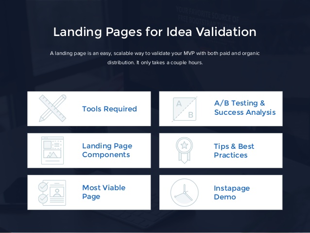
Today we are going to discover what are the elements required to create a successful landing page MVP:
1. Headline

The Headline is the first thing that marks an impression in the user’s mind. The direct impact of a headline might lead the users to check out further pages or just ignore them. Hence, the Headline is very much an important element of your landing page. The direct marketers also consider that the headlines are super important while launching an MVP page. Brian Clark of Copy blogger says “On average, 8 out of 10 people will read headline copy, but only 2 out of 10 will read the rest.” .The headline which is the best use for your landing page should be direct and should be able to describe what is your product is, and its work or purpose or the benefits to expect.
2. Value Proposition

The value proportion of your website also has serious importance on your impact over your landing page. The people might judge the MVP by just looking at the value proportion of the landing page. “A value proposition is a promise of value to be delivered. It’s the primary reason a prospect should buy from you.” Says Peep Laja, author of the blog Conversion XL. He describes a value proposition should have the following criteria to stand out and make an impact
- It should have 2-3 sentence sub-headline
- 3 bullet points
- Visual representation like photography or and small clip proposing the product or the concept
3. Provoke with an opportunity of contact:

Creative marketing cricks can work miracles when done correctly. To gauge customer demand, firstly you need to try and sell to potential customers, or you should at least have them show the buying intent. But the real challenge exists is how to make the clients show buying intent? That’s where the call-to-action comes up. It might contain a buy button, a contact number or an online form. It shows that based on the psychological study if the opportunity is given to people to be a part of the product buying, the will 80% shows interest in engaging in them. This is one of the marketing strategies that can be used to enhance the effectiveness of the idea.
4. Proving an offer

An offer is a specific promise of value in exchange for something else of value. It is something very specific that your customers will get right now. The offers indirectly enhance the product selling by more percentage. It critically provides the favor for the customers. It could be time-specific and provides an extra bonus to entice customers to buy now. Some of the famous offers given by different industries are as follows, Dominos Pizza’s “30 minutes or it’s free,” or FedEx’s “When it positively has to be there overnight.”
5. Testing different versions

While you are using a Landing page as a landing page MVP to test your product ideas, consider testing different versions of your landing page. This will give an opportunity to isolate what element of your minimum viable product is attractive and outstanding or which might be cranky and not attractive to your potential audience.
Serve about 2 to 3 versions of your landing page. Isolate what you want to change all you need to focus on the main areas like headlines, your value proportions, the offers and providing the call-to return. If none of the versions of the landing page is doing a particularly good job of attracting prospects, then it’s a way or safe bet that your product ideas are unfortunately not viable. Then it’s time to think of a different approach to your product idea. If however, you are able to see a big change or high rating in conversions from one landing page to another, then keeping testing as an option might be able to enhance the winning version of your landing page.
6. Pop-up signup utilization.

Most of the successful landing pages will include a clear call-to return, a list of offers, a list of benefits of advertisements and a captivating headline. As pop-up signup provides more and more chances for the interaction of the customers with the product, it also increases the possibility of raising the product review and the interest might build up. Many companies often create their landing pages for MVP, hoping to engage with interested customers for future businesses. These interactions of the utmost importance, as they can convert a lead into paying customers.
These are some of the ways to design a good and outstanding MVP landing page that allows excelling in your business sector.
