
Wrike
KickFire is the industry leader in IP Address intelligence, providing B2B first-party intent to power your account-based marketing stack.
Wrike Pricing Page Design
$0 - $49 4 Plans
Launch Website
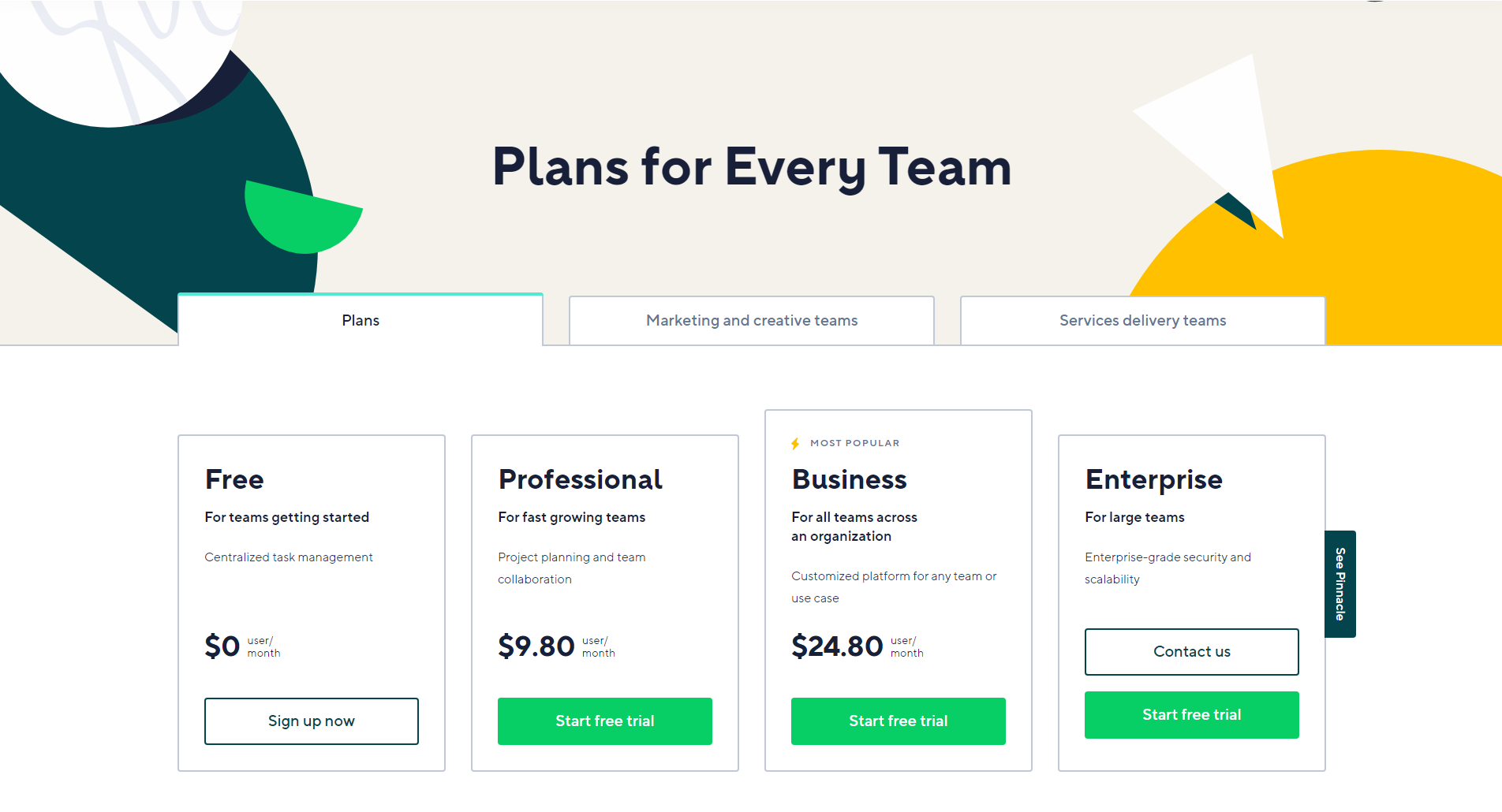
This Wrike pricing section is effective for several reasons:
1. Clear Hierarchy and Visual Appeal:
- Headline Focus: “Plans for Every Team” immediately communicates the broad applicability of the product.
- Tabbed Navigation: The tabbed navigation (“Plans,” “Marketing and creative teams,” “Services delivery teams”) allows users to quickly filter and view relevant plans.
- Tiered Structure: “Free,” “Professional,” “Business,” and “Enterprise” tiers are clearly labeled and visually separated.
- Visual Cues:
- The “MOST POPULAR” label highlights the recommended plan.
- The “Sign up now” and “Start free trial” buttons are visually distinct and consistent.
- The “See Pinnacle” button on the side provides an additional navigation option.
- The use of color accents and geometric shapes adds visual interest.
- Layout: The layout is clean, organized, and easy to follow, with consistent formatting.
2. Value-Based Differentiation:
- Target Audience: Each tier is tailored to different user groups (teams getting started, fast-growing teams, all teams across an organization, large teams).
- Feature Progression: The descriptions clearly outline the increasing capabilities of each tier, showcasing the added value of higher plans.
- Benefit-Oriented Descriptions: The descriptions focus on the benefits each tier provides (e.g., “Centralized task management,” “Project planning and team collaboration,” “Enterprise-grade security and scalability”).
3. Transparent Pricing:
- Clear Pricing: The monthly prices are prominently displayed for the “Professional” and “Business” tiers.
- Free Tier: The “Free” tier is clearly marked as $0.
- Contact for Enterprise: The “Enterprise” tier uses “Contact us,” indicating a more customized pricing approach.
4. Addressing Different User Needs:
- Tier Names: The tier names are intuitive and suggest a progression in features and capabilities.
- Scalability: The tiers offer a clear path for businesses to scale their usage as they grow.
- Tabbed Navigation: The tabbed navigation allows users to quickly find plans relevant to their specific team type.
5. Strategic Use of Information:
- Benefit-Driven Headline: The headline directly addresses customer needs and highlights value.
- Clear Call to Action: The “Sign up now” and “Start free trial” buttons encourage users to take the next step.
- Concise Descriptions: The descriptions are brief and to the point, making it easy for users to quickly understand the differences between tiers.
- “MOST POPULAR” Highlight: Emphasizing the “Business” tier as the most popular likely increases its selection rate.
- Additional Navigation: The “See Pinnacle” button provides an additional navigation option, potentially leading to more advanced features or plans.