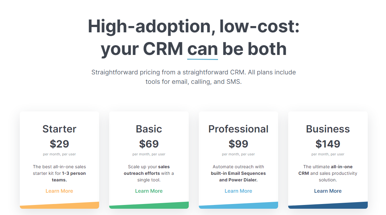
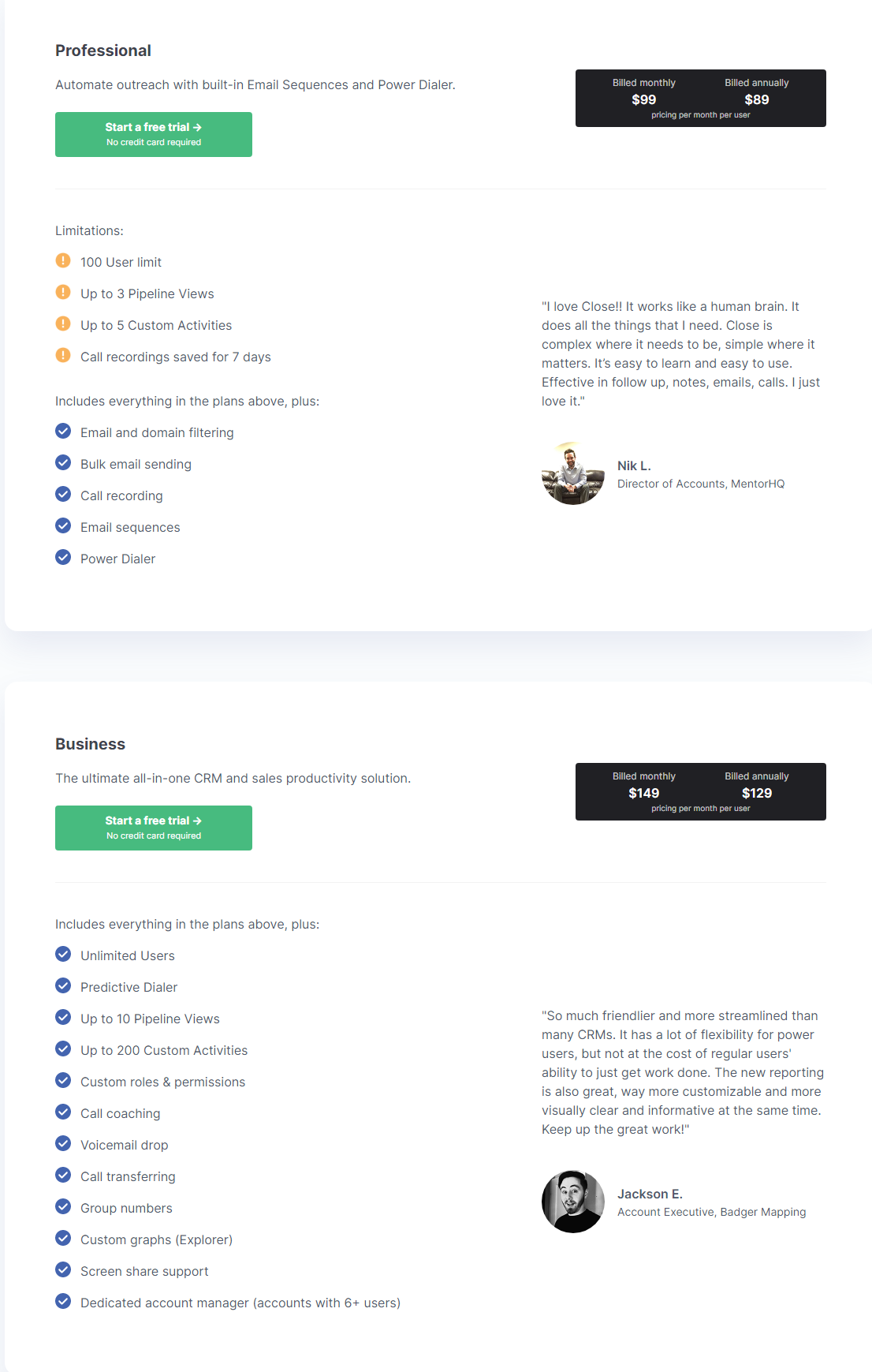
This Close pricing section is effective for several reasons:
1. Clear Hierarchy and Visual Appeal:
- Headline Focus: “High-adoption, low-cost: your CRM can be both” directly addresses common customer concerns and highlights key benefits.
- Tiered Structure: The four tiers (“Starter,” “Basic,” “Professional,” and “Business”) are clearly labeled and visually separated.
- Visual Cues:
- The pricing is prominently displayed with a clear “per month, per user” format.
- The “Learn More” buttons are visually distinct and consistent.
- Each tier has a subtle, unique color accent at the bottom, aiding in visual differentiation.
- Layout: The layout is clean, organized, and easy to follow, with consistent formatting.
2. Value-Based Differentiation:
- Target Audience: Each tier is tailored to different user groups, ranging from small teams to larger businesses with advanced needs.
- Feature Progression: The descriptions clearly outline the increasing capabilities of each tier, showcasing the added value of higher plans.
- Benefit-Oriented Descriptions: The descriptions focus on the benefits each tier provides (e.g., “Scale up your sales outreach efforts,” “Automate outreach”).
3. Transparent Pricing:
- Clear Pricing: The monthly prices are prominently displayed.
- Per-User Pricing: The “per month, per user” format is clearly stated, ensuring transparency.
- Included Tools: The statement “All plans include tools for email, calling, and SMS” clarifies the core offerings.
4. Addressing Different User Needs:
- Tier Names: The tier names are intuitive and suggest a progression in features and capabilities.
- Scalability: The tiers offer a clear path for businesses to scale their CRM usage as they grow.
5. Strategic Use of Information:
- Benefit-Driven Headline: The headline directly addresses customer pain points and highlights value.
- Clear Call to Action: The “Learn More” buttons encourage users to explore further details.
- Concise Descriptions: The descriptions are brief and to the point, making it easy for users to quickly understand the differences between tiers.
- Straightforward Messaging: The overall messaging is straightforward and easy to understand, reinforcing the “straightforward pricing” promise.

