
Pipedrive
Pipedrive is the easy-to-use, #1 user-rated CRM tool.
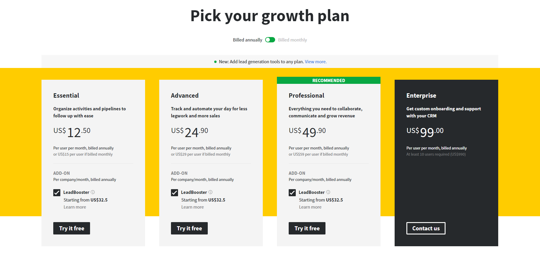
Pipedrive Pricing Page Design
$0 - $49 4 Plans
Launch Website
Get more qualified leads and grow your business. Sign up for a 14-day free trial.
The Pipedrive pricing section is effective for several reasons:
- Clear Hierarchy and Visual Appeal:
- Headline and Value Proposition: “Pick your growth plan” is direct and benefit-oriented.
- Toggle Switch: The “Billed annually/Billed monthly” toggle provides transparency and highlights potential savings with annual billing.
- Tiered Structure: Four distinct tiers (Essential, Advanced, Professional, Enterprise) are clearly displayed with visual separation.
- Visual Cues: The “RECOMMENDED” banner highlights the Professional tier. The Enterprise tier is visually distinct with a dark background.
- Pricing Clarity: Prices are prominently displayed for each tier, with clear per-user/month and annual/monthly billing options.
- Call to Action: “Try it free” and “Contact us” buttons are clearly visible and encourage user engagement.
- Layout: The layout is clean, organized, and easy to scan.
- Value-Based Differentiation:
- Target Audience: Each tier description highlights the target user and their needs, progressing from basic organization to enterprise-level support.
- Feature Progression: The descriptions clearly show the increasing functionality and complexity of each tier.
- Focus on Benefits: The messaging focuses on the benefits users will receive, such as organization, automation, collaboration, and custom support.
- Add-on Clarity: The “ADD-ON” section clearly indicates the availability of “Lead Booster” for each tier, with starting prices and “Learn more” links.
- Transparent Pricing:
- Clear Pricing: Prices are clearly displayed for each tier, with both annual and monthly billing options.
- Add-on Pricing: The starting price for the add-on is clearly stated.
- Addressing Different User Needs:
- Tier Names: The names suggest different levels of service and functionality.
- Target Audience Descriptions: The descriptions explicitly target different customer segments based on their needs and business size.
- Add-on Availability: The availability of the add-on across all tiers provides flexibility.
- Strategic Use of Information:
- Call to Action: The prominent CTAs drive conversions.
- Concise Messaging: The descriptions are brief and to the point.
- Visual Clarity: The use of checkmarks and the contrasting card designs makes it easy to compare features across tiers.
- “Recommended” Highlight: The “RECOMMENDED” banner draws attention to the recommended plan, potentially increasing conversions.
- Enterprise Tier Distinction: The distinct design of the Enterprise tier highlights its premium nature.
- Add-on Information: The clear presentation of the add-on encourages users to explore additional features.