The Journyx pricing section is effective for several reasons:
Clear Hierarchy and Visual Appeal:
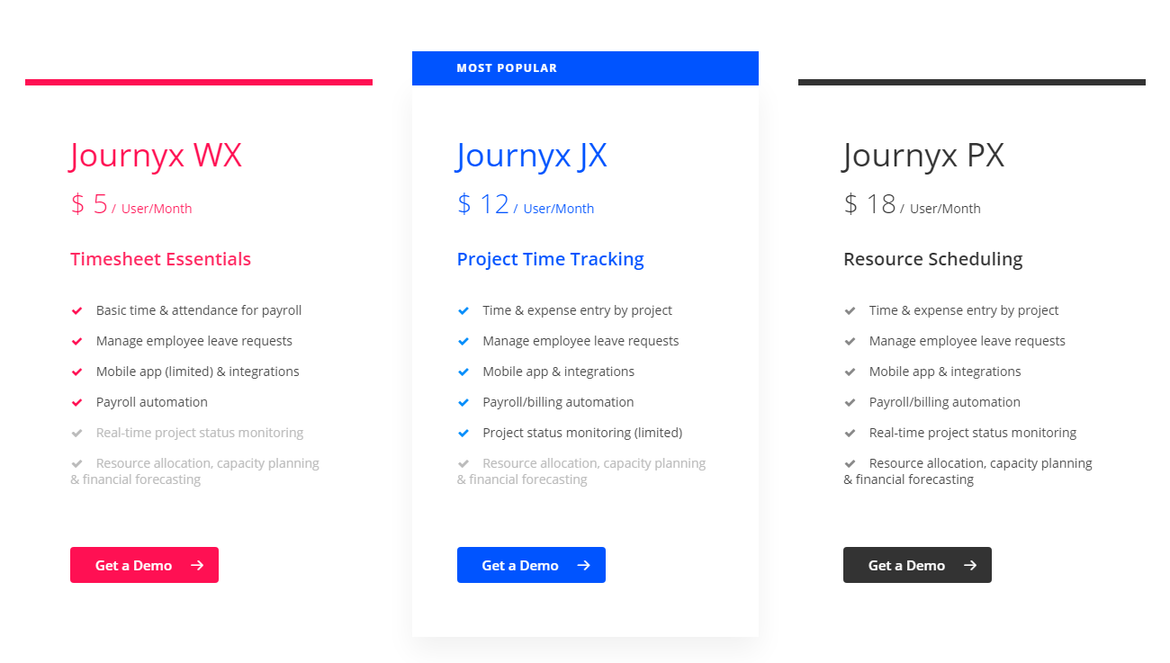
Tiered Structure: Three distinct tiers (Journyx WX, Journyx JX, Journyx PX) are clearly displayed with visual separation.
Visual Cues: The “MOST POPULAR” banner highlights a recommended option. Pricing is prominently displayed. “Get a Demo” buttons are clearly visible for each tier.
Layout: The layout is clean and organized, presenting information concisely within each tier.
Value-Based Differentiation:
Target Audience: Each tier description clearly defines the target customer profile and their needs (e.g., “Timesheet Essentials,” “Project Time Tracking,” “Resource Scheduling”).
Feature List: The feature list shows increasing functionality and value across tiers, with each tier building upon the previous one. Features are presented with checkmarks for easy comparison.
Transparent Pricing:
Clear Pricing: Prices are clearly displayed for each tier, along with the per-user/month unit.
Addressing Different User Needs:
Tier Names: The names suggest different levels of service and functionality, catering to various business needs.
Target Audience Descriptions: The descriptions explicitly target different customer segments based on their needs.
Strategic Use of Information:
Call to Action: “Get a Demo” buttons are strategically placed for each tier.
Feature List: The detailed feature list allows for easy comparison.
Highlighting Key Features: The descriptions and feature lists highlight key benefits and features.
“Everything Included” Messaging: The messaging makes it easy to understand what’s included in each tier.
Visual Appeal: The design is clean and professional, making the information easy to digest.