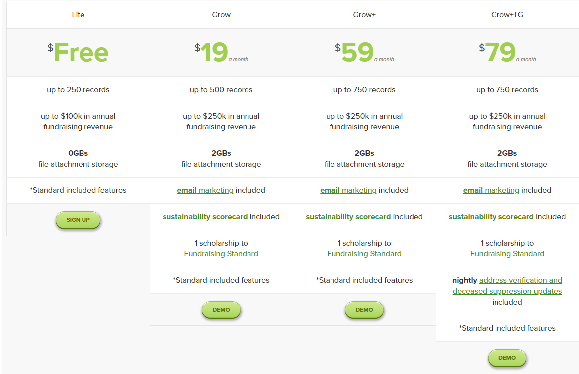
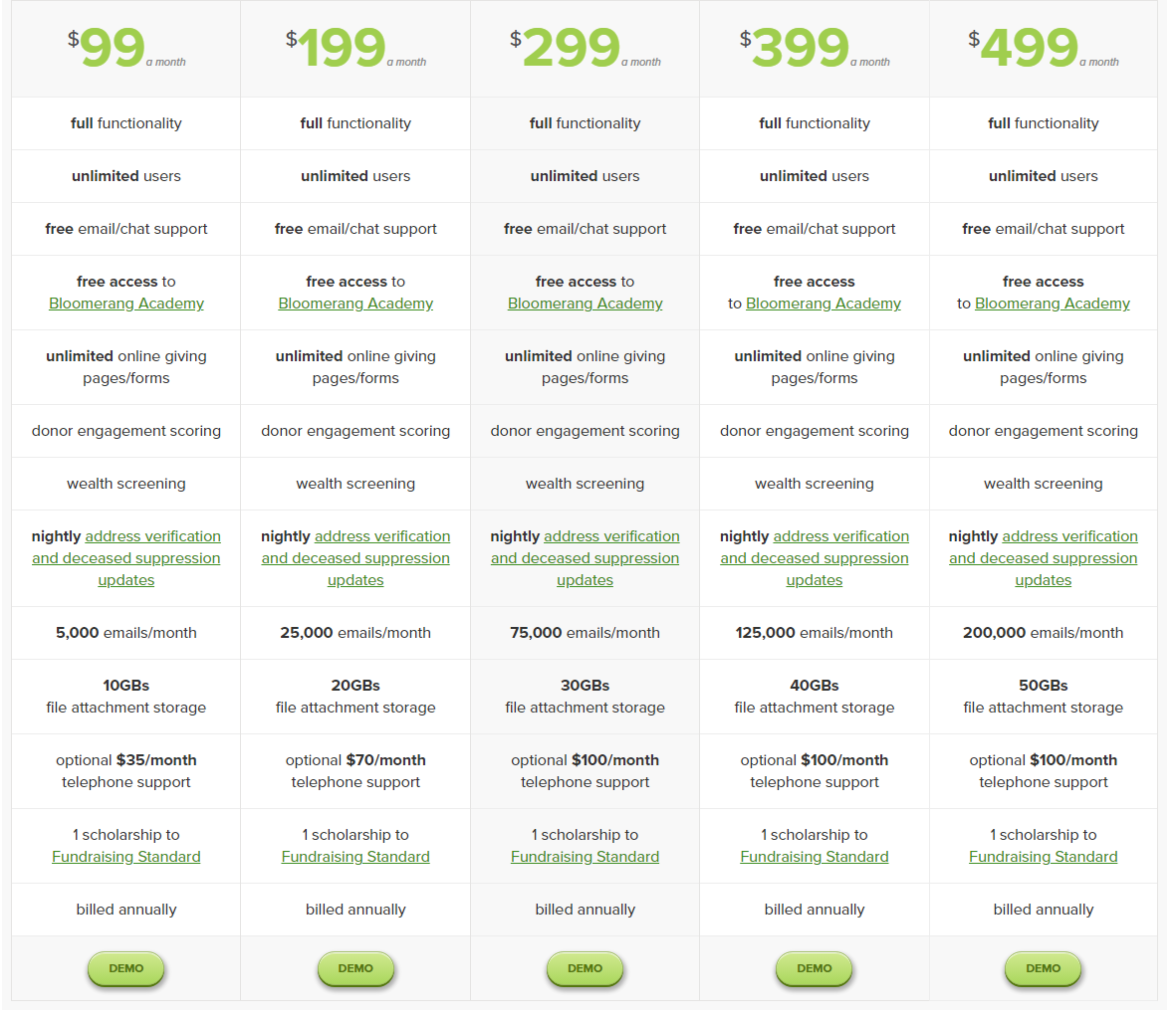
This Bloomerang pricing section is effective for several reasons:
Clear Tiered Structure and Targeting:
Distinct Tiers: The “Lite,” “Grow,” “Grow+,” and “Grow+TG” tiers are clearly defined and visually separated, making it easy to compare options.
Target Audience Differentiation: The tiers seem to target different levels of usage and needs, catering to various user segments based on records, fundraising revenue, and features.
Transparent Pricing:
Clear Price Points: The prices are prominently displayed for each paid tier, with the “Lite” tier offered for free.
Monthly Pricing: The “a month” indicator clarifies the pricing model.
Emphasis on Feature Differentiation:
Feature Lists: The features included in each tier are clearly listed, allowing users to easily compare functionalities.
Quantifiable Metrics: Features are quantified with metrics like “up to 250 records,” “up to $100k in annual fundraising revenue,” and “0GBs/2GBs file attachment storage,” providing clear usage limits.
“Standard included features” Reference: The repeated reference to “Standard included features” indicates a base set of features available across all tiers.
Strategic Use of Calls to Action:
“SIGN UP” and “DEMO” Buttons: Clear and prominent buttons encourage users to take action.
Visual Clarity and Organization:
Clean Layout: The layout is clean and organized, making it easy to read and understand the information.
Consistent Formatting: Consistent formatting across tiers enhances readability and makes comparisons easier.
Free Tier Availability:
The “Lite” tier offers a free option, lowering the barrier to entry for users to explore the platform.
Feature Highlights:
The inclusion of features like “email marketing,” “sustainability scorecard,” and “nightly address verification” highlights the platform’s capabilities and target audience.