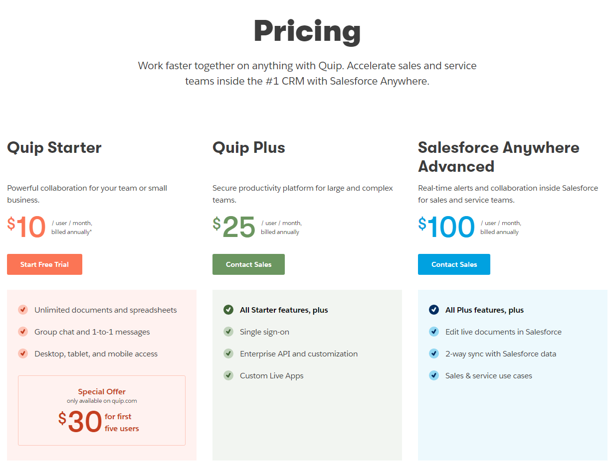
The Quip pricing section is effective for several reasons:
1. Clear Hierarchy and Visual Appeal:
- Headline Focus: The headline “Pricing” and the introductory text clearly communicate the product’s value proposition and integration with Salesforce.
- Tiered Structure: “Quip Starter,” “Quip Plus,” and “Salesforce Anywhere Advanced” tiers are clearly labeled and visually separated.
- Visual Cues: Checkmarks effectively indicate feature availability. The “Start Free Trial” and “Contact Sales” buttons are visually distinct. The “Special Offer” box is visually set apart.
- Layout: The layout is clean, organized, and easy to follow, with consistent formatting.
2. Value-Based Differentiation:
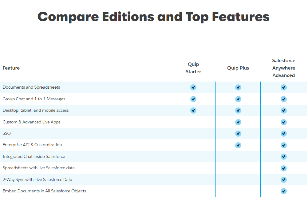
- Target Audience: Each tier is targeted to different user groups (small teams, large teams, Salesforce-integrated teams).
- Feature List: The feature lists clearly outline the core differences between the plans, emphasizing the added value of the higher tiers with “All [Previous Tier] features, plus” structure.
3. Transparent Pricing:
- Pricing Information: The per-user monthly prices are clearly displayed for all tiers, with annual billing information provided. The “Special Offer” is also prominently visible.
4. Addressing Different User Needs:
- Tier Names: The tier names suggest different levels of usage and integration.
- Feature Availability: The feature availability caters to different needs, from basic collaboration to advanced Salesforce integration.
5. Strategic Use of Information:
- Call to Action: “Start Free Trial” and “Contact Sales” buttons are prominently placed, encouraging user engagement.
- Other Information: The descriptions provide clear explanations of each plan’s benefits and target audience. The “Special Offer” creates a sense of urgency and encourages immediate action. The clear mention of Salesforce integration targets a specific user base.