Logos are the face of a brand, meant to leave a lasting impression and communicate its identity. But what happens when things go terribly wrong? From baffling design choices to unintended humor, some logos have become infamous for all the wrong reasons. In this article, we’ll take a look at 10 of the worst logo designs ever created—reminders of how a small misstep can make a big impact, and not in a good way!
Let’s dive into these logo design disasters and see what lessons they offer.
1) Junior Jazz Dance Classes Logo Design
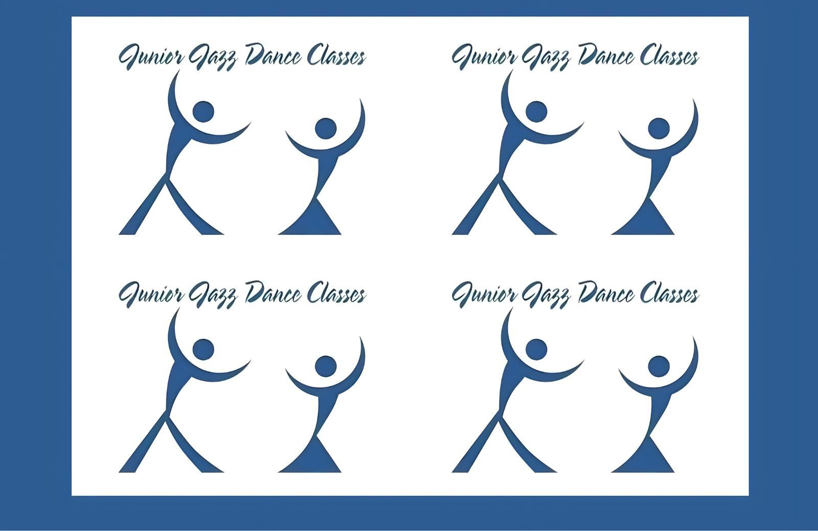
This infamous logo comes from Junior Jazz Dance Classes, a small, relatively unknown brand, but its design has become legendary for all the wrong reasons. At first glance, it appears to show two dancers performing a lively, spirited dance. However, when you inspect the white space between them more closely, you’ll see something entirely different—a shape that could be interpreted as something far more inappropriate. Once you notice it, it’s hard to unsee, which has made this logo an ongoing source of amusement (and horror) for its design.
2) Arlington Pediatric Center Logo Design

The Arlington Pediatric Center’s 2009 logo is another infamous example of a design oversight that quickly became a source of controversy. Intended to represent a family-friendly, welcoming atmosphere, the logo depicted a simple image of a child being embraced by a pair of hands.
What was meant to convey warmth and care instead looked strangely suggestive, leading to public ridicule. The backlash was swift, forcing the Arlington Pediatric Center to redesign the logo shortly after it was unveiled. This incident highlights the importance of considering how designs are perceived from different perspectives, especially when the target audience includes families and children.
3) Pepsi Logo Design
The redesign of a logo by Pepsi in 2008 sparked controversy in the branding and design community. The massive cost of this exercise and the relatively subtle changes to the iconic logo left many scratching their heads and prompted much debate. One of the strong grounds to actually speak against redesign in 2008 was that of cost-effectiveness.
Industry observers could not help but think about it if the heavy outlays made on this program really justify the correspondingly minimal changes in the logo design.
The new design retained the essence of a familiar Pepsi globe, changing only slightly the shape and orientation of the world and the font used for the brand name. Undeniably refined, these changes certainly did not represent a shift in brand identity.
4) London Olympics 2012 Logo Design
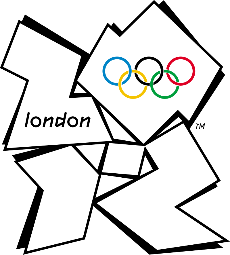
London has magnificent landmarks that make designers wonder what went on in the minds of the developers of the dissonant logo for the 2012 London Olympics. Bad comments include that it looks like a distorted swastika. It is one famous bad logo that designers were embarrassed to see.
The complexity of the logo made it difficult to use in various media and on merchandise. It was considered challenging to apply effectively on a wide range of formats, from small items like pins to large banners. This created additional challenges for the branding and merchandising efforts leading up to the Games.
5) Sherwin-Williams Logo Design
The Sherwin-Williams logo design has long symbolized the company’s commitment to providing high-quality paints and coatings. However, in recent years, this iconic emblem has come under intense observation due to its perceived insensitivity in the face of pressing global issues, particularly climate change.
The controversy centers on Sherwin-Williams’ logo and the environmental impact of the paint industry. Traditional paints, made with VOCs and harmful chemicals, contribute to air and water pollution. As climate change accelerates, many consumers and environmental advocates question the responsibility of companies like Sherwin-Williams to address these concerns. Amplified by social media, the criticism calls for the company to rethink its logo and adopt a more sustainable image, highlighting the importance of corporate responsibility in today’s society.
6) Office of Government Commerce Logo Design
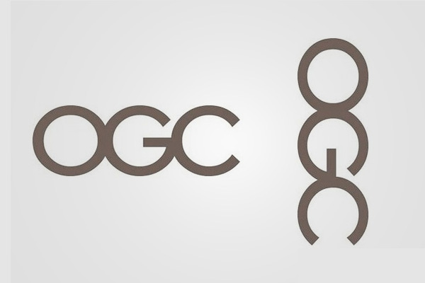
In 2008, the UK’s Office of Government Commerce (OGC) invested over £14,000 in a comprehensive redesign of its logo, aiming to modernize its image. However, At first glance, the logo seems perfectly acceptable, but when the logo is rotated 90 degrees, what initially appeared to be a clean, professional design suddenly transforms into an image that many viewers found uncomfortable and inappropriate. This incident serves as a classic example of how branding can easily backfire when organizations fail to consider all angles—both literal and metaphorical—when designing a logo.
7) Mont-Sat Logo Design

Mont-Sat, a satellite and antenna service established in 1995 in Lower Silesia, became the subject of widespread criticism—not for its services, but for its logo. Designed to represent a support arm for satellite dishes, the logo inadvertently conveyed a far less professional and much more inappropriate image. What was likely intended to be a simple, functional design quickly turned into a visual misstep, sparking confusion and discomfort among viewers. This serves as a cautionary tale in logo design: even the most innocent intentions can go awry without careful consideration of the message a design might inadvertently send.
8) Gap Logo Design
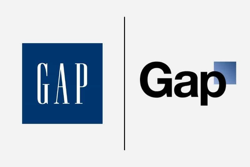
In 2010, Gap introduced a new logo design that cost the company a reported million dollars. The new logo replaced the iconic blue box with a simple all-black font and a strange bright blue gradient square next to the ‘p’. The design felt flat and uninspired.The public response was swift and harsh. It was so intense that Gap reversed the change after just six days. The CEO of the company resigned after four months of this incident. Gap should’ve stuck to their original logo design instead of recreating it.
9) A-Style Logo Design
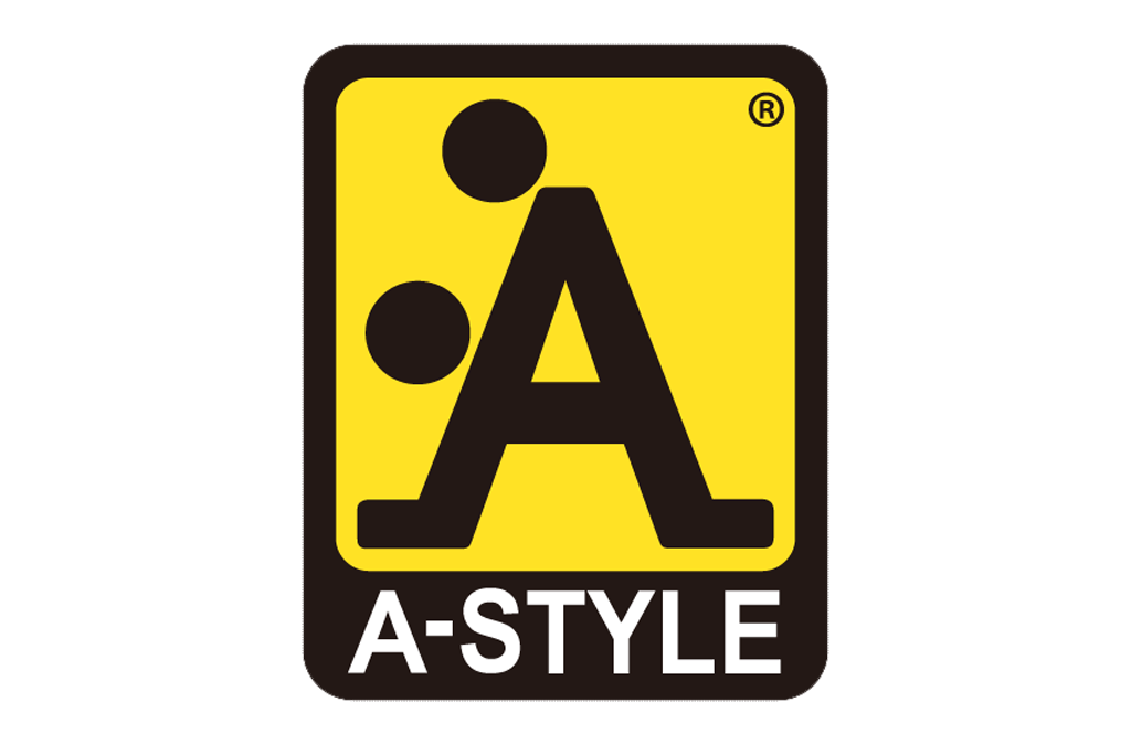
The A-Style logo was created in 1989 and first marketed in Italy in 1999. The logo’s mysterious appearance in urban areas attracted media attention, which helped to increase its visibility. It quickly gained attention for its bold designs and unique marketing approach. While it got attention, it landed in the realm of worst logos, serving as an unintentional yet notorious example of poorly executed branding strategies.
10) BT Logo Design
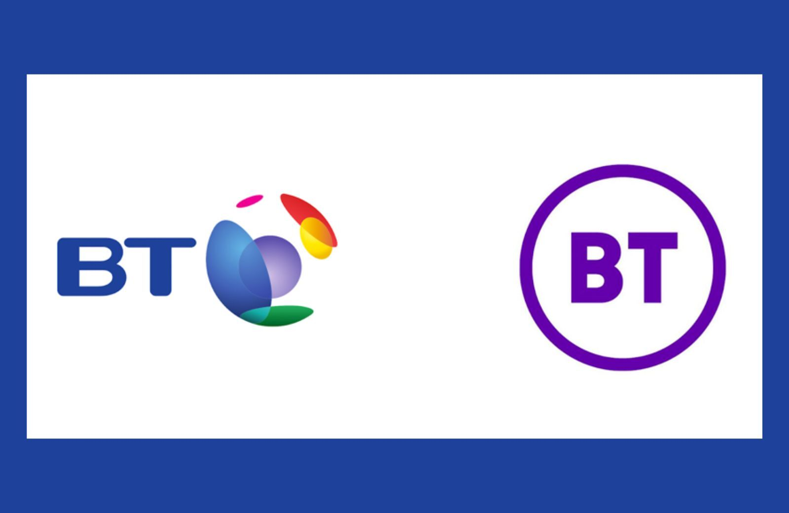
After years of development and countless delays, BT finally unveiled its monumental new logo back in 2019. The result? A circle with the letters ‘BT’ written inside—all in one color. They should’ve at least tried to create and come up with something attractive for their logo.
A logo is more than just a visual, it’s the face of your brand and a key element of how people perceive your business. Getting it right can elevate your brand’s credibility, while getting it wrong can lead to unintended humor or even backlash. Taking the time to design a thoughtful, well-executed logo is an investment in your brand’s future, ensuring it resonates with your audience and stands the test of time.
Creating a logo that truly represents your brand requires more than just a creative idea, it demands clear communication, effective project management, and consistent updates. Miscommunication or lack of clarity can lead to designs that miss the mark, causing frustration for both clients and designers. That’s why it’s important to use tools that streamline the entire process, from brainstorming to final approvals. Whether it’s collaborating seamlessly on projects with your team or keeping clients in the loop with real-time updates, having the right solutions in place can make all the difference in delivering a logo that resonates.
At Draftss, we believe a logo should represent your brand in the best possible way—professional, memorable, and meaningful. That’s why our team of skilled designers works closely with you to create logos that truly align with your vision and values. We ensure every design is carefully thought out, avoiding any unintended messages or visuals that could lead to embarrassing situations. With unlimited revisions and a collaborative process, we make sure your logo not only stands out but also tells the right story. Let us help you design a logo that you’ll be proud to showcase.
Drop your thoughts in the comments below.
Your email address will not be published. Required fields are marked *

