
Do you want to create a logo design that surpasses fame like Apple? Or say LinkedIn or Nike? Logos are truly the hallmark of any website or company. If you create a logo that contains everything that is required, you automatically create brand loyalty too. However, if looked at closely, logos can be quite complex too. They may look simple on the face of it. Yet in designing them, there are required a lot of hard work and brainstorming.
Just think as a consumer yourself. What do you want to see in a logo? You obviously want it to look relatable. Besides that, you want the logo to capture your attention.
Look at these crucial logo elements that you can focus on as a graphic designer while designing them.

- Good Branding of Logo
Good branding is nonetheless very important for literally every corporate product. Branding gives an opportunity to showcase your logo to the masses. Thus, whenever designing a logo make sure you add a unique brand value to it. This can be done through the general design in a logo. Logos provide more opportunity to tell a story.
Try advertising your designed end product as much as possible. No matter what the design is, branding can do miracles. With the right logo, you are communicating your brand’s values from the first moment a customer sees it.

- Choosing a good Logomark style
All logos consist of one or two main components:
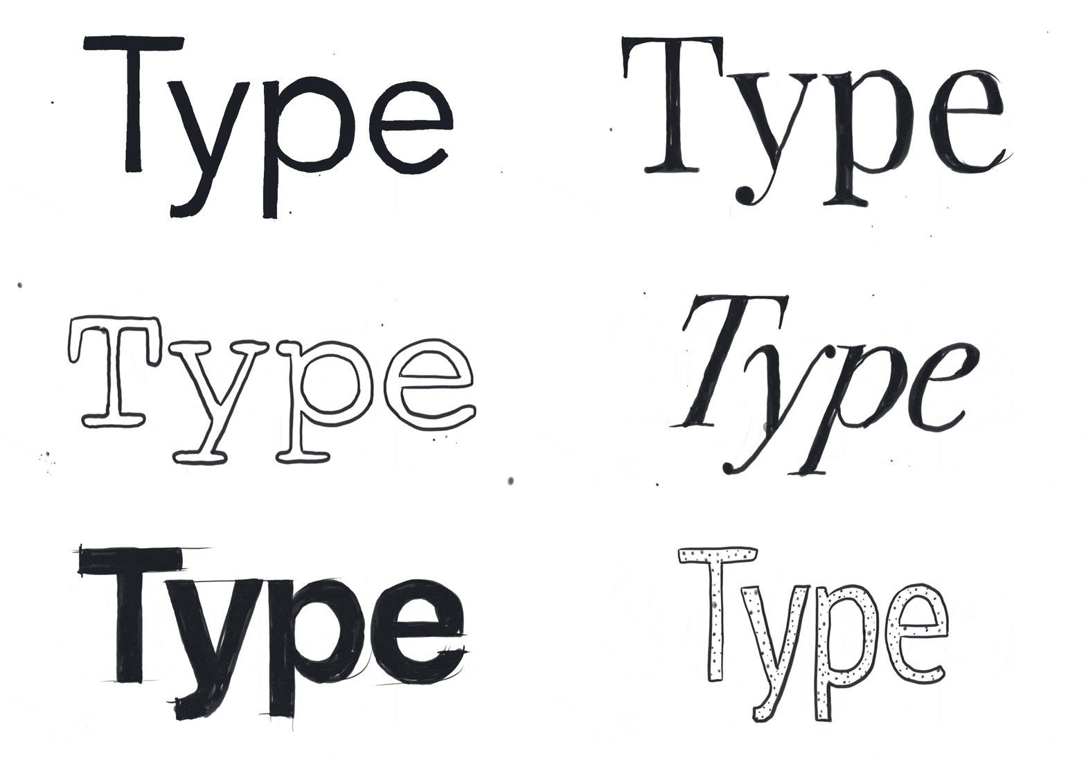
The logotype is the design of the text or letters. On the other hand, logomark is the icon used to represent the business. Now if you wish to create one of the best logos as a designer, try incorporating the best elements. A good logo can have both these elements. For example, the logomark of Apple is quite famous: “That one half-eaten apple”.
As a designer, you should also experiment while creating a logotype. Try creating a logo that contains lettering that captures attention. For say the yellow “M” of McDonald’s is a good example.
- Employ good Logomarks

As discussed previously, logomarks should be the principal attraction of your logo. These can include anything from the range of a mascot like any turtle or animal to abstract marks. Abstract logomarks use geometric shapes. But as the name suggests, they don’t have definite form as such. This includes brands like Adidas who only have abstract logos. But are still doing brilliantly.
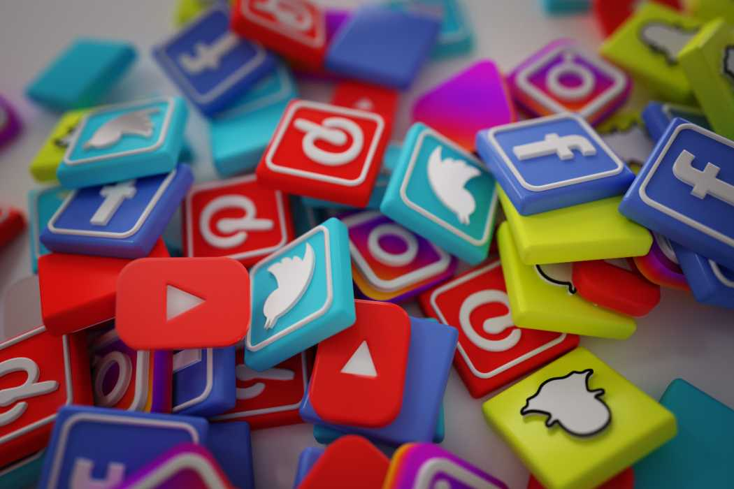
There are other marks called Pictorial marks. They are basically concrete images. Examples include logos like Instagram or Facebook etc. So a logo need not be following any previous archetype or standard set of rules. Rather it should be created in a novel form every new time. By experimenting too, you can create the best logo for yourself.

- Simplicity and Subtlety
When we say “simple and Subtle”, we mean that the logo should not be very much over-the-top. When designing one, make sure you keep the target audience in mind. Logos need to serve its purpose. That is: they should make your product famous and reachable to audiences, besides promoting the brand value.
“Design is the silent ambassador of your brand.” – Paul Rand
Besides that, the logo needs to be subtle in a way that it doesn’t create any ambiguity. If your product is a pen, you should design a logo related to it. By making a completely divergent logo, you tend to confuse the public a lot. Besides that, make a logo that has elements of adaptability in it. It should be having elements like the versatility that may change when other trends change.

- Add creative tinges
After choosing a good designer for your logo, the next thing should be asking him)/her to make it look exotic. Best logos aren’t mundane. Rather they have a royalty around them. While your designer does provide unlimited graphic designing services, you can ask for some additional facilities or services too. This may include things like colour contrast, colour choice etc. A logo is obviously just not about marks but about presentation and colours too. That’s when you need a designer. If your brand is all about fun and creativity, you can say that it’s a good design. Make lovely colour combinations and see the magic happening!
So these are some of the principal elements that you should include in designing your logo. You can include other elements too as snd when you need them!
Drop your thoughts in the comments below.
Your email address will not be published. Required fields are marked *


