

21st-century markets are flooded with a massive variety of products across all categories. A consumer walking into a supermarket is bombarded with an overwhelming number of options on the shelves. They will only pick the one that stands out. The challenge for brands and product manufacturers is clear: how do you attract customers to your brand? In today’s highly competitive market, the best way to do that is by making your product packaging visually striking, and for that, expert graphic design services are essential.
A well-designed package not only makes a product visually appealing but also addresses critical marketing aspects such as logo design, brand identity, sales growth, and overall brand recognition in the market.
The phrase “Don’t judge a book by its cover” may hold moral value, but in reality, consumers often make purchasing decisions based on a product’s appearance. Therefore, brands must leverage this psychological tendency by investing in high-quality graphic design for their packaging.
What goes into making a great package design?
Color Choices: How to Use Colors in Marketing and Advertising
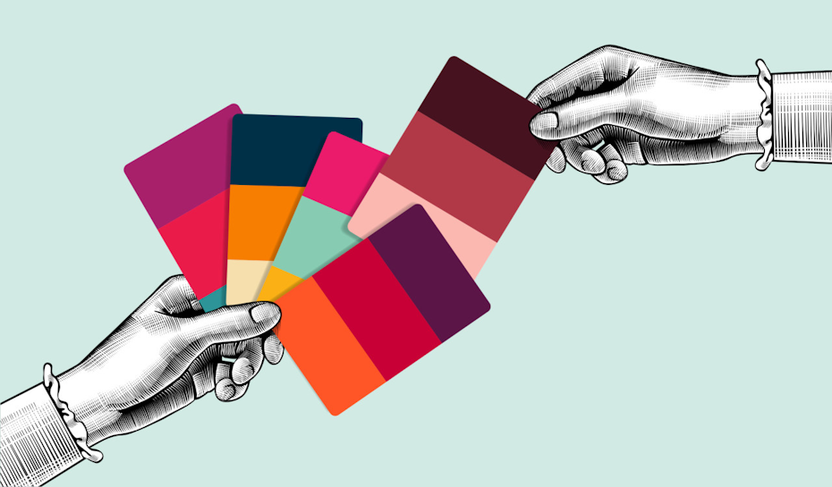
Colors play a crucial role in making a brand stand out on the shelf. They give a product its identity and, when combined with great graphics, can turn an average brand into a market leader. The choice of colors in packaging also conveys a deeper brand message, helping you cement your brand image.
Telling a Story: Colors evoke emotions in customers, so selecting a color that aligns with your brand’s message is essential.
Let’s understand what each color signifies on the packaging:
Black: Power, Strength, Elegance, Boldness, Richness and Sophistication
White: Freshness, Goodness, Hope, Purity and a Cool vibe
Blue: Calmness, Trust, Stability, Faith, Peace and Integrity
Green: Environment, Eco-friendliness, Freshness, Soothing, Safety and Relaxation
Red: Energy, Excitement, Love, Passion, Hunger and Style
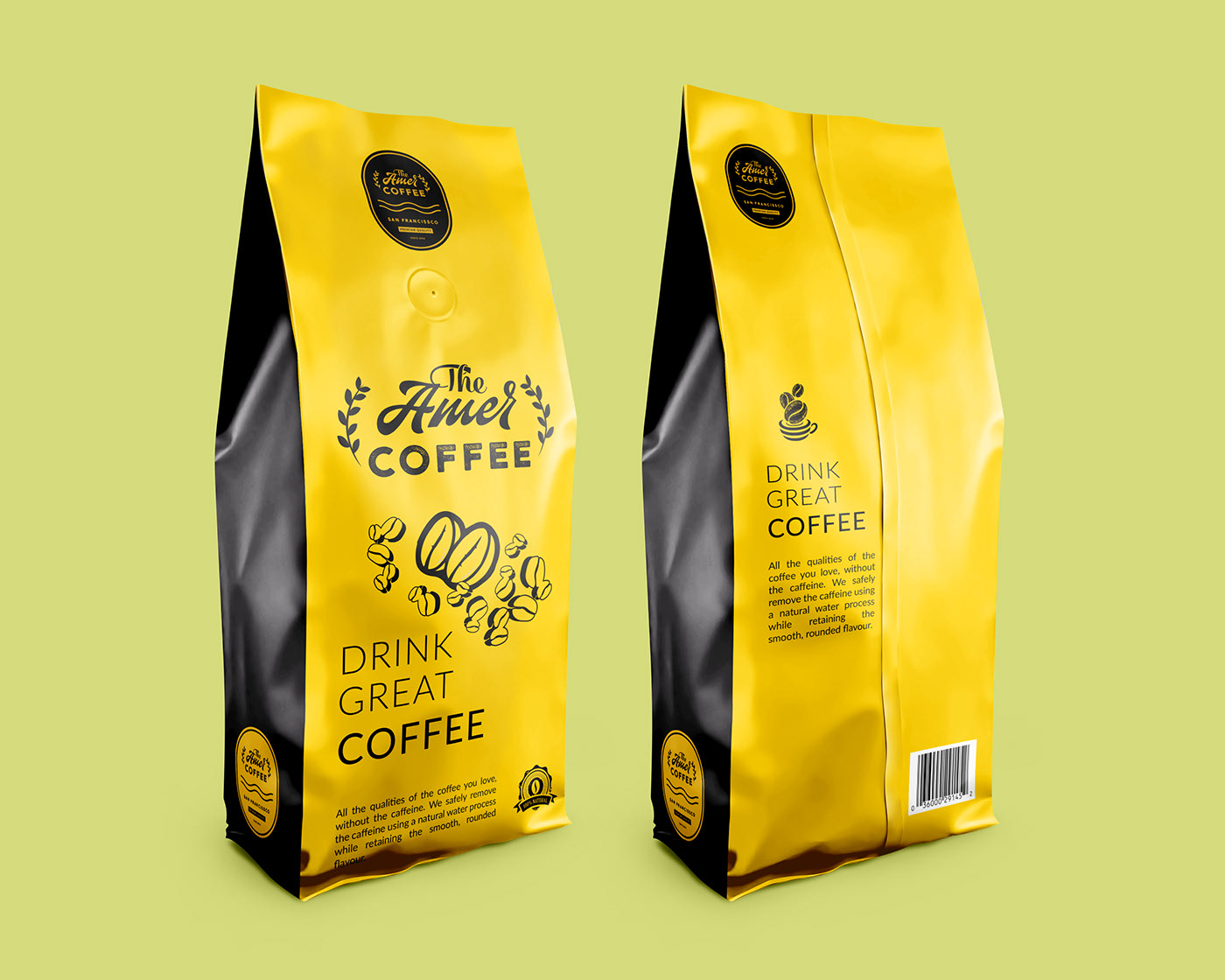
Yellow: Warmth, Cheerfulness, Optimism, Joy and Attention
Orange: Happiness, Engaging, Youth, Standing out, Attraction and Health
Pink: Tenderness, Beauty, Sympathy, Sensitivity, Care and Romance
Purple: Creativity, Magic, Mystery, Wisdom, Luxury and Royalty
Grey: Strength, Authority, Stability, Maturity and Security
Logo Design:
Logo design is usually a one-time job for any brand and therefore is something that must be handled by experts who work in this field of design. Any company looking to take their brand further will need to get their logo designed by a good graphic design firm. A Logo is the ‘identity’ of the brand, so utmost care should be given to it while designing. It must speak of the product that you want to market, the idea that you are selling, and the story that your brand wants to tell and also stand out on the material of packaging being used.
Unique Product Packaging = Unique Designing
It is often forgotten while designing the graphics of the package, the way in which the product will be packaged. A particular design that works well on a metallic round can might not work in the same way for a cardboard box or a plastic package. One also needs to understand the packaging material choice and its texture- Is it plastic, metal, a fabric, or cardboard, or even a new type of material?
Canned Drink design:
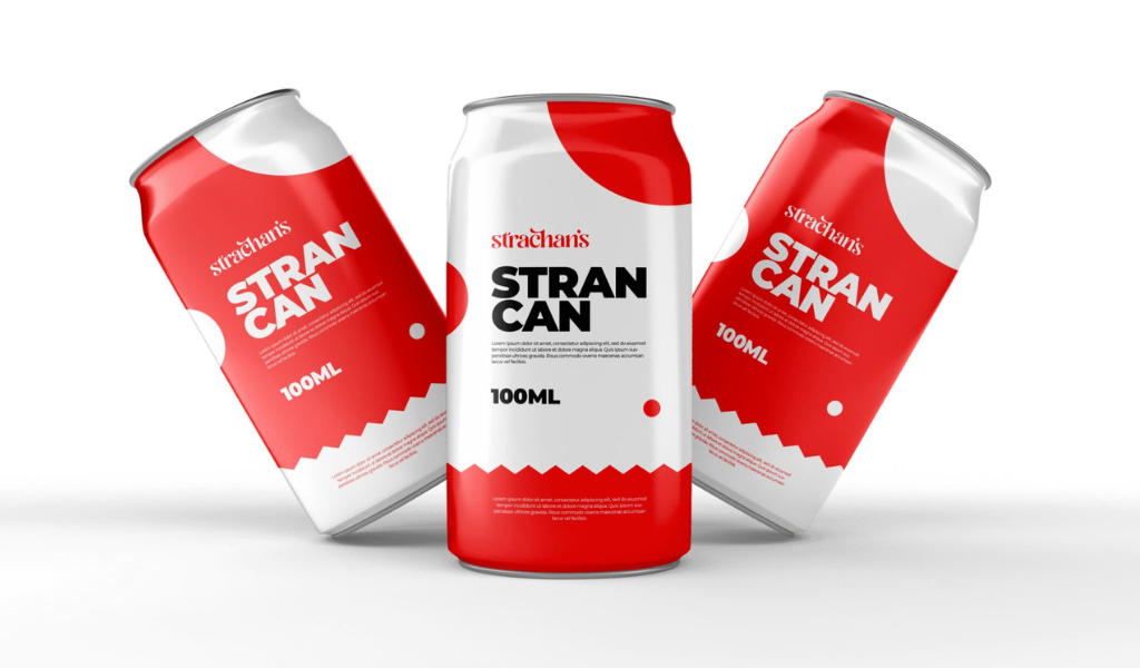
A vibrant color scheme (such as red and white) evokes joy and freshness, while fruit-based graphics add to the appeal. A catchy tagline enhances brand recall.
Poly-Packets design:
In a competitive market like salt or snack packaging, vibrant graphics and high-contrast colors (such as orange) can help a brand stand out on supermarket shelves.
Metallic Box design:
Metallic boxes are widely used for packaging luxury items, stationery, confectionery, and premium food products. These boxes provide durability, protection, and a premium feel. A well-designed metallic box can enhance the perceived value of a product and make it more desirable to customers. Metallic packaging can be enhanced with embossing, foiling, or matte finishes, making the design more striking and ensuring a premium unboxing experience.
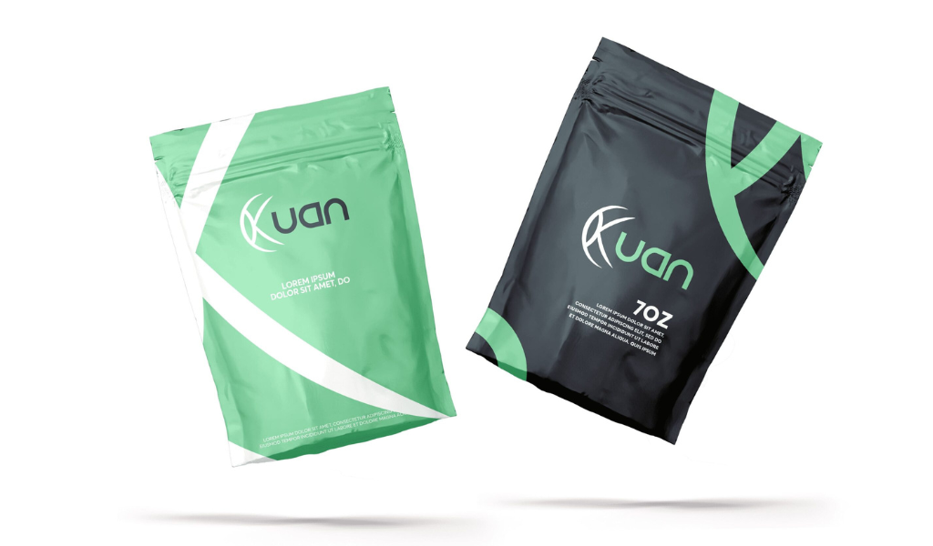
Zipper Pouch package design:
Zipper pouches are widely used for food items, snacks, and eco-friendly products due to their reusability, convenience, and modern appeal. A well-designed zipper pouch should effectively communicate the brand message while being practical and user-friendly. Some zipper pouches can also incorporate transparent windows, allowing consumers to see the product inside, adding a level of trust and transparency.
Squeeze packet design:
In the above example of a tomato ketchup squeeze-up package, the color red has aptly been used, which symbolizes the fruit Tomato and also evokes in the consumer the emotions of energy and excitement. The color red is also a huge appetite enhancer, which works well for a food brand. The graphics of fresh tomatoes are a great add-on by the designer. This makes it more appealing for the consumer to go for this particular brand. The unique packaging for this liquid and viscous sauce has been taken care of by the designer. This can also be implemented in unique ways for other viscous materials’ packaging like mayonnaise, chili sauce, salsa sauce, etc.
New Trends in Product Packaging Design
Sustainable Packaging Design
With increasing awareness of environmental issues, consumers are drawn to brands that use sustainable packaging. Graphic design plays a key role in making eco-friendly packaging visually appealing. Using earthy color palettes, recycled materials, and biodegradable elements can help brands attract environmentally conscious buyers.
- Example: Kraft paper packaging with minimalist graphics and nature-inspired designs.
- Trend: Brands now highlight “100% recyclable” or “biodegradable” packaging directly on their labels to emphasize sustainability.
Minimalist Packaging Trends
Minimalism in packaging is gaining popularity. Simple, clean designs with ample white space give products a modern and premium feel. Brands are moving away from cluttered designs in favor of sleek aesthetics that focus on key information.
- Example: Apple’s packaging relies on clean lines, soft colors, and simple typography to create an elegant look.
- Tip: A minimalist design should communicate everything necessary with fewer elements, ensuring a strong visual impact.
Smart Packaging & AR Integration
Technology is transforming packaging with smart packaging elements like QR codes, NFC chips, and augmented reality (AR). These features allow customers to interact with the product beyond just its physical packaging.
- Example: A QR code on a beverage bottle can take consumers to an interactive website, loyalty program, or a behind-the-scenes video, all with a simple scan through the QR scanner.
- Trend: Brands are embedding AR technology where customers can scan packaging with their smartphones to see product details, animated stories, or tutorials.
Typography in Packaging: Why Font Matters
Typography can make or break a product’s packaging. The right font choice ensures readability, enhances brand recognition, and adds to the overall aesthetic appeal.
- Example: Luxury brands often use elegant serif fonts (e.g., Dior, Rolex) to convey sophistication, while playful brands like Ben & Jerry’s use bold, quirky typography.
- Tip: Use a font that complements the brand personality, script fonts for elegance, sans-serif for modern appeal, and bold fonts for high-energy brands.
Cultural & Regional Influences in Packaging
Packaging design isn’t one-size-fits-all, as local, regional, and cultural preferences play a major role. Different regions have unique visual aesthetics and color associations that impact consumer behavior.
- Example: In Japan, packaging is often intricate, using delicate illustrations and pastel shades, while in the US, bold and straightforward designs dominate.
- Tip: Brands expanding into global markets should research regional preferences to ensure their packaging resonates with local customers.
Takeaway points:
- Great package designing leads to the sales growth of your product.
- Graphic designing services are a great way to outsource the designing of your product packaging. They bring with them their unique design experience and ideas. Some graphic designing firms offer Unlimited design services for your company, which is a great feature if you are planning a range of products to be floated in the market.
- Color choice is an important area of product packaging. It evokes in your customer emotions that you would want them to relate to your brand.
- Attractive packaging will catch more eyeballs towards it and will make your brand stand out among the prevalent competitors.
- Tell a story on your packaging. A story can take the brand to the farthest corners of the world and, in turn, boost your brand power.
Drop your thoughts in the comments below.
Your email address will not be published. Required fields are marked *