
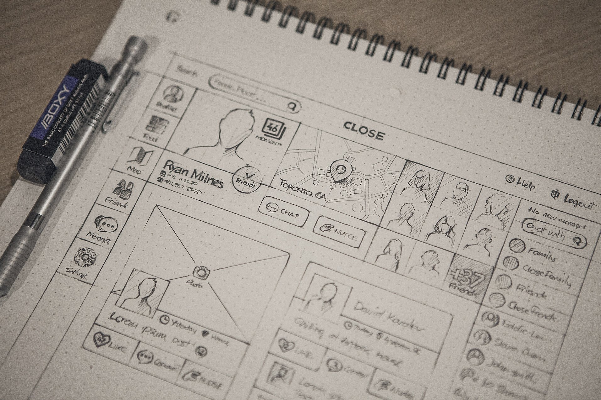
Though Graphic Designing for Printable and web designers we have a lot in common. There are some important variations that people have both outside and inside the industry). Often don’t understand — ranging from workflow and file formats to tools and terminology. While certainly not extensive, the following guide offers a brief overview of some of the biggest (and often, the most confusing) differences between the two disciplines.
Draftss has also helped its clients to develop substantial e-commerce platforms with unlimited graphics designs, illustrations, WordPress, HTML, and more for building your website, brand, etc. you can check on our website at draftss.
What is print design?
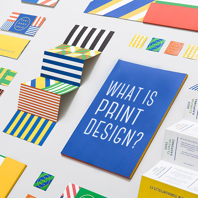
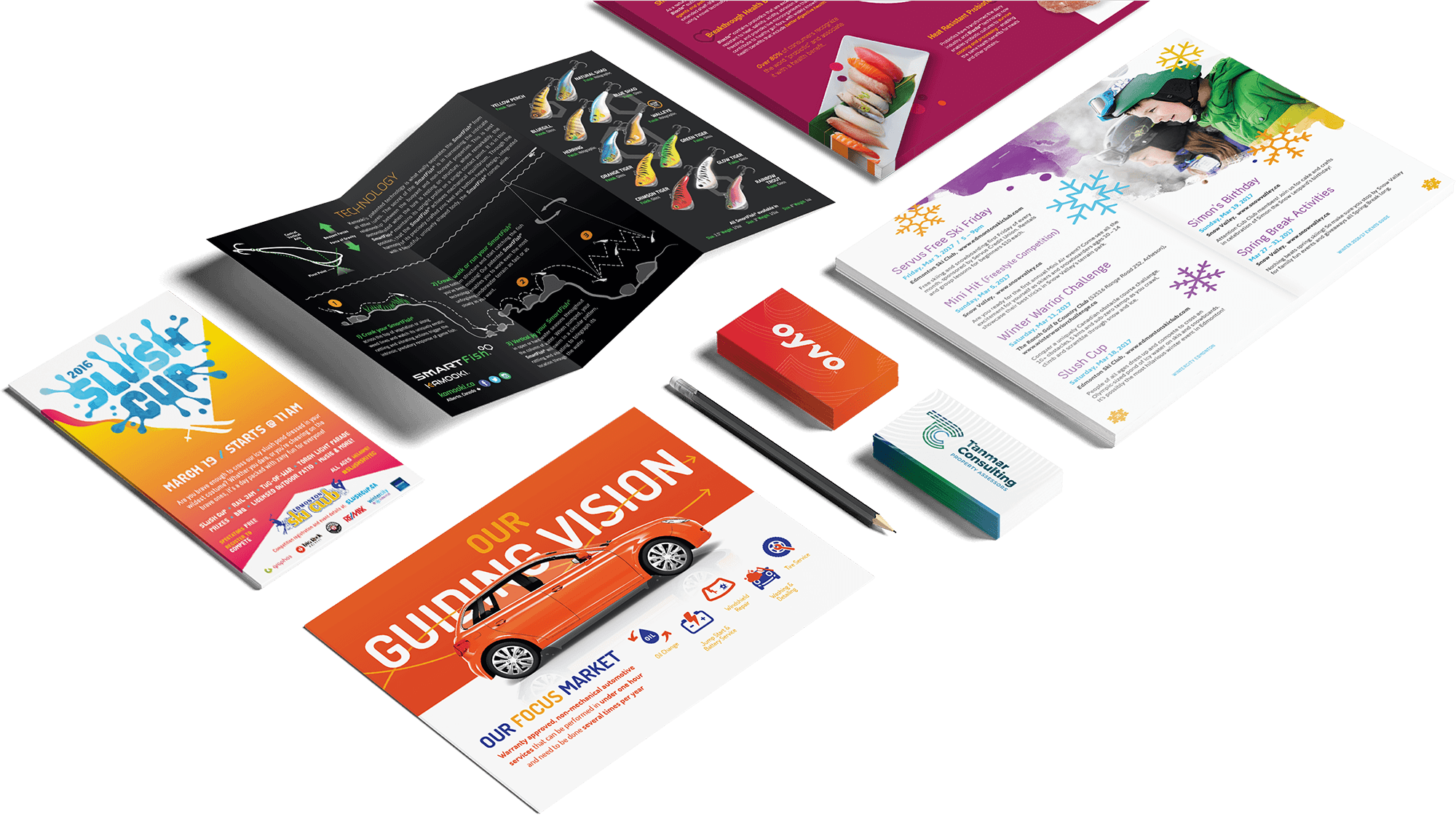
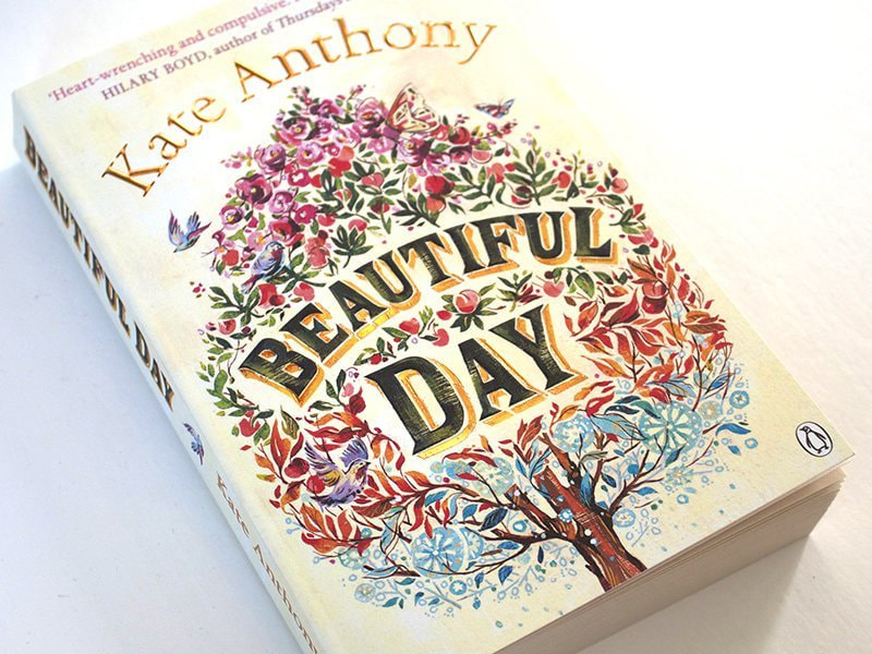
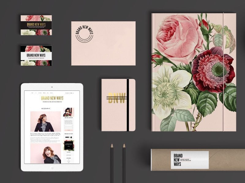
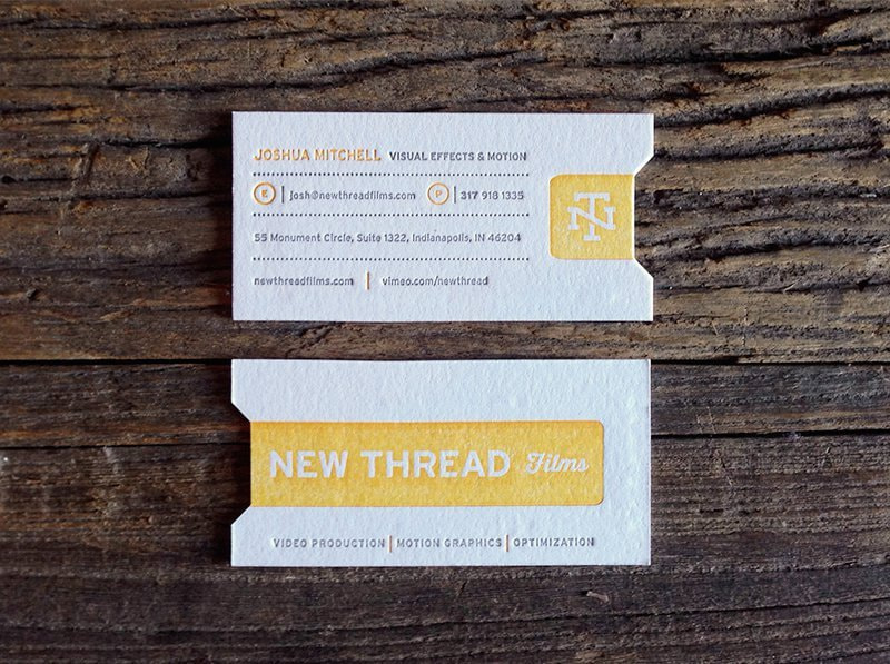
Print design is any design where the final form is intended to be printed. In today’s world of digital design tools, the actual design will likely be done on a computer. But the end product will be printed. This covers items such as brochures, flyers, shopping bags, stickers, labels, book covers, posters, business cards – even t-shirts!
What is web design?
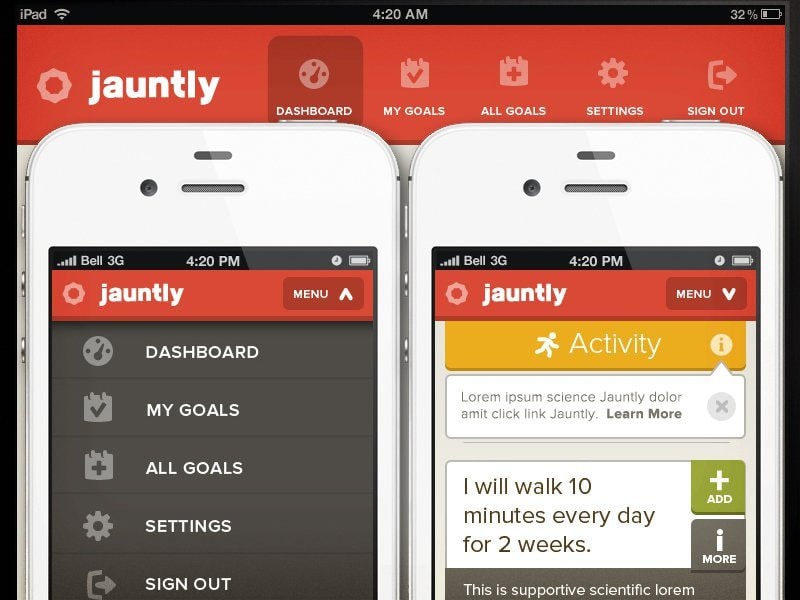
Web design is a combination of skillsets that goes into the design and creation of websites. Web design isn’t just about the graphics on the site, but also the overall look of the webpage, the user experience, usability, and accessibility. It is a design that is intended to be viewed on a computer, mobile, or another device with a web connection.
Now that we’ve got the definitions out of the way, let’s dive into the key points of Graphic Designing for Printable.
1. How users approach and view your design
One of the biggest differences between print and web designs is how people view them. Holding something physical in your hand — a piece of paper, a folding brochure, a book — is a much different experience than viewing something on a screen. There is some crossover, such as digital magazines that are laid out in the same way as their printed counterparts, but generally, the physical versus digital experience is a pretty clear dividing line between print and web design. Where and how designs are viewed play a big role in the decisions designers make.
2. The experience: How your design engages users’ senses
Closely related to the physical or digital nature of a design is how users experience it. Both print and web design share a visual quality in common — the design needs to make a good impression no matter what the final product. To this visual component, the print design adds a tactile experience that might include texture, shape, or printing effects like letterpress, embossing, or screenprinting. The web design experience adds the possibility of audio/video elements and other interactive options.
Take books, for example. Many readers love the weight of a book in their hands, with the texture, rustle, and even the smell of the pages; those are qualities that can’t be reproduced in any digital form. E-books, however, have unique qualities that can’t exist in printed form: a children’s e-book might have animated illustrations, or a digital textbook might have hyperlinks to other resources. Both approaches have their value and appeal.
3. Static vs. interactive: The design lifecycle and how users connect with a project
Once a design goes to the printer, it’s not going to change (barring a decision to re-design and re-print — which costs time and money; not ideal). Web design, however, can be tweaked, changed, or completely redesigned at any time. Many websites, especially those with frequently changing content — a news website, for example — will look different every day. Different pictures, different text; they’re created to change.
That means that (unlike print designers, who generally ship off a job to a printer and call it done), web designers must consider the ongoing functionality of a project. Elements like buttons, links, mouse-over effects, forms or polls, videos, and other interactive features need to work correctly. There’s no quicker way to lose a user than when something doesn’t work as expected. Web design stands apart from print design in that this interactive, dynamic quality often requires some sort of input or effort on the viewer’s part, such as clicking, typing, etc., which brings us to our next point…
4. Usability and navigation: Making your designs user-friendly
Since print design is contained to the physical size and shape of the surface or object, navigation is usually limited to flipping or unfolding a page. On the web, it’s not so straightforward. Users might encounter any number of different layouts and need an easy way to find the content they’re looking for. That’s where menus come in. They have become the hub of website navigation, and need to be in a location that’s easy for visitors to find.
With the recent explosion of different web-enabled devices and gadgets, there’s a growing concern about how websites display on various devices and screen sizes — which has led to a focus on responsive design, or designs that adapt to various viewing methods. Web designers must consider not only how the design looks on different devices, but also what happens (and how the design changes) when viewers scroll, zoom in and out, or take other actions. Mobile design and mobile web browsing have become huge considerations. How will readability and navigation need to change to best cater to those formats and create a good user experience?
5. Compatibility: Testing your web designs
For web designers, compatibility forms a major component of creating a great user experience. Any design for the web — including websites, emails, e-newsletters, and other formats — needs to display and operate correctly in different web browsers and with different operating systems. This can get complicated since these various platforms each have their limitations. For instance, iOS, Apple’s mobile operating system, won’t render any Flash-based designs, and Internet Explorer (versions 8 or below) can’t display SVGs (scalable vector graphics). Web designers have to keep all these issues in mind and more to make their designs as user-friendly as possible for as many people as possible.
6. Layout: How you arrange your content
Both print and web design have many design elements in common: typography, images/graphics, shapes, lines, color, etc. So, many of the same best practices apply to each.
Each approach also has its unique layout requirements. For print, all information must be available within the constraints of the printing surface. Whereas for the web, designers have almost unlimited flexibility to organize, arrange, and filter information.
Printed projects must meet certain standards using parameters such as margins and bleeds, while websites aim for a consistent experience between different viewing methods, such as web and mobile. Because various browsers may change a web designer’s original layout, achieving top functionality requires testing with different browsers and operating systems.
7. Size: Making good use of your design space
Size and layout go hand in hand. For print design, the size of the printing surface is one of the biggest determiners of how the designer will use that space. What design elements will be good, the amount and size of the text, etc. Though the standard sizes for many projects (letters, business cards, posters, photos), possibilities are virtually unlimited. As paper and other printing surfaces can be cut to any size or shape.
For the web, “size” is more abstract. The sizes that designs attend should have some limits to a certain number of devices that are currently available — from computer monitors and laptops to tablets and smartphones, but that content should ideally scale to fit any device. That adaptability, known as responsive design, is becoming increasingly in demand as people’s web browsing habits shift in a more mobile direction.
8. Resolution and DPI: Making sure your print designs look their best
It’s important to understand the basics of resolution for both print and web since resolution determines image quality — how good photos and graphics look in your final design. That being said, bear with me; we’re about to get a little technical here.
You’ll often hear resolution referred to using two terms: DPI (dots per inch) or PPI (pixels per inch). Many people mistakenly use these interchangeably, but they’re two different things (Even software developers that should know better — Adobe included — have labeled these incorrectly at times).
DPI comes into play in the actual printing process — it’s the density of the dots of ink printed on an inch of the printing surface.
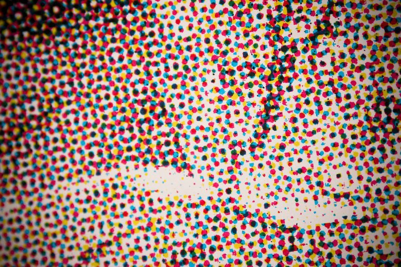
Equipment that is set to print at a higher DPI will produce a higher quality image reproduction. But, unlike PPI, DPI has nothing to do with the size of a print. It goes with the capabilities of the printing equipment in use. Something most designers have no control over. Furthermore, DPI is irrelevant for web design. Since it specifically involves how ink is on a surface. Just be aware that many people mistakenly use “DPI” as a blanket term to refer to resolution in any design context.
9. Resolution and PPI: Making sure your print designs look their best
PPI involves the number of pixels (the square building blocks of a digital image) displayed in an inch of screen space.
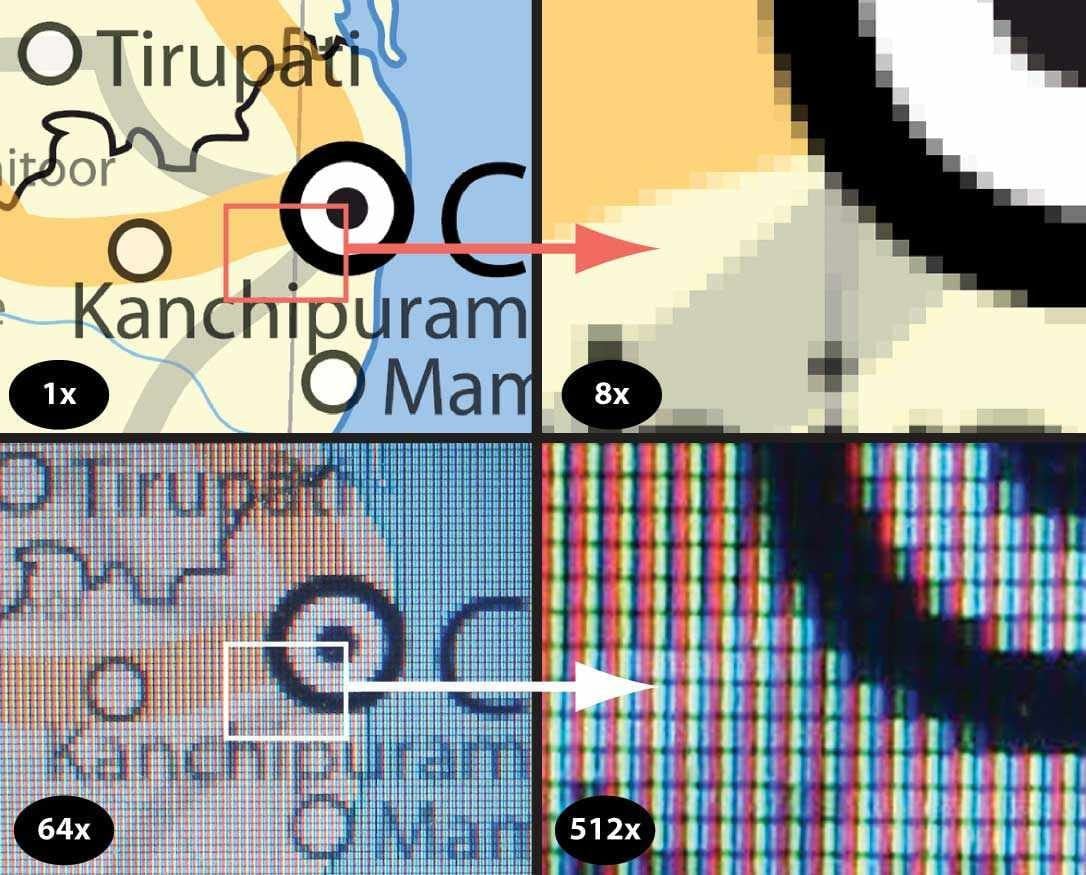
The more pixels per inch, the higher quality an image will be — clearer, sharper. Pixelation (blurriness, distortion, loss of quality) occurs when the PPI is not sufficient for printing. Or when a digital image is online at a size larger than its original pixel dimensions.
Preparing a digital image (measured in pixels) for printing (measured in inches, centimeters, or other units) is where the confusion often sets in. If pixels represent screen space, how does that translate to how the design will render on paper? An official U.S. government resource advising museums on how to best conserve photographs and other resources suggest that PPI and print size have an inverse relationship. That is, a higher PPI value (more pixels per inch) condenses or reduces the physical size of a print, but increases its quality. This means that, depending on the characteristics of a specific project, designers need to set a file’s PPI to produce the right combination of size and quality:
“The acceptable amount of PPI needed for a quality print is dependent on the size of the print. Larger prints are generally seen from farther away than small prints, so a lower number of PPI will generally look acceptable visually….
Without magnification, the human eye can’t differentiate detail in a print greater than 300 PPI. Depending on the printer, the general standard today requires 300 PPI for a quality print.”
You may often hear printmakers and even designers express the need for a file saved at 300 DPI. They mean 300 PPI.
10. File types: How to choose the right format for your design
Designers have a multitude of file types to choose from. But which ones are right for which situations? Are some more suitable for the web than for print, and vice-versa? Although all those acronyms can get confusing, it helps to understand that every file format falls into two basic categories: raster or vector. A combination of pixels builds raster images. Digital photos are a common example — and their quality varies depending on their resolution. Distortion can happen easily if a raster image is beyond what its resolution (pixels per inch) allows for. Vector images, on the other hand, have no limits by pixels. Without getting too technical, vectors refer to graphics that define mathematical equations. It allows them to scale to any size without loss of quality.
Here’s a quick rundown of some common file types, their characteristics, and what types of projects you can use them for:
Both Print & Web:
-
-
JPG (or JPEG): Most people will be familiar with this one, the default file format on many digital cameras. Save JPGs with an appropriate resolution and in the correct color space (CMYK for print and RGB for the web; more on that in the next section).
-
PDF: widely used; preserves the original content and appearance of a file regardless of its view resolution
-
EPS: most common for saving vector graphics to preserve their scalability; not always readable on PCs
-
PNG: high image quality; supports transparency/opacity
-
Print Only:
-
-
TIFF: high image quality and large file size (compressing image does not reduce quality, unlike with JPGs); compatible with both Macs and PCs; commonly used for final handover to a printer
-
Web Only:
-
-
GIF: supports graphics featuring animation and/or transparency effects; color capabilities not as good as JPGs (256 colors or less, so not appropriate for photos); ideal for simple graphics on the web, since low file size doesn’t negatively impact page loading speeds
-
SVG: vector format supports scaling of any size without loss of quality
-
Software-specific:
-
-
PSD: an editable (raster-based) file created in Photoshop
-
AI: an editable (vector-based) file created in Adobe Illustrator
-
With an abundance of options out there, Canva makes the selection simple for print and web projects. If your design is for the web, always select “as an image”, or if it’s for print select “PDF”.
CONCLUSION
Whew, you made it! If you’re still reading this far, I commend you. I hope you learned something new and/or have a little better grasp of the differences between print and web design. If you think of any other interesting differences (or similarities). Graphic design uses visual compositions to solve problems and communicate ideas through typography, imagery, color, and form. There’s no one way to do that, and that’s why there are several types of graphic design, each with its own area of specialization.
You can try out draftss for an excellent experience and increase your product marketing. We provide premium quality services on unlimited graphic designs, WordPress, Webflow, HTML, Illustrations, Websites, Landing pages, Dashboards, App UI/UX, and many more. Here we provide our clients with 73+ types of design and code services.
Drop your thoughts in the comments below.
Your email address will not be published. Required fields are marked *