

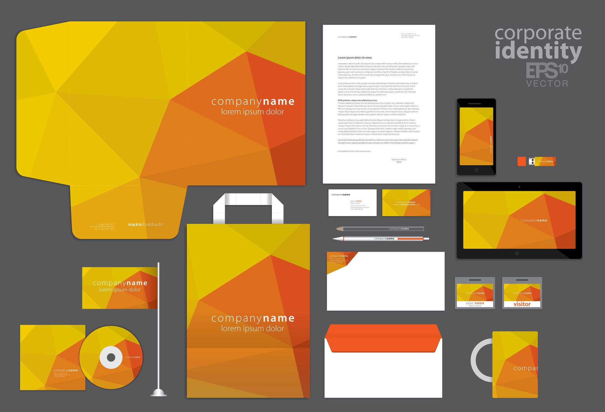
Cohesion is important when it comes to branding. Having a consistent set of colors, designs, and styles across your marketing campaign makes it easier for customers to recognize and remember your brand.
However you choose to market your business, one thing should remain the same: the style you use to create designs. You can use a brand style guide to refer to each time you’re creating new marketing materials for your business.
For clarity’s sake, let’s distinguish between two forms of advertising:
- Print marketing: This tried-and-true method might never go out of style. Examples of print marketing include business cards, flyers, posters, and direct mail. One advantage of this approach is that it gives customers something tangible they can hold in their hands, which can have a more lasting impact.
- Digital marketing: Everyone is online these days, and the marketing realm is no different. Take advantage of the internet to advertise your business on social media, as well as your website, email campaigns, and more.
But why is a brand style guide so important for your marketing strategy? The benefits are as follows:
It makes outsourcing designs easier

If you’re the only person who designs promotional materials for your business, then making a brand style guide may be less important. But what if you have several employees or companies who create designs for your business?
One artist might use Helvetica font with subdued colors, and the other may use Comic Sans with neon shades. Even if they both look good, customers will have a hard time recognizing your business when your branding is so varied.
You can keep your branding consistent
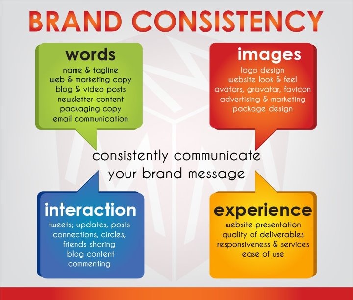
Every day, your customers are bombarded with advertisements, from the flyers they see on the bus to the ads that play before YouTube videos. How will they remember yours? When your branding is familiar to your customers, it becomes easier to recognize. You can improve loyalty through personalized printing.
Roll out branding/rebranding successfully
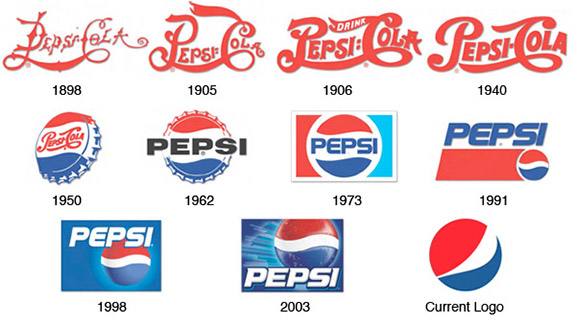
Is it time to try tapping into a new market? For your rebrand to be a success, you need to eliminate any confusion between your old aesthetic and your new one. Keep track of any changes in your style guide.
Make A Branding Rulebook
You’ll have a harder time keeping things consistent when you can’t keep track of what you feature in your marketing materials. Make things easy for yourself by creating your own branding rulebook. In it, you can outline a template for all of your print and digital marketing. Specify things like:
Colors
Start by choosing one or two primary colors. These are the main shades you’ll use in every design. They should be a focal part of your logo, flyers, and website.
Have a specific color in mind? Don’t leave it to chance. Instead, write down the specific values of that color. You can use the Pantone Color Finder to find out the color formula of your preferred shade.
Fonts
Fonts vary depending on the type of text you’re writing—you’d choose a different style for a heading than the one you would for a descriptive paragraph in a flyer. It’s a balance between readability and grabbing attention. We recommend choosing one font to use for the title and a different one for larger blocks of text.
You can get pretty technical with your typography. If you’d like, you can specify things like alignment and spacing. Prefer to feature more images than words in your designs? Designate a character limit for bodies of text on your flyers and social media posts.
Logo
This is the signature of your business. While you might allow leeway with different fonts or colors at times, the logo should remain more or less the same. It’s a powerful image that helps customers recognize your business across various platforms, from their social media feed to the emails in their inbox.
With this aspect of your branding, it’s good to get technical. Include specifications for how large the image should be and how much space should remain around it.
Tones
The voice used in your branding needs to showcase the personality of your business; the words you use tell customers about your story and your values.
You might adapt your tone based on the target audience you’re communicating with. For example, the way you write an Instagram caption might differ from the copy on your website—but these variations should be subtle. Again, the key here is consistency.
Start by outlining what your brand is about and what it’s not. If you own a luxury brand, you might aim for a sophisticated tone in your marketing materials. But if you’re trying to appeal to a younger demographic, you might throw a few memes and emojis into your posts.
You can make a word pool of traits that describe your brand’s voice and ones that don’t. As a banking institution that markets to college students, acceptable words might include low-interest rates, mobile, savings plans, and no bank fees. Words to steer clear of maybe things like contract, minimum balance, withdrawal limits, and financial planning. You can adapt your strategy based on your industry and target demographic.
What Not To Do
You can save time by specifying the designs that won’t work for your branding. For example, some variations on the color of your logo may be acceptable. But switching out your signature black shade for a bright orange? That’s a clear violation of your branding rulebook!
If you have a specific vision for your brand in mind, you can include examples of things that go against your vision. Use photos of ways you don’t want colors to be used, patterns you don’t like, or topics you want to steer clear of.
Keep Things Fresh
You’ve established a brand that you’re happy with. But when sales start to dip, don’t be afraid to shake things up.
When you’ve laid out all the elements of your designs in a style guide, it’s easier to spot any weaknesses or things you might want to change. Could you alter one of your primary colors to add more contrast to the mix? Or, is there too much going on?
It might be time for a rebrand. And when it is, you’ll have all your design elements in one convenient place.
You can refer back to your brand style guide whenever you’re writing content for your website, making posts for your Instagram, or designing promotional flyers for your customers. It helps customers recognize your marketing materials and boosts brand loyalty. Maintain consistent themes across your print and digital marketing with a brand style guide.
Drop your thoughts in the comments below.
Your email address will not be published. Required fields are marked *