
Panopto
Panopto is the leading video platform for businesses & universities.
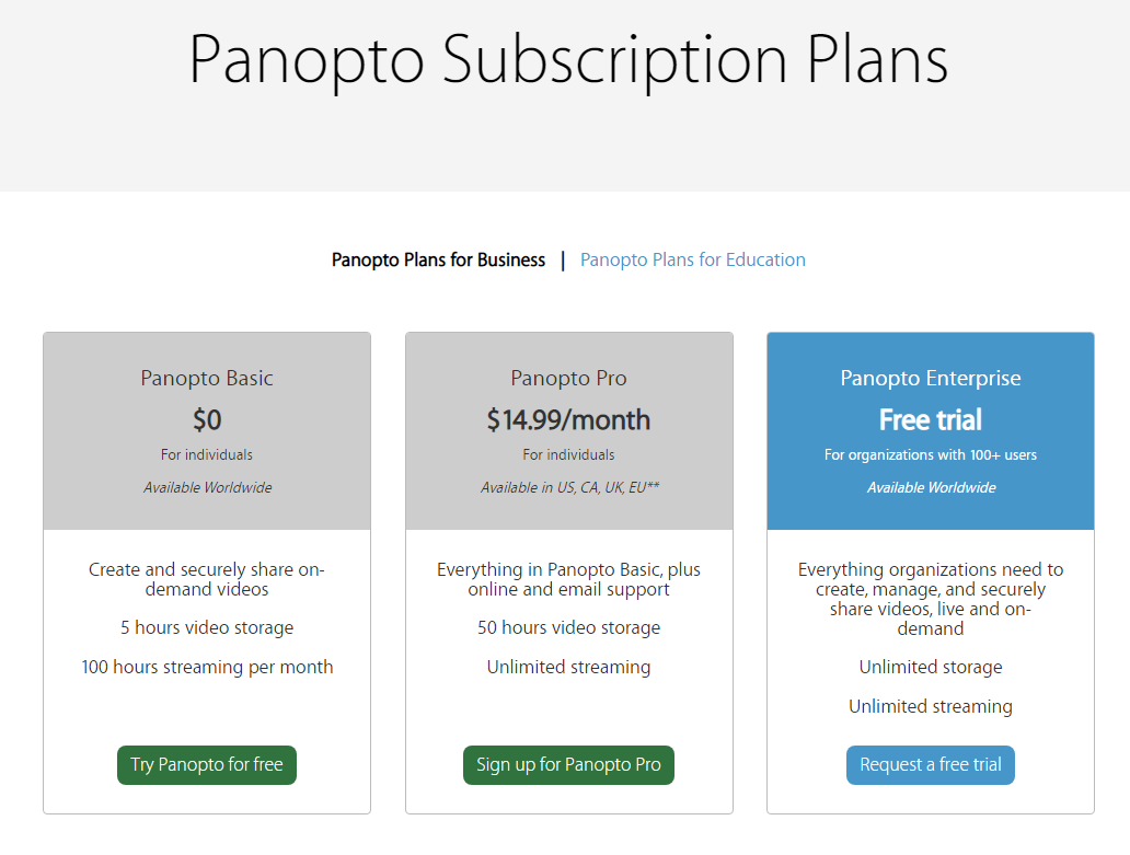
Panopto Pricing Page Design
$0 - $49 3 Plans
Launch Website
With Panopto, anyone can create and share professional on-demand videos securely.
The Panopta pricing section is effective for several reasons:
1. Clear Hierarchy and Visual Appeal:
- Headline Focus: “Panopto Subscription Plans” clearly states the page’s purpose.
- Tiered Structure: “Basic,” “Pro,” and “Enterprise” offer a simple, three-tiered choice.
- Visual Cues: Color-coded headers and distinct boxes differentiate tiers.
- Concise Information: Key features and pricing are presented succinctly.
- Call to Action Buttons: “Try Panopto for free,” “Sign up for Panopto Pro,” and “Request a free trial” are clear and actionable.
2. Value-Based Differentiation:
- Feature Comparison: The table format allows for easy comparison of features between tiers.
- Targeted Messaging: Descriptions highlight the intended user for each tier (individuals vs. organizations).
- Benefit-Oriented Language: Phrases like “Create and securely share,” “Everything organizations need,” and “Unlimited storage” emphasize the value proposition.
3. Transparent Pricing:
- Free Tier: “Panopto Basic” at $0 lowers the barrier to entry.
- Clear Pro Price: “$14.99/month” is straightforward.
- Enterprise Pricing: “Free trial” for Enterprise suggests a more customized pricing structure, which is common for enterprise-level software.
4. Addressing Different User Needs:
- Individuals: “Basic” and “Pro” cater to individual users with varying needs.
- Organizations: “Enterprise” is designed for larger organizations with more complex requirements.
5. Strategic Use of Information:
- Storage and Streaming Limits: Clearly stating limits for “Basic” helps users understand its limitations.
- Geographic Availability: Specifying availability for “Pro” sets clear expectations.
- “Free Trial” Emphasis: Encourages users to experience the product firsthand.