
Calendly
Calendly is the modern scheduling platform that makes “finding time” a breeze.
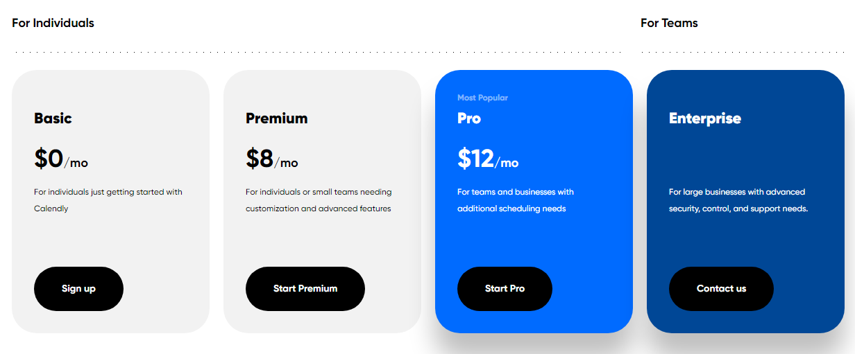
Calendly Pricing Page Design
$0 - $49 4 Plans
Launch Website
When connecting is easy, your teams can get more done.
The Calendly pricing section is effective for several reasons:
1. Clear Hierarchy and Visual Appeal:
- Distinct Tiers: The “Free,” “Team,” “Business,” and “Enterprise” tiers are clearly labeled and visually separated with different background colors.
- “Most Popular” Label: The “Business” tier is highlighted as “Most Popular,” guiding user choice.
- Consistent Layout: Each tier follows a consistent layout with pricing, descriptions, and call-to-action buttons.
- Visual Cues: The use of color, icons, and whitespace enhances visual appeal and readability.
2. Value-Based Differentiation:
- Targeted Descriptions: Each tier has a concise description that clearly identifies the target customer and their needs.
- Feature Progression: The descriptions and feature lists clearly show the increasing capabilities of each tier.
- Price Differentiation: The pricing clearly increases with each tier, reflecting the added features and benefits.
- Free Option: The “Free” tier offers a starting point for individuals and small teams.
3. Transparent Pricing:
- Clear Pricing Information: The monthly per-user prices are clearly stated for each tier.
- Annual Discount: The option for annual billing with a discount is clearly presented.
4. Addressing Different User Needs:
- Individuals and Small Teams: The “Free” tier caters to basic needs.
- Growing Teams: The “Team” tier offers collaboration and customization features.
- Businesses: The “Business” tier is designed for businesses needing advanced features and integrations.
- Large Organizations: The “Enterprise” tier caters to complex needs with advanced security and support.
5. Strategic Use of Information:
- Benefit-Oriented Descriptions: The descriptions highlight the key benefits of each tier.
- “Most Popular” Label: The “Most Popular” label on the “Business” tier influences user choice.
- Free Option: The “Free” tier lowers the barrier to entry.
- Clear Call to Action: The “Try Free” and “Contact Us” buttons provide clear paths for action.