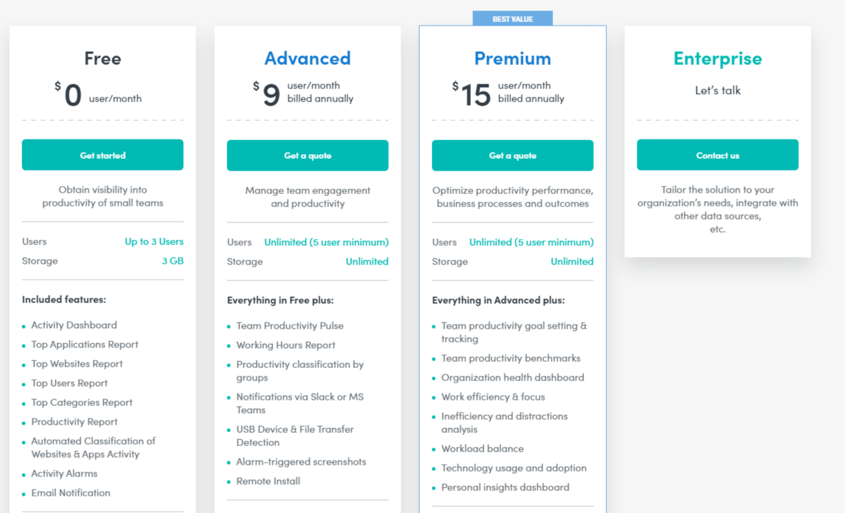
This Activtrak pricing section is effective for several reasons:
1. Clear Hierarchy and Visual Appeal:
- Distinct Tiers: The “Free,” “Advanced,” “Premium,” and “Enterprise” tiers are clearly labeled and visually separated.
- “BEST VALUE” Highlight: The “Premium” tier is clearly marked as “BEST VALUE,” drawing attention and guiding user choice.
- Consistent Layout: Each tier follows a consistent layout with pricing, descriptions, features, and call-to-action buttons.
- Visual Cues: Checkmarks and icons are used to indicate included features, enhancing readability.
- Clear Headings: The headings clearly indicate the purpose and target audience of each tier.
- Pricing Clarity: The monthly prices are prominently displayed for the “Free,” “Advanced,” and “Premium” tiers.
- Call to Action Buttons: The “Get started,” “Get a quote,” and “Contact us” buttons are visually distinct and clearly labeled.
2. Value-Based Differentiation:
- Targeted Descriptions: Each tier has a concise description that clearly identifies the target customer and their needs.
- Feature Progression: The “Everything in [Previous Tier] plus:” structure clearly highlights the added value of higher tiers.
- Specific Feature Differentiation: Features like “Team productivity goal setting & tracking,” “Organization health dashboard,” and “Personal insights dashboard” differentiate the higher tiers.
- Quantitative Differentiation: The differences in user limits and storage provide clear quantitative differences.
- Free Option: The “Free” tier offers a starting point for users with basic needs.
3. Transparent Pricing:
- Clear Pricing Information: The monthly per-user prices are clearly stated for the “Free,” “Advanced,” and “Premium” tiers, with the “Premium” tier being billed annually.
- Custom Pricing: The “Enterprise” tier uses “Let’s talk” and “Contact us,” indicating a tailored solution for larger clients.
4. Addressing Different User Needs:
- Small Teams/Basic Needs: The “Free” tier caters to small teams with basic productivity tracking needs.
- Team Engagement and Productivity: The “Advanced” tier is designed for teams needing to manage team engagement and productivity.
- Optimized Performance: The “Premium” tier caters to businesses looking to optimize productivity performance and business outcomes.
- Enterprise Needs: The “Enterprise” tier caters to organizations needing tailored solutions and integrations.
5. Strategic Use of Information:
- Benefit-Oriented Features: Features like “Team Productivity Pulse,” “Organization health dashboard,” and “Personal insights dashboard” highlight the value of each tier.
- Clear Call to Action: The call-to-action buttons provide clear paths for action.
- Feature Lists: The feature lists clearly show the differences between the tiers.
- Concise Descriptions: The descriptions are brief and to the point, making it easy to understand the purpose of each tier.
- “BEST VALUE” Highlight: The “BEST VALUE” label on the “Premium” tier influences user choice.