-
Clear and Compelling Headline:
“Zero Touch SaaS Operations” is a strong, concise, and intriguing headline. It immediately communicates the core value proposition and promises a streamlined, automated approach to SaaS management. The phrase “Zero Touch” is particularly appealing in today’s efficiency-driven environment.
-
Value Proposition:
The text below the headline expands on the value proposition: “BetterCloud is the market leader for SaaS Operations, empowering IT to transform their employee experience, centralize data protection, and maximize operational efficiency.”
This highlights key benefits:
- Market leadership.
- Improved employee experience.
- Centralized data protection.
- Increased operational efficiency.
-
Strong Call-to-Action (CTA):
“REQUEST A DEMO” and “FREE ASSESSMENT” are both clear, prominent, and action-oriented CTAs. They offer different engagement paths: a personalized demonstration and a free assessment. This caters to different user preferences and stages of the buying journey.
-
Visual Reinforcement:
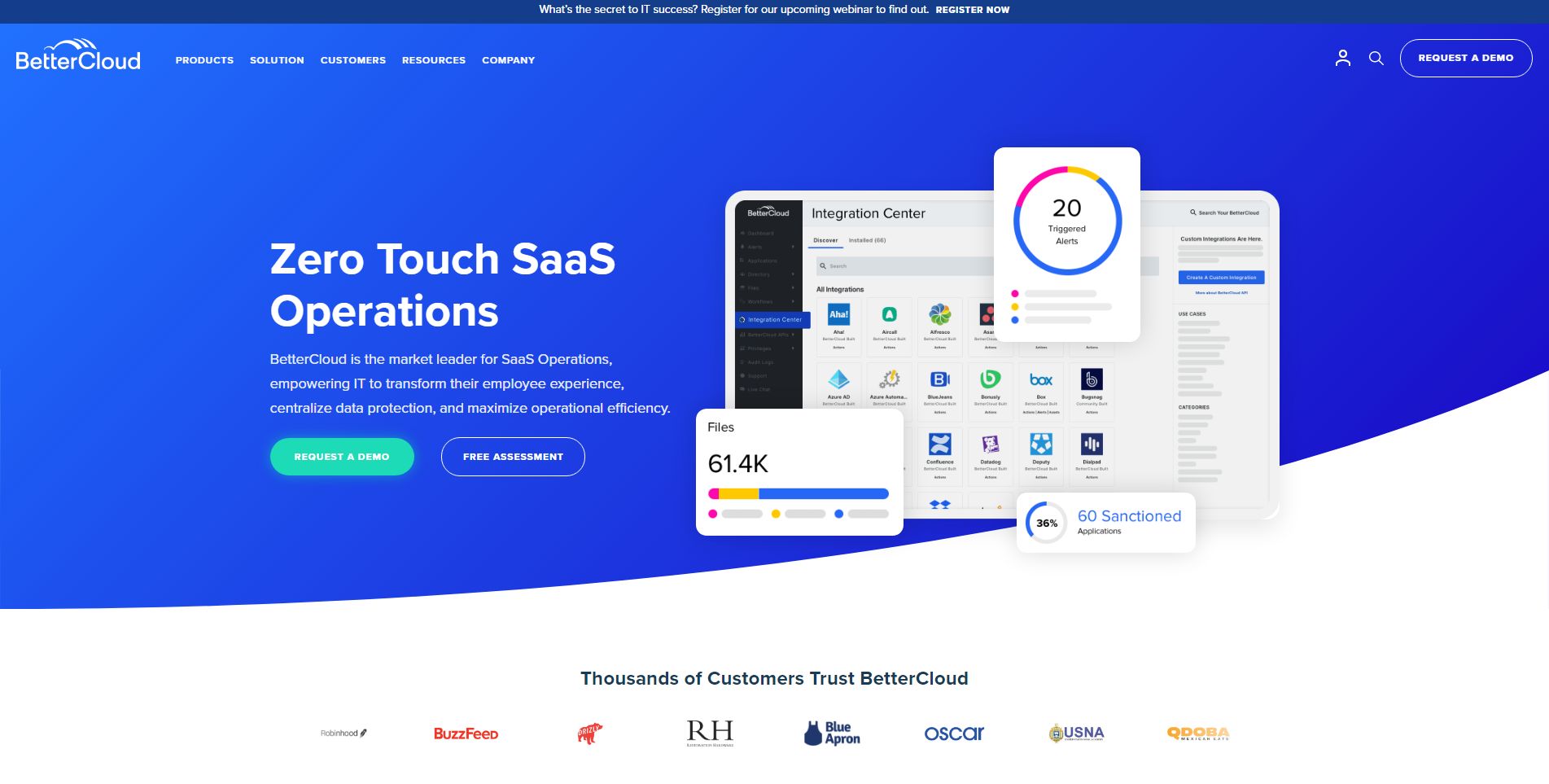
- Screenshot of the Platform: The prominent screenshot of the BetterCloud platform provides a concrete example of the product in action and visually reinforces the “SaaS Operations” aspect of the offering. The interface shown suggests various features, including application management, user insights, and security controls.
- Modern and Clean Design: The overall design is modern, clean, and professional. The use of white space and clear typography makes the information easy to digest. The blue and white color scheme is consistent with BetterCloud’s branding.
-
Strategic Design:
- Color Palette: The blue and white color scheme is professional and trustworthy. The highlighted CTAs stand out against the background.
- Typography: The use of clear and readable fonts ensures the information is easily digestible.
- Visual Hierarchy: The headline is the most prominent element, followed by the screenshot, the value proposition text, and the CTAs, creating a clear visual hierarchy.
-
Focus on the Target Audience:
The language and messaging are clearly targeted at IT professionals and organizations managing a growing number of SaaS applications.
-
Unique Aspects:
- The combination of a strong headline, clear value proposition, and prominent CTAs makes this a highly effective hero section.
- Offering two distinct CTAs caters to different user needs and stages of the buying journey.
- The “Thousands of Customers Trust BetterCloud” section, along with the display of recognizable company logos (BuzzFeed, RH, Oscar, USNA), provides strong social proof and builds credibility. This reinforces the message that BetterCloud is a trusted solution used by reputable organizations.
- The “Integration Center” and “Files” sections on the screenshot highlight specific features and integrations, further demonstrating the platform’s capabilities.