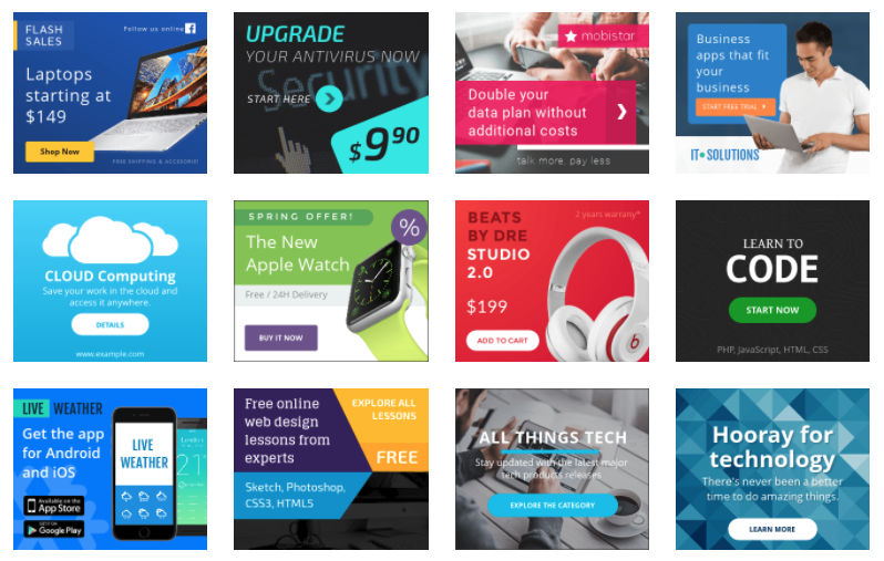
The Internet arrived and banner ads too. And for the same time duration, banner advertisements that are poorly designed have been annoying many users around. But 30 years later, companies still pay to put them on websites and in their ad rotation. Although, when done right, they have to work. That’s where Bannersnack comes in.

More than ever, banner advertisements, particularly animated ones, are used on social media profiles and social promotions, as marketers realize the power of video to attract attention. Sophisticated and well-designed banner ads can be extremely efficient. But they present an enormous challenge for designers.
What is Bannersnack?

Bannersnack is an online app that supports your design fully responsive banner ads without having any coding or design skills for websites and social media platforms. The banner snack twitch banner creators figured out all the arduous coding stuff, so you log in, choose your size, add your image, select colors, fonts, and get creative.
Let’s take a quick run-through of, Bannersnack banner set.
1. Choose your size
Start with a custom (vertical, horizontal, and square) size and orientation, or choose a preset size. A Facebook ad or an Instagram post can even be selected.
2. Design your advertisement
You can design from scratch or use an existing template for Bannersnack. Bannersnack offers static or animated methods in its template gallery, so you can get started even without having a design idea.
3. Add Pictures and Text
With just a couple of clicks, customize your design. You can use the Bannersnack banner if you can make use of Mailchimp or other SaaS marketing tools. Edit headlines, text, buttons, background, add logos and images of your own, and change nuances of design such as line heights and transparency. You can produce beautifully designed banner ads that are a perfect match for the standards and colors of your existing brand.
4. Animate with ease
It’s no secret that animated ads are more engaging and drive action better than static ads. Readers are more likely than non-animated content to react to videos and more likely to visit the page or website of the publisher. But animation is tricky, notoriously. With HTML5 animations, including fade-in, slide-in, and bounces, Bannersnack has managed to solve that obstacle. These aren’t complete video ads, but on a busy web page, they will still pull a user’s eyes towards them and boost your engagement. They have the added benefit of rapid loading, which is essential to stop mobile users from scrolling past your ad before it is even loaded.
To make animation easy, Bannersnack’s HTML5 editor has an intuitive and user-friendly interface and slide management system. Try one of the 32 animation presets which are premade to animate any particular part of your video ad. Or, create custom animations and modify items such as duration, delay, and transitions.
5. Develop a complete set of banners in a range of sizes and shapes
Try Bannersnack’s Smart Resize option once you’ve got your layout full. In just a few minutes, you can generate a set of 30+ banner ads, all based on the same design, so that you can use the same ads across the website, ad campaigns, and social media platforms of your client. If you want, you can tweak the layout of individual banners by modifying transition timelines or rearranging specific layers. Still, thanks to Bannersnack ‘s unlimited designing services and intuitive resize features, this is usually not necessary.
6. Collaborate with ease
Like sending around design proofs for comments and markup, nothing wastes time. Use the online collaboration interface of Bannersnack instead of downloading files and emailing for authorization. Within the system, your team can view the ads, leave comments and suggestions, and even mark the advertisement as approved.
7. Export and go
Once everyone is happy with the ad, select and export the format you want. Your banner is ready for integration. Compatible with all significant display ad platforms, including Google Ads, ReTargeter, and more, you can choose JPG, PNG, GIF, or HTML5. You can download HTML5 or AMP HTML (Google’s preferred format for security and quick downloads) for HTML ads.
Tips for Designing Banner Ads

Now that you have a useful tool for making banner ads let’s get you ready to get the most out of your ad investment with a couple of pro tips.
1. Retarget
By obtaining a low response rate, banner ads often get a bad rep. That’s true, but from TV ads to billboards, the same can be said of any medium. It depends on how great the artist is and how well the ad is targeted and retargeted. Retargeting banner advertisements give you a second opportunity to influence purchasing decisions. For the second or third time, the viewer is seeing your marketing graphics. Another factor is that your advertisements are seen again by web users because they are interested in your services. For retargeting ads, the click-through rate is ten times that of first-time display ads.
2. Overcome ad blindness
Readers are getting better at ignoring display advertisements.
- Position your advertisements in unusual locations
- Keep your advertising relevant to the audience
- Use unique colors, sizes, and formats
- To optimize for mobile users, use fewer ads to
- Make your advertisements part of your design
One can get better engagement with the ads, following this logic, if:
- You are picky about the banners that you show.
- You use custom sizes and colors that contrast (without conflicting) with the colors of your main site.
- Place the banners somewhere right in the middle of a blog post and let your users come across the banners with even more focus and attention.
3. Testing, testing, testing
Test your ads. Perform split testing or multivariate testing or A / B testing. Testing of the ads is the key to enhancing their performance.
You also need to have a good amount of visitors and traffic before performing multivariate testing. A suggested number of visitors range about 100,000 unique visitors each month. Instead, most companies should do easy A / B testing, where you test two variants of an ad, sending half of your visitors to one ad, and a half to the second.
The keys to split testing are designing your banner ads and being able to modify them quickly; using a service such as Bannersnack can make it cost-effective for you.
4. Be vigilant regarding analytics
It’s likely that your online ad platform includes analytics. They certainly have Banner ad automation platforms, along with the ability to see heat maps of interactivity and know which ads work best for you.
When you do them right, banners can be powerful!
You need to stand out, in the right way, to generate ad banners and truly leverage them. Create with your client in mind, rather than hitting clients over the head with a sales pitch, by being entertaining or enlightening somehow. Banner generation applications such as Bannersnack allow you to quickly design banners and easily make changes so that you can use your modified ad against your original one to try to improve your ROI and engage your clients.
Drop your thoughts in the comments below.
Your email address will not be published. Required fields are marked *


