AUTHOR

Tushar Dauthal

With experience in the content & marketing industry, Tushar writes his views and opinions on topics from design, web development, technology, and business growth.

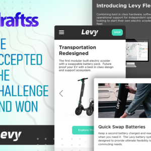
OneUp App is Flaunting Its Dashboard Designed By Draftss

Client: OneUp App LLC Description: OneUp App is a social media management and advertising management tool for businesses and individuals. Industry: SaaS Project: Web Designing & Development Problem With great power comes great responsibilities and with powerful tools comes the responsibility of having great features and design. OneUp App has got some of the best offerings in the market and all it needed was a great companion to uphold the features and offering with the best and unique design which can be comfortable as well as responsive for the user. The dashboard is a functional aspect of the website and has to be treated the same way. It has to be very easy to operate and be self-understanding to be able to convey to the user of the options and offerings. Hence, Draftss got its hold over the dashboard and understood the whole concept. The problem had to be resolved with web designing and an interface that could be very comfortable and easy to use. That’s where we picked it up from! The Draftss Solution Understanding the Problem The project was a very straightforward and complex one at the core of the understanding. We knew what had to be developed but the sheer spontaneity of the design and outlook of the dashboard on the screen could change everything. It was not just about the big screens which are easy but also about the small screens which can be difficult at times to handle and stuff everything in. The brief of the client talked about how he visualized the dashboard to be. His concepts and designs had to be understood and brought into reality as well as onto the screens. In the complete duration of the onboarding of the client, knowing about the project, and creating a background detail of the working and performance of the tool, we had a team that was ready to put forward its best effort and make sure the real outlook of the dashboard looked similar and even better than that of the visual appeal in the mind of the client. Brainstorming Solutions & Crafting Results We knew that the tool had t be very comfortable and easy to use. It had to be handy on both the big screens as well as the small screens. The only parameter we had to work upon in the starting was how to devise customer navigation and journey wireframes so easily that we could minimize the clicks for everything that had to be done on the software. We devised multiple options of the designs for the clients to choose from and select the best one according to what he sees his software to be. That’s what we do at Draftss – Propose a number of great concepts for a single design to choose from! The client was catering to technology and an audience that was highly active on social media and thus had to be very keen to offer a sharp, modern, and bold look which can speak to the masses. The product was powerful and innovative and hence should have been the designs. With every feature they added to bring ease of social media management and add experience, we had to keep in mind that every feature on the web design too should equally be intact with the work the product performs for the users. We kept delivering the other designs as well with the wireframes as requested by the client. The tasks thus started finishing off and we were moving towards the development of the dashboard. The development phase was a very complex process that involved coding and modifications in the functionality. Modifying every bit of the designs from dropdowns to custom buttons, fixing everything according to the preference, and getting them clean and very edgy design thus started off bring results onto the screens. With constant feedback, reviews, and fixes, we started looking forward to a full-fledged dashboard design which was nothing less than great. The account section of the dashboard lets the user have a number of accounts of different social media platforms connected to the software. The dashboard is easy to use, very comfortable as we wanted it to be, and brings forward a very neat and clean design that enables the user to understand the information and grab each detail on the page thus displayed. The next feature that the tool offers its users is to create new categories for different types of posts a user is going to make on different social media accounts. We made sure that through the design process, we have the user and its ease of operation in mind. For every option that we have designed, it is in line to keep the process the shortest and the option to be easiest. The queue area, as it sounds, could have been very tacky and messed up as a lot of information for every post which is queued had to be displayed over the screen. However, the clean and neatly designed interface of the screen does not let even a bit of the tacky element affect the design and working of the flow of work through the queue dashboard. How great is the product, especially the one which helps you enhance the efficiency of the users and management of the work, gets defined by how better is the management options provided and how easily can it be tracked. The calendar option helps the users track the complete data of the user in one place with no mess and complete neatness. Do not miss out on the color combination! Process Flow The wireframes of this complete flow of work have been a tremendous task to work upon. We had to create the complete model out of it. How do you use the product? You hop on to the dashboard and select a category. Until you select a category, you are not moving ahead. Hence, one option at once. That’s how simplified the screen is. Next, the user selects the

Read More »

Draftss Accepted The Challenge & Won Levy Electric

      Client: Levy Electric Description: Levy Electric offers a range of affordable and powerful electric scooters. Industry: Automobile Technology Project: Web UI Design & Development Problem Levy Electric is doing some great work out there to serve the customer base with affordable and powerful solutions of electric motor vehicles and the first ones on the road among all the other products are electric scooters. They have great expertise in developing and maintaining their technology. However, all of it means nothing until it is showcased and presented in a great way before the customers and the target audience. The problem was thus more of a challenge to bring the best out of the company and the services and showcase all of it with a blend of class and novelty, With a completely new look, the website also had to be built on Wix. Wix usually is preferred by clients as it is easy to customize and works well for pick and drop customizations. Draftss has been delivering “great” services for a long now and this was exactly the project we had to deliver nothing less than just great once again. Our UI/UX designers were required to create icons, color combinations, the structure of the website, and every feature that the website was going to have. That’s where we picked it up from! The Draftss Solution Understanding the Problem The brief of the client mentioned the preferences and the colors that were to be put into the web design as per the perception of the services. The brief further described the services and the applications of the products of the company and how well have they been into the performance of the electric products. Draftss follows a very open nature of communication. That is, we have a number of channels for the clients to communicate with us to help maintain the comfort and clarity of the particulars to convey. We kept in touch with the client over our dedicated dashboard to manage the projects and to keep everything updated and on track. We also used to regularly share the progress as well as the outlines of the ideation process and take suggestions to keep the progress aligned with the expectations. It was for about 8 months in total that the client was with the great Draftss with great comfort and rich experience throughout. Throughout the project, we kept suggesting to the client various new ideas and features for the design. The client could put up a request for every new design in just a fraction of a minute through the dashboard that every client gets to manage the tasks upon. Brainstorming Solutions & Crafting Results The brilliant designers at Draftss started by laying out the structure of the website. We tried a number of color combinations and laid them over the designs to present to the client. Every concept we would present would get approval instantly. For every request the client had to make, an ETA was promised. Our smooth processes and excellent structure helped us to successfully deliver every request on time. The designs were loved by the client. We thus moved ahead with designing the other and inner pages of the website while regularly updating the client on the progress and sharing the designs regularly to prevent the designers from going ahead in the wrong direction. We kept presenting a number of different concepts for each of the designs that we developed for Levy Electric. That’s what we do at Draftss – Propose a number of great concepts for a single design to choose from! The client was catering to technology and youth and thus had to be very keen to offer a sharp and bold look. Their products are powerful and innovative and hence should have been the designs. With every feature they added to bring ease of travel and add experience, we had to keep in mind that every feature on the web design too should equally be intact with the work the product performs for the customers. We kept delivering the other designs as well with the wireframes as requested by the client. The tasks thus started finishing off and we were moving towards the development of the website. The development phase was a very complex process that involved coding and modifications in the Wix customizer itself. Modifying every bit of the designs from dropdowns to custom buttons, fixing everything according to the preference on a CMS platform is a novel and highly skill-oriented aspect in itself. With constant feedback, reviews, and fixes, we started looking forward to a full-fledged website design which was nothing less than great. The hero section is a very bold and aesthetically pleasing concept of the combination of dark and light colors. Also, the green color adds attention and vibrancy to the design. The background of the hero section is a slider with iconic images of the product. With every intricate and smallest detail on the design, the icons and illustrations throughout the website are a complete masterpiece. Now that is called the perfect color combination of the theme colors of the website. Green & black with a light fade would never look such brilliant that this set of icons represent. Building a website on a CMS platform might sound easy. But with the specifications of the client, nothing comes in handy as such. The sheer example of the same is the dropdown menu on the header of the website. Each of the particulars is manifested and designed with very intelligent use of colors, dynamism, shades, and much more.   How good is the product should also be felt when the designs are presented before the eyes. This section represents the product like no other. It comes with a very beautiful set of icons and designs of the product designed at Draftss. On the right-hand side is a compact and crisp section of the description of the product. Do not miss out on the color combination! One of the

Read More »

Web UI Design For AVMNC By Draftss

Client: AVMNC Description: AVMNC is a boutique smart devices and AV consulting company for offices and homes. Industry: Technology Project: Web UI Design Problem Starting a business is often a herculean task. AVMNC had a great idea, resources, and plans to execute all of it. However, making all of it into one and coming out as a brand again requires a lot more than just a lot. That’s where the aspects of branding and web come in. AVMNC chose Draftss as their partner in the making of the business a brand. The challenge was to manifest a brand out of an idea that never was previously existing as a brand. A completely new website and logo for the business had to be carved out of nothing. Draftss has been an expert in working in multiple industries and hence this was one of the major competitive benefits that AVMNC was definite to avail while working with Draftss. Draftss has done it for a number of its clients and yet again our designers had to deliver results that could actually make a lasting impression for the website of the client. Thus, we signed up our best web UI/UX design team for the project. The team started to think on the lines of how could the design convey the services. That’s where we picked it up from! The Draftss Solution Understanding the Problem The brief of the client mentioned the preferences and the colors that were to be put in into the web design as per the perception of the services. The brief further described the services and the applications of the products of the company and how well have they been into performing the services. Draftss follows a very open nature of communication. That is, we have a number of channels for the clients to communicate with us to help maintain the comfort and clarity of the particulars to convey. We kept in touch with the client over our dedicated dashboard to manage the projects and keep everything updated and on track. We also used to regularly share the progress as well as the outlines of the ideation process and take suggestions to keep the progress aligned with the expectations. Before proceeding ahead with the web design, we also suggested the client get a new logo design by simply creating another request on the dashboard of Draftss. In just a fraction of a minute, the client created a request for the logo which the designers started working on. Brainstorming Solutions & Crafting Results The designers at Draftss then started scribbling on the structure of the web design. Ideation started and the team laid a plan out soon. It was soon after the initial discussion with AVMNC that we pitched them our initial few concepts of the home page of the web design. The designs reflected all the aspects that the client wished to be reflected by the design. It was warm, friendly, and caring. Right on the day the ETA was promised, we successfully delivered a set of another design. The designs were loved by the client. We thus moved ahead with designing the other and inner pages of the website while regularly updating the client on the progress and sharing the designs regularly to prevent the designers from going ahead in the wrong direction. We kept presenting a number of different concepts for each of the designs that we developed for AVMNC That’s what we do at Draftss – Propose a number of great concepts for a single design to choose from! The client was catering to homes and offices and thus had to be very keen to offer hospitality. All the devices they offer were to enhance the ease and the designs had to reflect the same. With every feature they added to the homes, we were required to keep in mind that every feature on the web design too should equally be intact with the work the client performs for the customers. We kept delivering the other designs as well with the wireframes as requested by the client. The tasks thus started finishing off. With constant feedback, reviews, and fixes, we started looking forward to a full-fledged website design which was nothing less than great. The landing page of the web design for the client was designed to uphold the preferences of the colors and the tone of the language that the website was going to display. Not keeping the page too bright and a little sober in the outlook, we enhanced the colors to brighten up with a few shades. The hero section of the design has a background for the picture to showcase and convey the service domain. The hero section itself holds up an option to order the services or a product with the client directly. A section with a perfect blend of text, pictures, and colors is nothing less than a great combination every web design has definitely to get to make up for a perfect platform. This section of the web design developed for AVMNC is exactly what it looks like! Let your customer review and state how good are you at what you do! Thus, a great sections to display testimonials. With a flashy blue background and white text over it, the section is easy to read and eye-catching.   Let’s get on to what the businesses are before their customers for – services! Here’s the service page for the AVMNC developed by the designers at Draftss. About us is a page that displays all the core values of the service provider. It defines the qualities of the services and the products that the business is offering to its customers. It is designed with a great combination of dynamic design, shades, bright colors, and white background. One of the most critical features & USP of a business is the team of the service provider. With a great team of designers and developers at Draftss, we have helped a number of clients transform

Read More »

Unlimited UI/UX Design Update – May 2021

With new technologies and the development in the domain of web platforms, UI/UX design has been one of the most critical aspects. No website owner wishes to have one with loose ends of the user interface. With easy navigation, a beautiful interface, informative alignment, and an appropriate ratio between text & visuals, websites have been able to perform much better than they ever have been able to and have reflected a huge ROI. This has made the UI/UX design even more critical for the web platforms to have. Draftss has not just understood the importance of great web design and UI/UX design, but also has been continuously helping the clients and partner firms to become better at these aspects for their own web platforms. With very innovative designs, dynamic layouts, and great navigational arrangements, designers at Draftss have put forward some of the amazing results in the past for the clients. With bright and colorful combinations to sophisticated and minimalistic approaches, here are some of the great samples of designs Draftss has worked upon recently.   A Clean Web Design for a Cleaning Service With very sober use of green color as the basic theme, the layout of the web design appears to be very clean and aligned. Pictures of humans aligned with the information give a very inclusive experience for the visitors and make them feel comfortable and clean. Much of the website get packaged on the home page itself of the web platform. The hero section comes as a perfect display of navigation, services, and usability of the platform with the options like booking the services and a link to the video showing how the service makes itself a unique one.   With a very clean and holistic display of the variety of the services, the section displays all the services of the service provider in a very categorical manner. With all these services displayed, a visitor who wants to know more about them can go ahead and connect with them over the contact section. Alternate Concept However, one great option might not suffice the need to have options! Thus, Draftss makes it easy for the clients to choose a great option by offering multiple concepts of the same design request. That’s what makes Draftss not just good but great for the clients. Another concept of the same web design provided by the Draftss to the clients looks something of a vibrant and bold design and stands completely in contrast with the previous one. Here’s how it looks! The basic color theme of this concept goes highly different from the previous one. From being sophisticated and minimalistic to being vibrant and colorful, Draftss can do it all at the same time. Here’s some vibrancy of the concept. The pricing of the services is in a very dynamic and bold look to have very clear and crisp information about each of the costs covered for the services. Now that’s displaying the core value of the clients in a very pictorial and attention-catching manner. Fresh Layout for Copy.ai Another absolutely amazing design that was developed by the amazing designers at Draftss was for the client serving in the AI space. With a very minimalistic design and white background of the UI/UX design, the website had to not be left empty but a piece of brilliance and skills. Here’s the hero section. With a dynamic and aligned outlook, the next section explains the workflow of the service provider in a very crisp and short form. Here is how it is designed. There is another section that is similarly very informative and minimalistic to ease the reading experience of the visitors and gather more information about the service provider. The complete design also gives a reflection of the content creation service of the services provider. Hence it has been designed to give a long-lasting impression. Here is how it looks. We had to find an amazing way to showcase the testimonials with absolute beauty. Also, a very clear style can also be seen with a contrasting background. Here is the section. Alternate Concept Draftss always has multiple options for its clients to choose the most suitable one from. No different was for copy.ai. Here’s how the alternate hero section looks. The version earlier was very minimalistic. With a more pictorial look of the section, this version gave a very unique and white-based visual appeal. With keeping up the color theme throughout the layout, here’s how the section looks. Enhancing Experience for Page Traffic Our clients are delivering great services & even they deserve nothing less than great designs for their online platforms. Web platforms are often where they are going to be seen and experienced by many for the first time. The hero section of the design is very unique and different. It comprises more of a visual representation of the mix of the data and the human illustration. It was designed to speak for itself. In a way that is innovative and does not feel boring with just texts and words, the numerical representation of the facts does a lot more than one can expect. That’s what numbers did for this section. Mentioning your partners and clients is at times one of the toughest jobs for many businesses. This becomes even tedious when the design is to be sophisticated. It also has to balance out with the pictures as well. Designers at Draftss did it fairly well with this section. Page Traffic wanted to publish content. The content had to in the form of case studies as well as blogs. Designers thus were in requirement to create two different sections for the respective content.                                     Web Design for Permanentlink Matching client expectations with results that can be as attractive and beautiful as they wish can be difficult. But it never happens when a client works with Draftss. Have a look at the hero

Read More »

Why Make Websites on The Famous WordPress?

“Yes! I do have a WordPress blog” “Ohh yes, I created my own website on WordPress” These are some of the most common statements one must have heard around them . WordPress is something we all have access to. Especially for writers and bloggers, it’s a boon. Owing to the flexible nature of WordPress, almost everyone can create their own writing blog. It also provides many other amazing features like customization, themed sections etc. The only steps you have to follow are : Go to the official WordPress site Click on create a new site Choose a domain name and then go ahead to choose if you want a premium version or not. After that, following a few procedures like adding your email etc. , the site becomes yours! You can then go ahead and adorn it the way you want to!   However, a dilemma that one may face is – Should I use WordPress or some other medium to make site? It’s true that there are other media, like private site creators etc. too who can do your job. Yet, today we are going to look at some reasons that will tilt your support in favour of WordPress! Reasons you should choose WordPress   Very trustworthy First things first : WordPress is a very reliable source to go for! You should never choose a medium that becomes a pebble in your site creation way. Till date, WordPress has maintained a very positive image in front of its users and customers. Sometimes, looking at how many people use a platform is the best way to determine its reliability. One can look at few facts and figures as listed below to look at how safe and secure it is: According to a recent study from Kinsta, WordPress dominates the CMS market share. WordPress fuels 34% of all websites worldwide. WordPress is used by about one-third of websites across the globe.   Tutorials and Guidance Now as soon as you become a newbie on WordPress, you will be spoon fed. Laughingly, it means that you will get a tutorial thing that will guide you how to use it. It will say how you need to complete these many steps to design your site. Besides that, there’s always enough material available on Internet and YouTube to know how to use WordPress. Since WordPress is used by so many people all over the world, there are countless guides, tutorials, and resources that can be found online. You can take advantage to get help from the WordPress support team too.   If you have a paid WordPress plan, you’ll have access to live chat support 24 hours per day, Monday to Friday. For those of you who have business or ecommerce plans, you can even reach live chat agents on the weekends.     WordPress is SEO-friendly Search Engine Optimization is important for any site. And you will be glad to know that WordPress has that feature too! WordPress has some built-in tools that tell you how SEO-friendly your content is. This will include telling things like: Your content is not readable It has these many words that were repeated a lot of times.   Beautiful content creation tools   What is a content without graphic? In today’s times, no one wishes going through your monotonous content. What customers/users want is a good friendly experience of knowing about your content, team etc. through your site. And miraculously, WordPress does it! You can add any template or theme in it. Once your site gets published, you just need to experiment with different graphics and designs. You can add your own too. You’ll find text editors, formatting tools, and ways to upload media files. Besides that, you can use WordPress in tandem with a graphic designer too. This means that once you are done with creating a basic site, you can hire a good designer who provides you unlimited graphic designing services. That way you will be adding a professional touch to your site.   Moderate price plans WordPress is free and comes with basic features. That’s the reason, many kids are today using it too . WordPress is free for anyone to download. It’s an open-source project that’s been around since 2003. Open-source projects are typically free, with large communities. But if you want to use it in a more professional manner, you can go ahead with premium version. There are around 6 subscription plans for WordPress, and you can use any. These range from $3 per month to $45 per month.   Comes with many languages Can you believe that WordPress works in languages other than English too? It miraculously supports more than 160 languages worldwide. So you’ll be able to create a website to reach your global audience as well. So you need not feel alienated if you don’t know English. If you are a regional content creator, you can go ahead with WordPress too!   So this is how we sum up our advantage counting session of WordPress! Needless to say, WordPress is self evidently quite famous. Thus apparently, any user would prefer going for it!

Read More »

The Great White space: Add Spices of Creativity In It

A beginner’s guide to white space   “Ohh God, what to do with this white space” ” Wow, the white space is so beautifully used “   These are the two moods that one can experience while seeing a space that is empty around any design. While some people feel it’s useless, others feel the opposite. And what is that space called? Well, it’s called the white space which some people love referring to as “Negative space”.    Now suddenly a question pops up in our minds as to what is negative about it? Well, some people in the business world believe that this empty space around margins or between columns largely goes waste. Since putting up designed advertisements both physically and digitally is a task quite expensive, carefully using space that is available, is crucial. Moreover, it takes a lot of time to design some banners on the web. Thus, it’s imperative to choose wisely as to what use can white space be employed for. There are basically two types of white spaces keeping in mind the area they cover- micro and macro. So if you are in this same dilemma as to how to use your white space creatively, then do read these below ideas! You are sure to grab some good ones!   How to use white space creatively?    Choosing a good designer  Now starting with this tip becomes very important. More often people who are in premium businesses don’t really do designing themselves. There are graphic designing companies that provide such services. They just hire a designer directly and do the needful. Now choosing a good designer becomes very important. Most often the designer has in his/ her hand the power to make the most appropriate and creative use of white space. For example, Draftss provides really good designing services which can be a boon to you! The same applies to other designers in the market as well.     Using a solid colour background   Now there is a common misunderstanding among people that white space has to be “white”. But that’s completely wrong. In fact, white space is a misnomer. You can use any background or colour you wish to use for it. For example, there’s a popular India’s largest student-led newspaper – DU Beat. And the white space used by it includes dark violet and purple colours which look phenomenal! That’s why they have a unique reputation owing to good white space usage in their graphics. You can surely adopt their formula by using some visible and bright colours that make your text content look raised among the white space.    Space in Text is important This tip needs to be reiterated again and again. Now obviously your content is something that’s crucial to any of your design. For say the Astronauts Wanted creates shows, media etc. It has a typical background in white space. And it very beautifully puts its brand name in capitals with enough space. It’s a typical example of how white space can be employed creatively.  They don’t crowd it with tightly written material. You also need to make sure that your text in terms of brand name or tagline has appropriate spacing. Furthermore, it makes it easy for the reader to read!    Lay emphasis on service/ product Who doesn’t adore Apple’s advertisement? Apple is one of the umpteen brands that know how to do everything best in every field. Be it designing, marketing, promotion or anything, they are the pioneers in setting trends. In their ad, you must have seen how their iPhone lies in the centre with a lot of white space surrounding it. This is a conventional way to highlight your product in centre amidst the white space. So what you can do is: firstly, choose a colour for white space. And then place the centre of attraction ( product/ brand/ service provided) in the middle.    Keep the layout minimal   Now there are certain companies that provide unlimited graphic designing services. Some of them largely clutter the whole white space with one or the other thing. But that’s a faulty thing to do! By putting literally everything on Earth in your design you tend to make viewers confused. This induces them to not see your design. Yet if you have seen Oreo’s biscuit campaign, you will get shocked! They have used milk in the background as white space. And have put an Oreo biscuit in it. Such a small thing has brought huge success to them. Thus, this technique can do wonders!    Altogether you have realized how white space isn’t really negative altogether. If used properly, space can certainly reap some good benefits. You will then realize the importance of White Space! Sometimes we see an empty visual and realize what’s this for? Well, that’s in itself a good marketing usage of white space. Extraordinary visuals do attract individuals. So you need to creatively mix up things and make an excellent visual. That’s how your white space will turn out being a magic space!!   

Read More »

Design Trends To Watch For In 2020 For Your SaaS Website

Almost everyone today has a subscription of Netflix or Amazon Videos to watch movies on our laptops, tablets, mobile phones and Smart TVs. People also have a Gmail and Yahoo mail account all around the world which they have been using for more than a decade now to communicate with each other. As you already know, these are all extremely essential tools and software of this day and age. One simply cannot do away with any one of these in this century. But think for a second as to how would you define their model of business. What is the product or service that they are providing? The answer is SaaS (Software as a Service). According to a recent NASSCOM report, just the Indian SaaS industry is estimated to touch $3.3 to 3.4 billion by 2022. With us witnessing this digital revolution of the 21st Century, the demand for these software have shot up through the sky, or you could even say ‘the space’. Their use has become second nature to us. According to a recent NASSCOM report, just the Indian SaaS industry is estimated to touch $3.3 to 3.4 billion by 2022. But not every company that provides a Software as service wins this race. Just Salesforce (largest publicly traded SaaS company) alone acquires a huge chunk in this growth charts with $10 billion in annual growth rates. So the need to create a strategy for a successful SaaS model becomes very important for companies looking to acquire a part in this humongous market. The common thread that joins all the successful websites of these SaaS companies is their use of amazing graphics, designs and the user experience their visitors see. Here, we are going to discuss some of the key components of designing a successful SaaS website or mobile application interface:    1. User Experience: This could not be stressed enough that the visitor on your website should first and foremost have the ultimate satisfaction in using and interacting with your web design. There should be no source of confusion when the user lands on your website. The use of sharp, concise and effective words is important. Fonts play a big role here, therefore extreme caution should be placed in the selection of high readability fonts. Your landing page is your first impression to the user and should be compelling. The design of the website should be trendy and yet have the ability to guide the visitor to whichever options they are looking for on the page. Your landing page is your first impression to the user and should be compelling. In a way the page should be able to handhold their users through the process of First, understanding what and how the website works and then take them on a journey of storytelling and ultimately to the subscription page. This makes it most effective of any website as the user is not bombarded with unnecessary and time consuming information. Highly acceptable design trends should be researched thoroughly and then implemented on the website. 2. Simplified Process: Again, the effort on the part of the website and design should be maximum in comparison to the user. Hand-holding with easy and simple ways of Signing-up on the website should be followed. The need to provide information from the user’s end should be minimum. Here, the user should be given the option to Sign-up or Sign-in with their already available Google, Facebook, Yahoo and Twitter account. Multiple columns where the user is asked unnecessary and not-so-immediate information(even with the optional case of an ‘*’ marked) should be avoided. 3. Proof videos and screenshots: The ability to understand how to use the software that the website is providing is greatly enhanced with the presence of informational and “How to use” videos. If the availability of video hosting is an issue the video can be embedded on the website from external sources like Youtube. They can also be complimented with screenshots of such videos and with the testimonials previous users of your software. Such interactive content on the website gives the user a hands-on experience of using the software. The provision of a free trial run is another great feature to be incorporated. 4. Actively engaging Tech-support: Actively engaging in any and all technical support with the company’s software development team builds a level of trust in the user and instills in them the confidence that once they buy your software, all their issues will be taken care of promptly and effectively. The new feature of AI (Artificial Intelligence) enabled chat-bot solution is also a huge success in the field of customer engagement. When a user lands on your website they can be greeted with a chat support help to guide them. This gives the user a personalized feel in using the website. 5. All devices and browser compatibility: Last but definitely NOT the least important is the effort to make the website/interface all device compatible. The website should not just constrict itself with making it laptop or PC friendly. The use of mobile phones are increasing day-by-day and is expected to go a long way ahead, therefore all efforts should be made to make it different screen size compatible as well. The use of any feature on the website should not prompt the user to download any Flash driver. Any and every feature of the website should be able to work on all the internet browsers, be it Chrome, Mozilla or even the now least used, Internet explorer. There is another feature here that needs to be explored and that is, ‘voice recognition’ support.  With the increasing use of voice recognition software like Siri, Okay Google and Alexa, the website should be designed around such pillar pages that define the most commonly asked questions about your website. The pattern should be explored to see how different questions will lead the traffic to your website. This promotes the SEO part of website development as well. Summing up: When we say, ‘Customer

Read More »

Five Significant Reasons To Invest In Web Design For Your E-Commerce Site!

In this digitized world, combining e-commerce is vital if you want to sustain and win the competition. This is particularly true when it is about web design in e-commerce. If you notice wide enough, you will simply see that there are several components in the web design process. That’s the reason it becomes difficult to find a good company for web designing, and we at Draftss provide the best service when it comes to web designing. We have premium quality designs and codes along with several pricing options.  Web Design in E-commerce: The process of web design in e-commerce is a bit complex because over here, it’s all about the user experience. It’s quite apparent that when it comes to web designing, any business or startup tries to find a way to exceed their standards from the existing older sites.  And it is not going to be easy, but it can be achieved with experience in web designing. Draftss have experts who have created more than 100 web UI designs with UX optimisation, which helped to improve the conversion rate drastically.  Apart from all different aspects, it is even more important to use the most current technology in website designing. A website which uses updated codes and user-friendly templates along with a responsive design will allow the user to view and load the site or page quickly. Why is web designing important in E-commerce? There are numerous reasons behind the importance of web design in e-commerce, but we have classified five significant reasons to illustrate why it’s a must for any type of business: It’s eye-catchy! Web designing can be considered as a type of marketing tactic because netizens usually get impressed by a company’s effort. And in this era of internet shopping, what builds a business is the user’s experience. It’s essential to win the customers quickly at a single glance. There would be thousands of businesses offering similar products and services as you, but through the website only you can mention how you stand out from others! What’s your business USP? There are probably thousands of other businesses offering similar products or services.  And the right design will let you catch an audience by providing the right amount of details you have mentioned on your site.  All the Information can be integrated well! Not all of the information on your site needs to be entertaining and engaging. Because as an e-commerce site, there are lots of essential details you need to include, even if it’s a bit boring to read or glance at. These boring information can be related to returns and terms and conditions. But your site needs to cover all essential details like delivery detail, product detail, manufacturer details and pricing structure. Every information should be worded well, as it can create problems in future with your customer or with yourself too! For developing an excellent web design, there are many steps taken, as the help of minimalism in graphic designing to create a proper logo and even better optimizations. One can track the user experience! When a customer lands on your e-commerce site, it can be any stage of the buying journey. For example, they might have received a marketing email or might have liked your product from a browser, or have stumbled accidentally on your site.  It doesn’t matter how they land on your page, what matters the most is for how much time they stay on your page! The time a viewer spends on your page speaks a lot about the web UI because it all goes hand in hand. A well-optimized site will work efficiently in all android or iOS versions. And as more shoppers use their phones to make purchases, it’s essential to build a UI which is well optimized, that’s the reason designing for websites is very tricky at times! Helps to increase the conversion rate! Web assigning can be considered as an asset only because the more you pay attention while designing the site, the better conversion rate you can notice! And even a study says that 48% of sales is determined by how smooth a web design is. All the efforts made while designing your website will be paid through the conversion rate. Builds trust! Through proper web designing, a business can even build trust for a longer time. Wondering how?  Most of the customers are cautious about their data getting hampered if provided, and even big giants like Amazon and Zalando work efficiently in this case. Customer’s trust can only build a business. Hence a professional web design is essential to secure the details of any viewer.  For example; if a person does purchase through your website, then it’s your responsibility to take care of the customer’s card details, and it should be end to end encrypted.  To conclude, the most effective way to get a better and intuitive web design is through an agency which has already worked under such projects. Draftss has successfully built 100 websites with highly affordable packages like unlimited graphic design services. Relying on such an agency will always give a truthful result, as technology is the solution to all the problems, and an agency who uses technology at its best can create wonders!

Read More »
app ui logo design branding

Graphic UI Design Feedback for OrbitsApp

Hello Founders, We are covering OrbitsApp for our feedback round. Here are a few suggestions to improve the current version of the landing page UI/UX: Add OrbitsApp.com next to the logo so that visitors remember the name. Once you are very popular with your audience then you can pull the solo logo branding. But at an early stage, it doesn’t make any sense. Add some navigation links in the header, it currently looks too empty. (Add hyperlinks of features, how it works, join now) The header image should come above the title ‘Encourage readers to stay…”. Personally, I think you should consider changing the image. If you’d like to try some uniqueness, you can bold the second line of the title text “recommending what to read next” so that it is easily readable and understandable in a few seconds about what OrbitsApp does. (Attached Screenshot) Change the text of ‘Reduce bounce rate’ to ‘Reduce Bounce Rate’. Increase the font size of ‘Reduce Bounce Rate’ & ‘Recirculate Content’. ‘Perfect for improving user engagement’ can be bold and same blue color as the OrbitsApp logo. Before starting ‘how it works’ section maybe you could add a gif of the product in action and how does it look. Increase the size of the 2nd icon or change it to something that looks similar to the other two in space proportion. Change the text of ‘Import your links’ to ‘Import your Links’. Join the beta section can be inverted. Meaning the background can be blue and text and button in white. Integrate live chat to the website which is very helpful for converting prospects. If you want Landing Page feedback for your website too. Just head over to Getfeedback and subscribe to get FREE feedback for your landing page UI/UX. If you want Graphic Design for your website; head over to Draftss.com and get designs on a monthly subscription.

Read More »