With new technologies and the development in the domain of web platforms, UI/UX design has been one of the most critical aspects. No website owner wishes to have one with loose ends of the user interface. With easy navigation, a beautiful interface, informative alignment, and an appropriate ratio between text & visuals, websites have been able to perform much better than they ever have been able to and have reflected a huge ROI. This has made the UI/UX design even more critical for the web platforms to have.
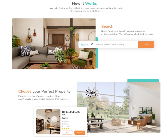
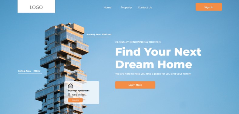
Draftss has not just understood the importance of great web design and UI/UX design, but also has been continuously helping the clients and partner firms to become better at these aspects for their own web platforms. With very innovative designs, dynamic layouts, and great navigational arrangements, designers at Draftss have put forward some of the amazing results in the past for the clients. With bright and colorful combinations to sophisticated and minimalistic approaches, here are some of the great samples of designs Draftss has worked upon recently.
A Clean Web Design for a Cleaning Service
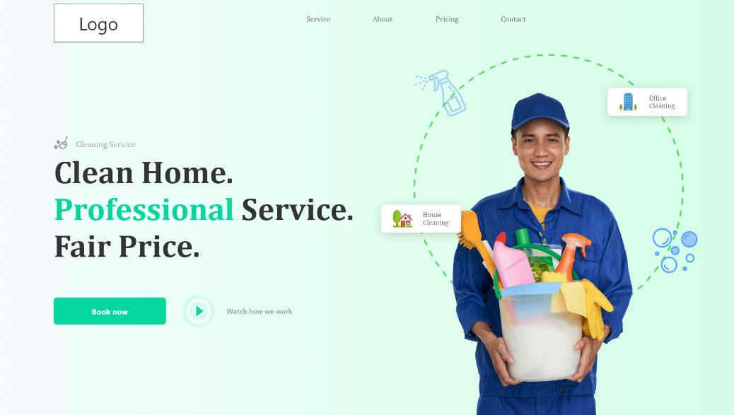
With very sober use of green color as the basic theme, the layout of the web design appears to be very clean and aligned. Pictures of humans aligned with the information give a very inclusive experience for the visitors and make them feel comfortable and clean. Much of the website get packaged on the home page itself of the web platform. The hero section comes as a perfect display of navigation, services, and usability of the platform with the options like booking the services and a link to the video showing how the service makes itself a unique one.
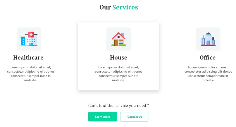
With a very clean and holistic display of the variety of the services, the section displays all the services of the service provider in a very categorical manner. With all these services displayed, a visitor who wants to know more about them can go ahead and connect with them over the contact section.
Alternate Concept
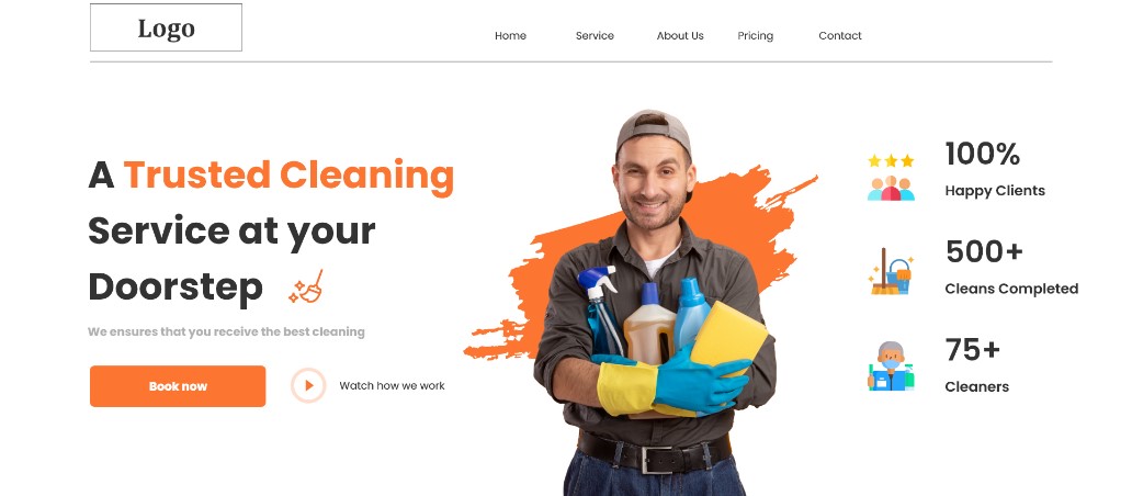
However, one great option might not suffice the need to have options! Thus, Draftss makes it easy for the clients to choose a great option by offering multiple concepts of the same design request. That’s what makes Draftss not just good but great for the clients. Another concept of the same web design provided by the Draftss to the clients looks something of a vibrant and bold design and stands completely in contrast with the previous one. Here’s how it looks!
The basic color theme of this concept goes highly different from the previous one. From being sophisticated and minimalistic to being vibrant and colorful, Draftss can do it all at the same time. Here’s some vibrancy of the concept.
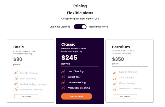
The pricing of the services is in a very dynamic and bold look to have very clear and crisp information about each of the costs covered for the services. Now that’s displaying the core value of the clients in a very pictorial and attention-catching manner.
Fresh Layout for Copy.ai
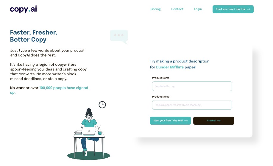
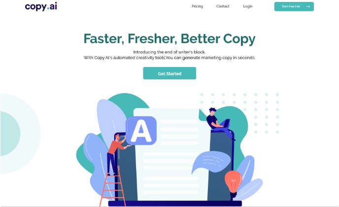
Another absolutely amazing design that was developed by the amazing designers at Draftss was for the client serving in the AI space. With a very minimalistic design and white background of the UI/UX design, the website had to not be left empty but a piece of brilliance and skills. Here’s the hero section.
With a dynamic and aligned outlook, the next section explains the workflow of the service provider in a very crisp and short form. Here is how it is designed.
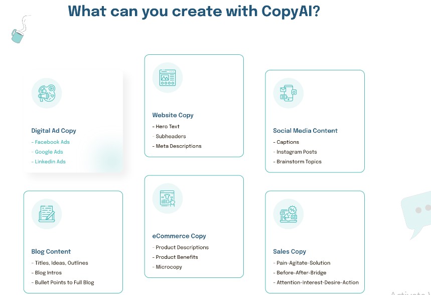
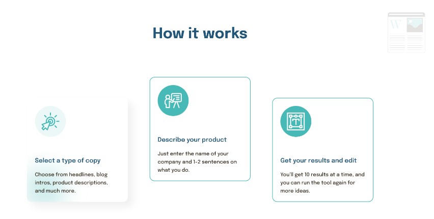 There is another section that is similarly very informative and minimalistic to ease the reading experience of the visitors and gather more information about the service provider. The complete design also gives a reflection of the content creation service of the services provider. Hence it has been designed to give a long-lasting impression. Here is how it looks.
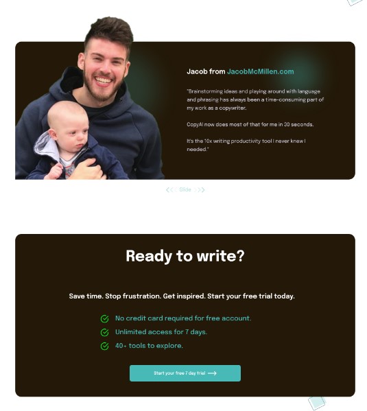
We had to find an amazing way to showcase the testimonials with absolute beauty. Also, a very clear style can also be seen with a contrasting background. Here is the section.
Alternate Concept
Draftss always has multiple options for its clients to choose the most suitable one from. No different was for copy.ai. Here’s how the alternate hero section looks.
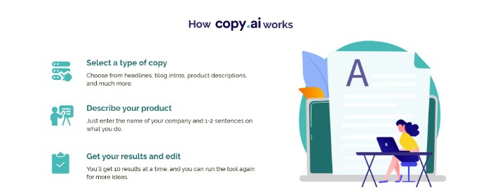
The version earlier was very minimalistic. With a more pictorial look of the section, this version gave a very unique and white-based visual appeal. With keeping up the color theme throughout the layout, here’s how the section looks.
 Enhancing Experience for Page Traffic
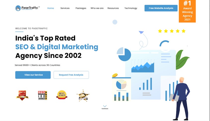
Our clients are delivering great services & even they deserve nothing less than great designs for their online platforms. Web platforms are often where they are going to be seen and experienced by many for the first time. The hero section of the design is very unique and different. It comprises more of a visual representation of the mix of the data and the human illustration. It was designed to speak for itself.
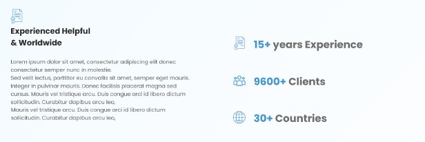
 In a way that is innovative and does not feel boring with just texts and words, the numerical representation of the facts does a lot more than one can expect. That’s what numbers did for this section.
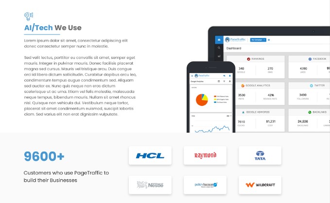
 Mentioning your partners and clients is at times one of the toughest jobs for many businesses. This becomes even tedious when the design is to be sophisticated. It also has to balance out with the pictures as well. Designers at Draftss did it fairly well with this section.
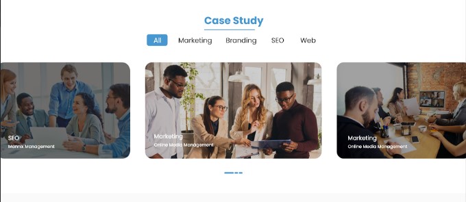
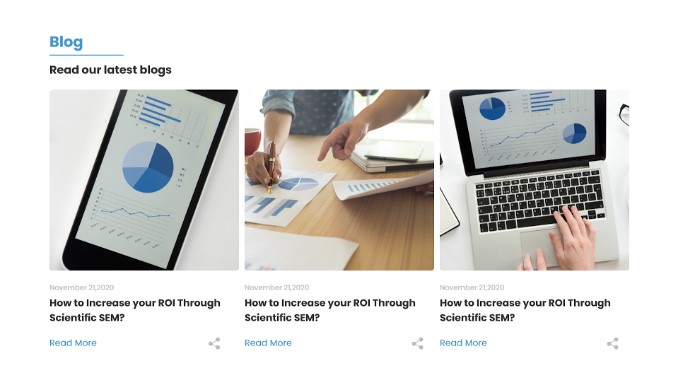
 Page Traffic wanted to publish content. The content had to in the form of case studies as well as blogs. Designers thus were in requirement to create two different sections for the respective content.
Web Design for Permanentlink
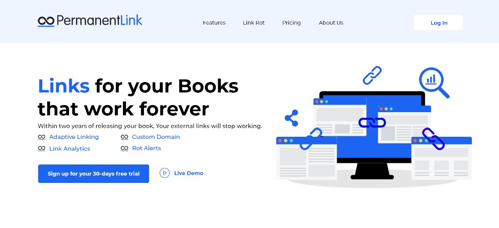
Matching client expectations with results that can be as attractive and beautiful as they wish can be difficult. But it never happens when a client works with Draftss. Have a look at the hero section of the web design developed by the designers.
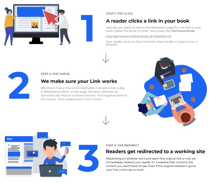
 What best can you have for a workflow of a company which deals in link building? Surprisingly, that is not what designers at Draftss believe in. We delivered something great for Permanentlink and here’s how it looks.
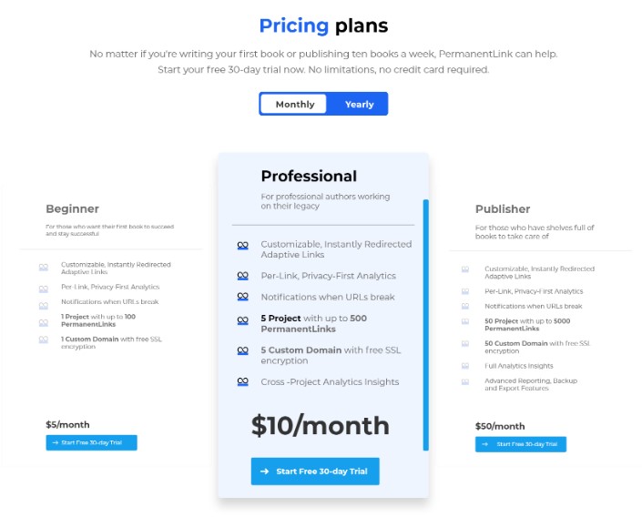
 The pricing section of the web design is as dynamic as always. With the absolutely aligned color theme and sophistication induced into it, here is a look at the section.
 Review of the Web Design for Tyson Review
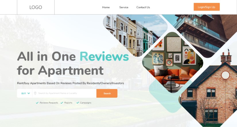
It is another web design with white in the background and sophistication at its core. Designers were required to develop something that could cater to the elite section of the society with class and beauty. Here’s what they gave out as the hero section.
Describing how does the service work can be a difficult job to do. It becomes even more complex when the design itself has to say it all. However, this section can be considered as an exception.
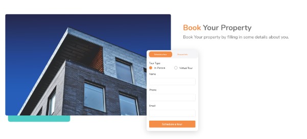
Great web design is not just about the looks and beauty but also about ease and navigation. The booking section is very elegant and comes not just easy but also very handy to book a service.
 To give the visitors an overview of the sample service/products of the firm, we also created a small and compact section that is dynamic as well as responsive in its design. Here is the section.
Alternate Concept
It is obvious that when a client has just one option, it feels limited. But at Draftss, every client gets to have unlimited benefits with unlimited graphic designing and web development. Thus, many concepts for many options to choose the most suitable design from. An alternate hero section of the web design is contrasting to the white background of the earlier layout.
With a very informative, functional, and descriptive section like this, it becomes very easy for the visitors of the service provider to find a very suitable match for the requirement based on the various parameters. Here is how it looks.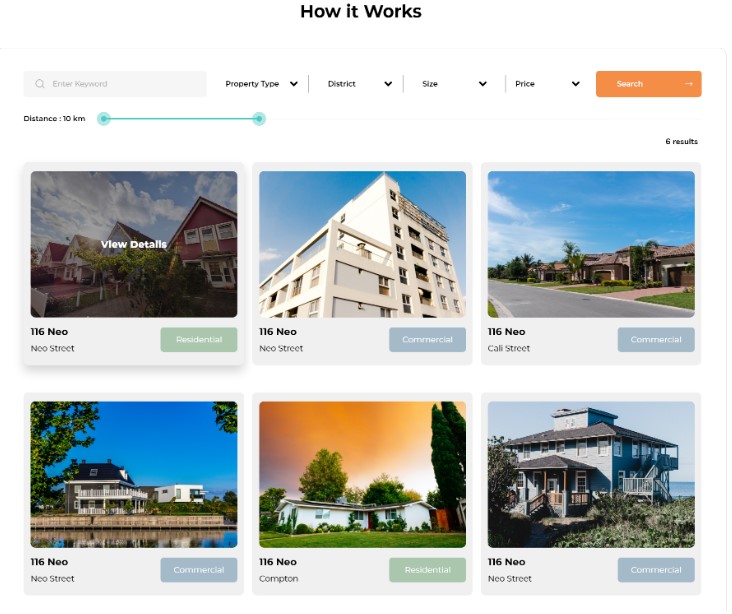
Winding Up
Hence, with a number of very comprehensive layouts given out by the designers at Draftss, snapshots of these web UI/UX design projects definitely are attractive and encouraging for the visitors to do more with the service provider. With ease, beauty, class, and sophistication, web UI/UX design at Draftss is often in perfect view and interest of the clients to cater to their respective customers in an absolutely satisfying manner. Another best thing is to have all of this at very affordable and flexible pricing offered by Draftss.
