Client: Levy Electric
Description: Levy Electric offers a range of affordable and powerful electric scooters.
Industry: Automobile Technology
Project: Web UI Design & Development
Problem
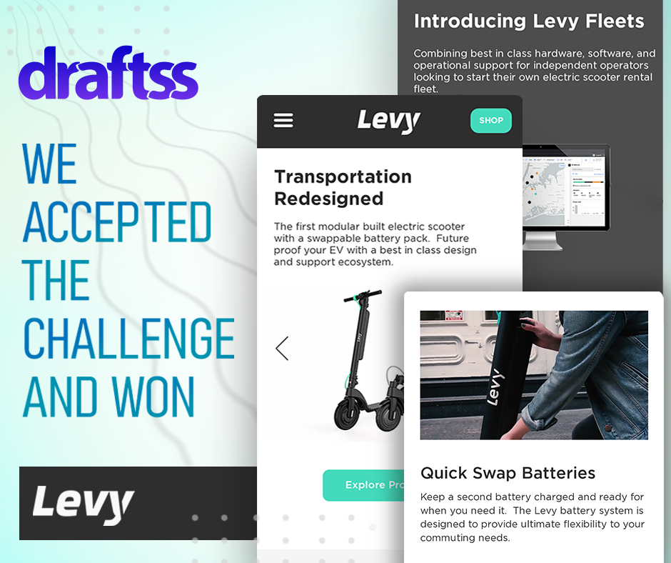
Levy Electric is doing some great work out there to serve the customer base with affordable and powerful solutions of electric motor vehicles and the first ones on the road among all the other products are electric scooters. They have great expertise in developing and maintaining their technology. However, all of it means nothing until it is showcased and presented in a great way before the customers and the target audience.
The problem was thus more of a challenge to bring the best out of the company and the services and showcase all of it with a blend of class and novelty, With a completely new look, the website also had to be built on Wix. Wix usually is preferred by clients as it is easy to customize and works well for pick and drop customizations.
Draftss has been delivering “great” services for a long now and this was exactly the project we had to deliver nothing less than just great once again. Our UI/UX designers were required to create icons, color combinations, the structure of the website, and every feature that the website was going to have.
That’s where we picked it up from!
The Draftss Solution
Understanding the Problem
The brief of the client mentioned the preferences and the colors that were to be put into the web design as per the perception of the services. The brief further described the services and the applications of the products of the company and how well have they been into the performance of the electric products.
Draftss follows a very open nature of communication. That is, we have a number of channels for the clients to communicate with us to help maintain the comfort and clarity of the particulars to convey. We kept in touch with the client over our dedicated dashboard to manage the projects and to keep everything updated and on track. We also used to regularly share the progress as well as the outlines of the ideation process and take suggestions to keep the progress aligned with the expectations. It was for about 8 months in total that the client was with the great Draftss with great comfort and rich experience throughout.
Throughout the project, we kept suggesting to the client various new ideas and features for the design. The client could put up a request for every new design in just a fraction of a minute through the dashboard that every client gets to manage the tasks upon.
Brainstorming Solutions & Crafting Results
The brilliant designers at Draftss started by laying out the structure of the website. We tried a number of color combinations and laid them over the designs to present to the client. Every concept we would present would get approval instantly.
For every request the client had to make, an ETA was promised. Our smooth processes and excellent structure helped us to successfully deliver every request on time. The designs were loved by the client. We thus moved ahead with designing the other and inner pages of the website while regularly updating the client on the progress and sharing the designs regularly to prevent the designers from going ahead in the wrong direction. We kept presenting a number of different concepts for each of the designs that we developed for Levy Electric.
That’s what we do at Draftss – Propose a number of great concepts for a single design to choose from!
The client was catering to technology and youth and thus had to be very keen to offer a sharp and bold look. Their products are powerful and innovative and hence should have been the designs. With every feature they added to bring ease of travel and add experience, we had to keep in mind that every feature on the web design too should equally be intact with the work the product performs for the customers.
We kept delivering the other designs as well with the wireframes as requested by the client. The tasks thus started finishing off and we were moving towards the development of the website. The development phase was a very complex process that involved coding and modifications in the Wix customizer itself. Modifying every bit of the designs from dropdowns to custom buttons, fixing everything according to the preference on a CMS platform is a novel and highly skill-oriented aspect in itself.
With constant feedback, reviews, and fixes, we started looking forward to a full-fledged website design which was nothing less than great.
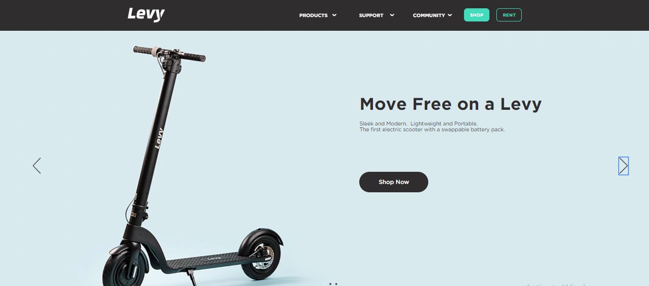
The hero section is a very bold and aesthetically pleasing concept of the combination of dark and light colors. Also, the green color adds attention and vibrancy to the design. The background of the hero section is a slider with iconic images of the product. With every intricate and smallest detail on the design, the icons and illustrations throughout the website are a complete masterpiece.
Now that is called the perfect color combination of the theme colors of the website. Green & black with a light fade would never look such brilliant that this set of icons represent.
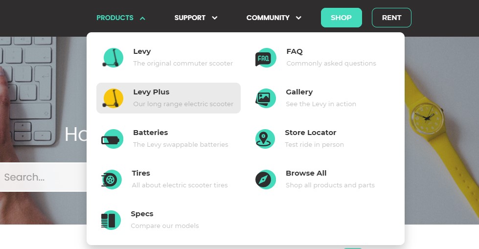
Building a website on a CMS platform might sound easy. But with the specifications of the client, nothing comes in handy as such. The sheer example of the same is the dropdown menu on the header of the website. Each of the particulars is manifested and designed with very intelligent use of colors, dynamism, shades, and much more.
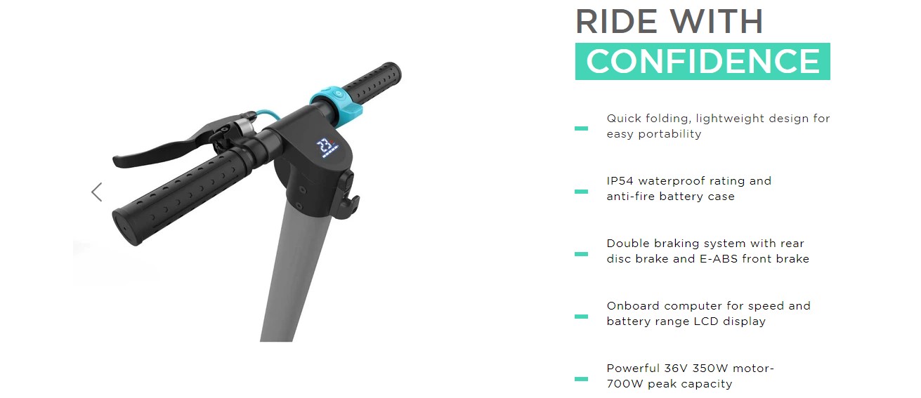
How good is the product should also be felt when the designs are presented before the eyes. This section represents the product like no other. It comes with a very beautiful set of icons and designs of the product designed at Draftss. On the right-hand side is a compact and crisp section of the description of the product.
Do not miss out on the color combination!
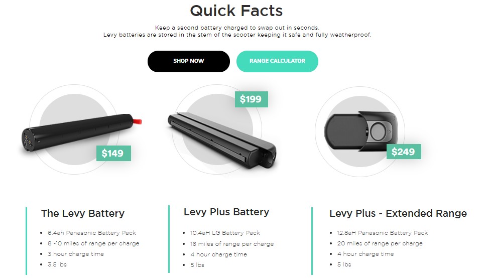
One of the most critical features & USP of a business and product like this is the level of performance and battery it can run on. With a great team of designers and developers at Draftss, we have helped a number of clients showcase their USP in a great way. Similarly, Levy Electric got a section that is actually into existence for this very reason. Also, this section is the perfect example of how to display multiple products with such sophistication and confidence.
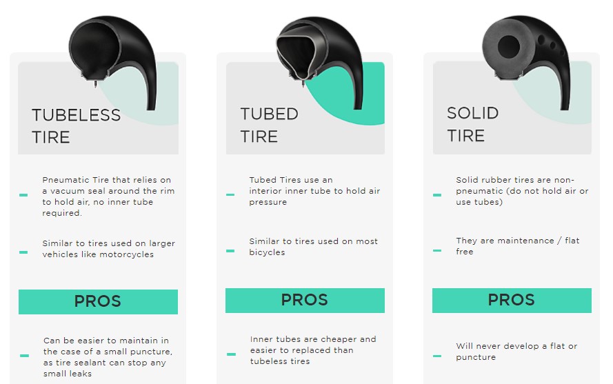
Are these tires real? They surely are but the designers at Draftss designed these icons. Aren’t they just amazing! Such a level of cleanliness in the designs and sharpness makes all of this look brilliant. Also, it is something that actually looks like made to deliver a rich experience.
The section on pros and cons is absolutely an amazing idea. It makes it informative and easy to compare.
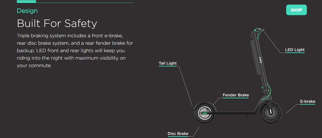
This section of the product is actually a design that talks and speaks for itself. Amazing is the color combination of the design and the neatness in the section. It comprises text, pictures, and detailing of the product.
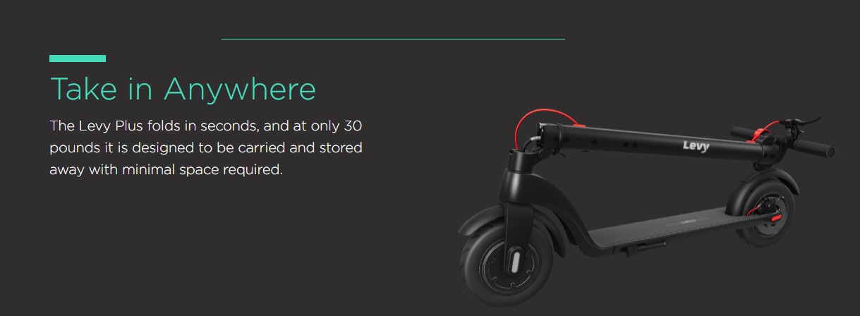
This section is a very dynamic one. The image is continuously moving and one can also zoom in to have a closer look. With the red color included in the section, the vibrancy increases. Hence, this makes a great blend of colors to give out a great picture of the brand and the product.
Conclusion
The web development for Levy Electric was thus completed with a very happy and rich experience for the client. The client had got a team of professional designers and web developers to work on the website. The team never let the client down with the requests. Everything that designers were presenting was just amazing and the client had multiple options to choose from for each design. But it got so confusing, choosing one of the best between the multiple best options.
However, it was actually a challenging task to set up this complete design on Wix. Every customization required a lot of effort and time to make things actually work. But know what, we did it like we always do!
The web design is finally live and looks quite sober and exactly how it should be. With easy navigations, user-friendly design, clean and quality combination of colors, text, and pictures, Levy Electric is serving its clients well.
This is how it looks: www.levyelectric.com
Thanks for taking the time to go through our project case study. If you too want to get designs done you can ahead and SIGNUP for 7 DAY FREE TRIAL + Our co-founder loves talking and consulting on projects for free, you can schedule a free call with him regarding your project here calendly.com/junaidansari
