
Hello Founders,
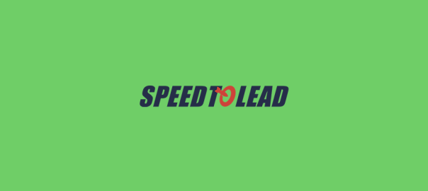
We are covering GetSpeedToLead.io for our feedback round. Here are a few suggestions to improve the current version of the landing page UI/UX:
- The website would look much more beautiful if the navbar can be aligned to the whole container of the website.
- Align the sub-title to the left of the title.
- Align the “Book a Free Call” to the left of the title and increase the button size.
- We are not sure if the background design goes with the branding of the website. However, the phone graphic is pretty good.
- The Maximum conversion section has a generic graphic gives a tone that your brand is a generic lead generation company. Rather you should brand yourself as something modern, unique, innovative and different from others.
- We are not sure if your target audience would like to read the word “Cool” on your landing page. Change that to some other adjective.
- I believe the pricing section should be better. The “Book a call” button should be inside the boxes.
- Too much text in the start. The header, titles, subtitle, everything together. Try eliminating the unnecessary content.
- Highlight the best plan for your user. Currently, I am not sure which plan should I go for. Recommending the best plan would enable the user to
- The pricing comparison section looks helpful to the user.
- In the “What our agents are saying” having 5 stars for all of them looks fake. You should have 4-4.5 stars in all of them or remove the stars entirely.
- The footer can be better.
If you want Landing Page feedback for your website too. Just head over to Getfeedback and subscribe to get FREE feedback for your landing page UI/UX.
If you want Graphic Design for your website; head over to Draftss.com and get designs on a