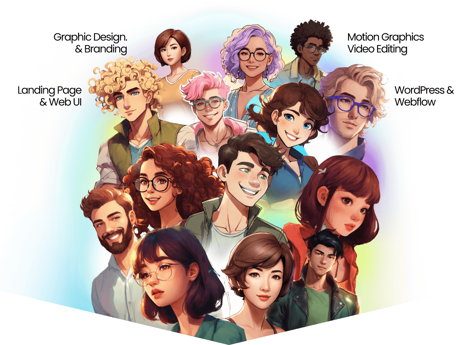


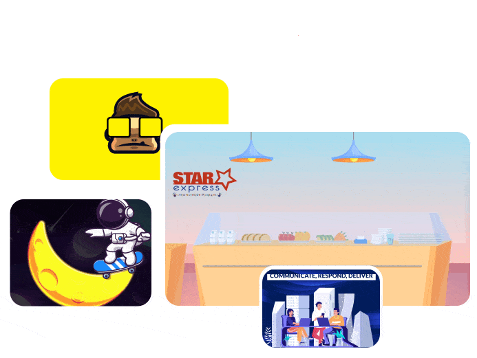
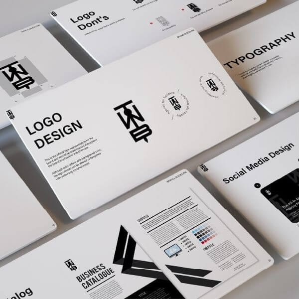
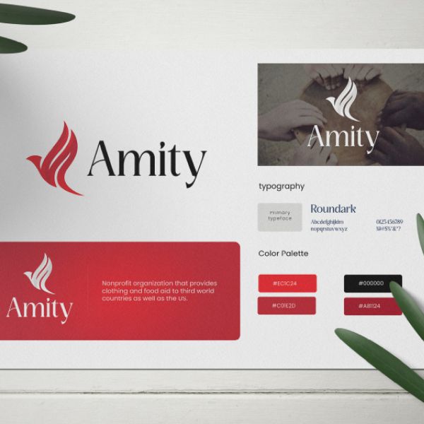
Branding & Logo

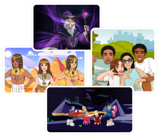
Human Illustration
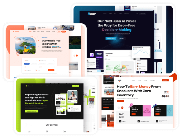
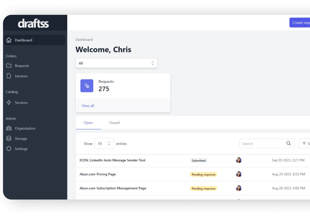
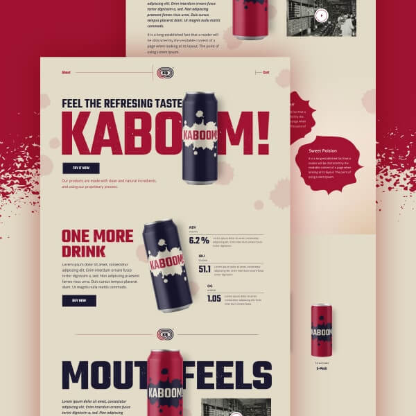
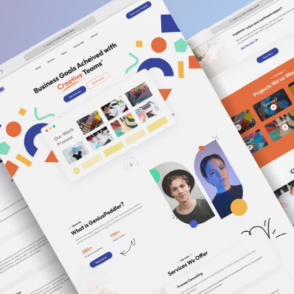
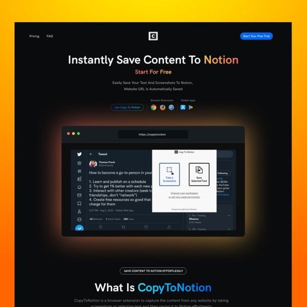
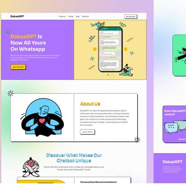
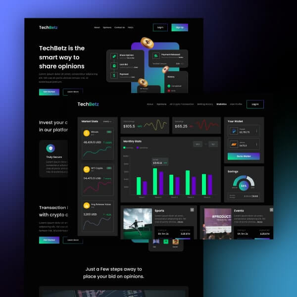
Web UI
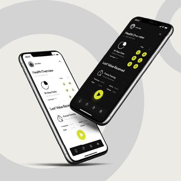
Mobile App UI
Artworks
T-shirt Design
Stationery
E-Book & Cover
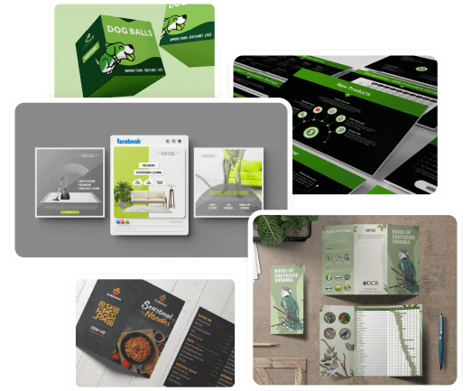
Packaging
Banner Ad
Infographic
Social Media
Pitchdeck
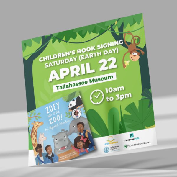
Flyer & Poster
Brochure
Newsletter
Icon Pack
Podcast Cover
Mascot
Photo Retouching

Explainer Videos

Logo Animation

Typography Videos

Gif Animations

E- Learning Videos

Character Animation

Testimonial Videos

Video Editing

UI Animation

Tutorial Videos

Text Overlays

Reels & Videos
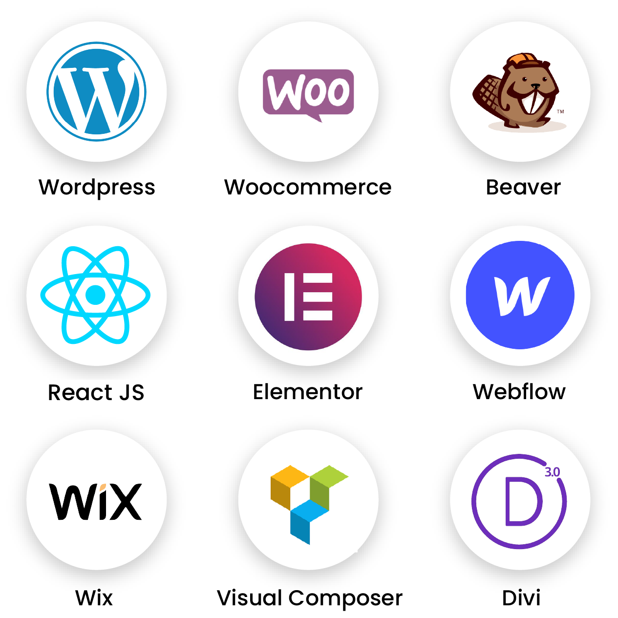
WordPress
Beaver Builder
WooCommerce
Woo Commerce
Unbounce
Visual Composer
Oxygen Builder
Divi Builder
WP Bakery
Elementor
Webflow
WiX
React JS

Say Hi to your New Team.

Send your Tasks to the Team.

Receive your Designs.


Overall very good experience
Overall very good experience, so much so that I decided to renew a 1 year plan with them.

Great graphic design company!
The Draftss team work quick and efficiently. They take all feedback and come up with the exact designs we need.

Quality team, quality work, great communication
We’re saving a ton of time and money without sacrificing any quality with the work. I tell every new entrepreneur I meet about them!

Great work and great value!"
When it came time for together.science to make our brand look professional, we hired draftss.com. The process was easy, the designs are striking, and the value cannot be beat! I will absolutely hire them again!

Love working with the Draftss team!
They have replaced the need for another designer in our office. We can rely on Draftss to put together concepts, products, fliers, and really anything visual before deploying teams on them. It's been a cost effective model for us to help scale production.

Nothing better than Draftss
All designs are high quality and delivered in a timely manner. They are easy to work with and always ensure to get the designs just how you like them, no matter how many edits you ask for. I will keep using this platform for as long as I can!

