
Jobs in the Graphic Design industry are rising in demand day by day. However, this results in a massive competition of the design and among all the designers out there. In case you are a new designer venturing upon the path of digital art and design aesthetics, one of the significant pieces of advice you might have received is probably opting for minimalism.
Before deciding on how to apply minimalism in design, you may have wondered what it is exactly. Or why is it so high in demand? Let us take a brief look around the use of minimalism in graphic design to explore this. The other question that most designers often find fostering inside them, is minimalism always preferred?
To answer that, we should take a look at what minimalism generally implies in graphic designs. Then what is required considering is what precisely a professional designer should opt for while collaborating with clients.
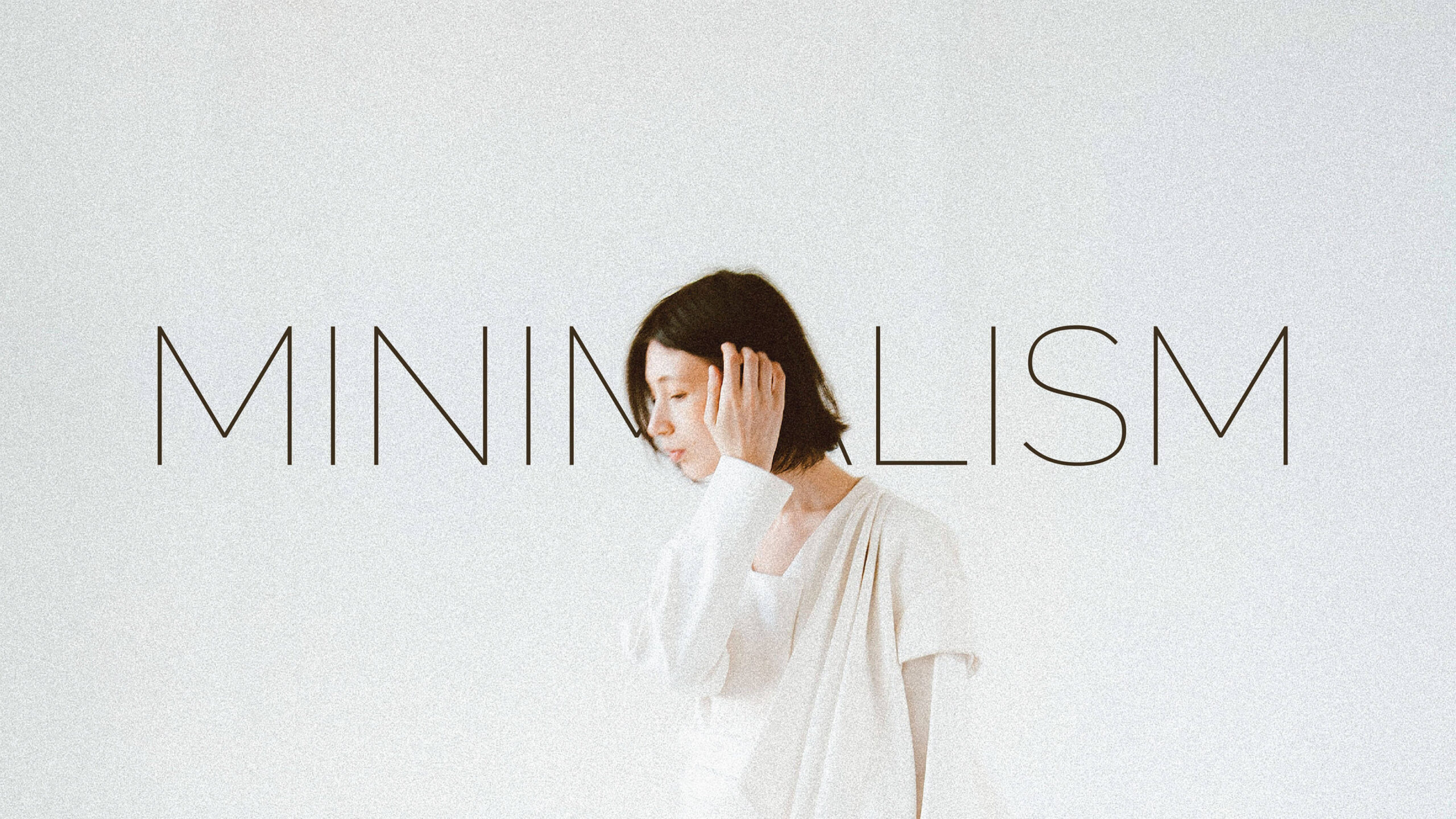
What is minimalism in graphic design?
Graphic design requires the use of software and tools to create illustrations. The visual aesthetic of a minimalistic design lies in the use of less style and more of the principle of design. Usually, minimalism uses only the essential tools and shapes and a minimal palette.
The sole objective of a minimalist design is to create a unique design using fewer elements. In other words, less is more!
Going for minimalism can bring much aesthetic appeal to your designs. It can make you stand out if you can think outside the box and use less material to depict a powerful and engaging content.
The most vital thing one ought to remember is to use less but meaningful designs. Thus, the white space you are providing into your illustration should be planned and impart a sense of utility. When you are deliberately opting for fewer materials, use only those strokes which add to the utility!

Designing the outlook of a webpage or a blog
While most of the designing hacks would probably suggest you to go for minimalism whenever applicable, what you require understanding is that the mood or purpose of your design matters.
While creating a landing page layout for any website or blog, your chief motive should be to project its agenda through your design. In other words, it is recommendable to have a design that suits the mood of the product or service being provided.
Take, for example; you are designing the landing page of a tour company. Let’s say they are seeking clients for a vacation to any tropical islands or somewhere like that. Your design should speak or reflect a holiday mood in this case. If you put up a somber and minimalistic design, it might not attract many potential clients!

It is not to say that a holiday mood or a party mood can only be created through a jumbled assortment of fonts and images! However, it is best if you reserve a minimalistic outlook for a more formal setting.
Incorporation of colors
While it is a fact that too much of anything can spoil the whole setting, but underusing of elements might not always have the desired effect either.
It can be more effectively understood for a logo design. While it is recommendable that you should limit the number of colors to a maximum of two to three, however, a minimalist logo design would demand you to limit it to one.
What You Can Do?
In case only one color suits your logo’s purpose and can be used to depict the brand agenda in the desired manner of projection, then it is recommendable to go on with it. However, there are cases there only one color might appear bland or have a missing visual appeal. In those cases, it is wiser to incorporate two or three colors to project the required vibes.
Often, more colors can be incorporated according to the needs and requirements of the company. Minimalism is not a rigid rectangular box within which you have to stay confined. As a designer, it is up to your discretion to afford to use a minimalistic principle and where you should not.

It would be completely wrong to state that minimalism is the best designing technique for any graphical illustration. Minimalism in graphic designs is only one of several strategies you can use to grow as an artist.
It is advisable to aim for a perfect blend of different types of aesthetics as per the requirements. In case you want to provide unlimited graphic design services, it becomes essential that you practice various kinds of designs and use your creativity to master them!
Ultimately, designing is an art. Just like any other art form, there is no right way to do it! If your style is a minimalistic one, and if you can pull off different moods and aesthetics with that, then that’s fine. However, if you cannot, it is recommendable not to fret over it. Better to harness your creative skills to explore other illustration principles as well!


