For any business in today’s day and age, an online presence is very important. This is because there are more and more people consuming online content. The most advantageous part of having strong online visibility is that the audience is very diverse. The reach that a business gets via online platforms is high. This online presence can be in the form of social media pages on which the business regularly posts updates. It can also be in the form of websites that have all the details about the business. It is therefore evident that it is important to have websites, social media posts, and ads designed well. While designers work on identifying the type of design they want to use, they are sure to come across optical illusions.
Apart from this, the way a company’s office looks also says a lot about the business itself. It is a reflection of the nature of the business. So, it is also necessary to have the interiors of the workspace designed by skilled interior designers.

Using Optical Illusion
We have all, at some point, been fascinated by optical designs. Somehow, many of us like the way it tricks the eye. How can designers effectively use optical illusions?
1. 3D Designing
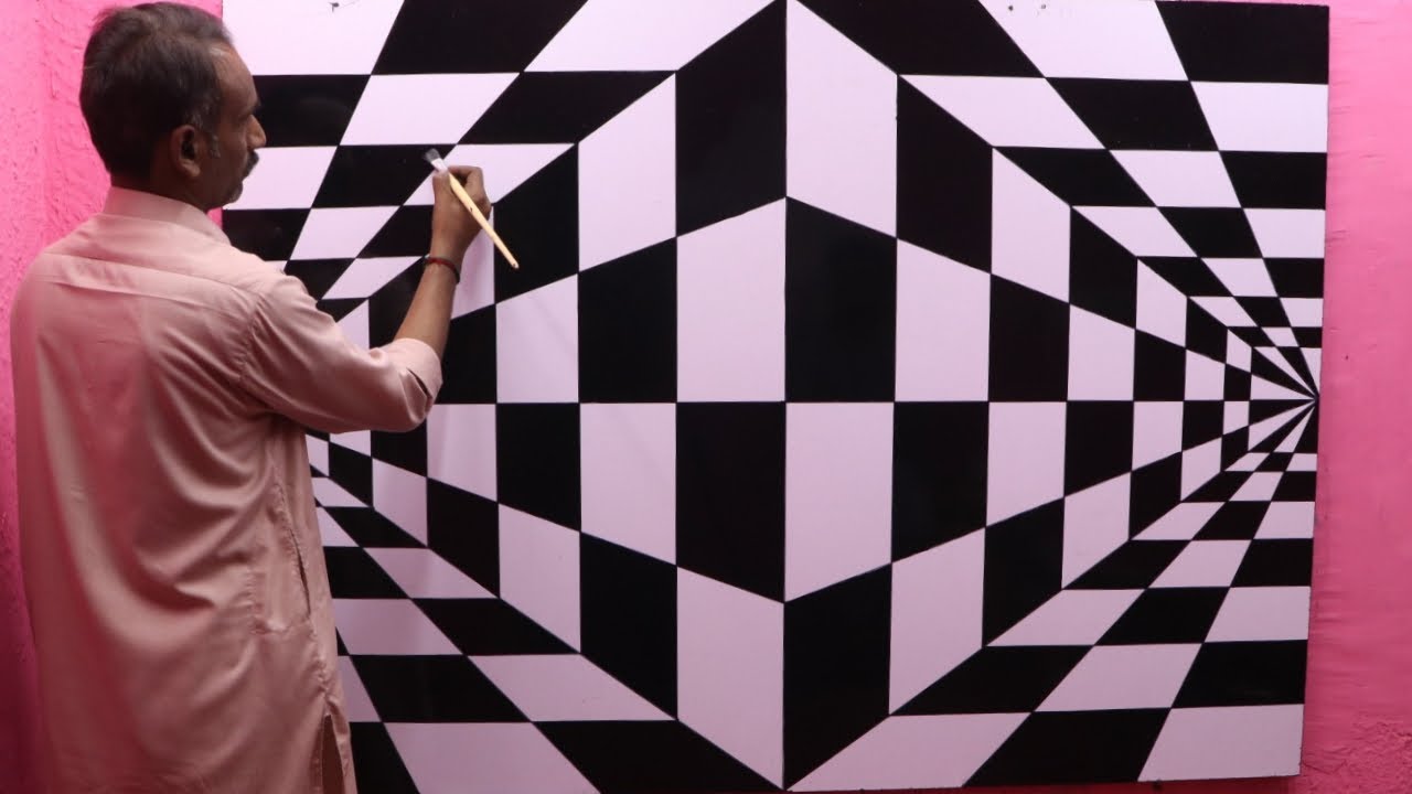
Optical designs can fool interior designers into believing that a flat design is a three-dimensional object. This not only saves space in the office area but also serves the purpose of sending out an essential message to those who see it. The efforts that are put into making a design are more worthy than just writing down something in a fancy font. It clearly tells the viewers that conscious attempts have been made to make the interior look good. These designs can be done by using tools like Photoshop, which has plenty of features and tools. Several add-ons can be used to create new illustrations of optical illusions.
2. Triangle-bisection illusion
If a triangle is placed inside a curved or straight shape, it appears as if the triangle is not “sitting”. This is because of the phenomenon called triangle-bisection illusion. If something is placed exactly halfway up the height of a triangle, it will appear as if it is way more up than halfway. This is due to the way our eyes perceive this figure. Such an illusion can be used in websites as well as social media posts to make the designs efficient and attractive.
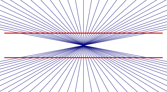
3. Hering illusion
When a design contains very fine lines or tiny dots, it is highly likely that the design looks like there’s something in motion in it when you scroll up and down. This is because of the Moiré pattern. Herein, two grid spaces superimposed on each other create a false motion perception when moved. This technique can be used to grab the attention of social media users, where it is common for people to just scroll away. Creating an illusion would at least make them stop and look at what the post is about. It is then up to the designer to efficiently direct them to the website or their official social media page.
4. Mach bands
When shades of the same color are placed in the increasing or decreasing order of intensity, it is possible that your eyes made you believe that there was a shadow. But, the truth is that there was nothing of that sort. Our eyes perceive the light shades as lighter and the dark shades as darker, so it appears as if there was a shadow. This trick of the eye can be used by designers who work on website designs. Such an arrangement of different shades of the same color could be used in designs where there is text that is supposed to be added to the design.
5. Overshooting
Most typographers are of the opinion that while inserting text into designs, one has to rely more on intuition than reasoning. In general, fonts of the same size also don’t “look” the same to us. So, in the process of overshooting, a designer resizes the text size. This makes all the characters look alike. While this may sound a little odd, it is required to be done in order to keep away the “illusions.”.
6. Cornsweet illusion
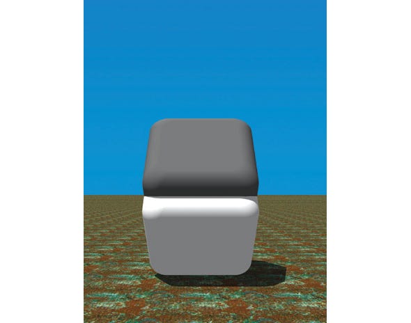
In this type of illusion, a gradient is used, like in Mach bands. But, there is also a line in the center. It makes our eyes perceive that one side of an image is lighter than the other. But, if these two sections were placed next to each other, one would realize that they are completely the same. Such illusions can be used to ease the work of a designer. It can be used in backgrounds, and two different ideas can be expressed in the two sections separated by a line. Creating such an illusion does not really require much effort.
7. Jastrow Illusion
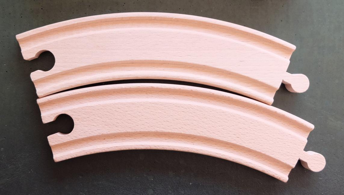
When two curved objects are placed a little away from each other in the exact same way, it appears as if one of them is smaller than the other. This is a very common illusion. It is said that it occurs because the short side makes the longer side look longer. And vice versa, the long side makes the shorter side seem shorter. This illusion can be used in websites and designs where patterns are commonly used.
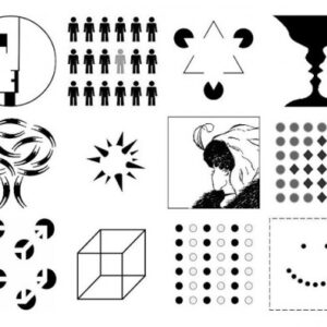
Optical illusions are plentiful. Simple shapes, lines, and colors can be used to create them. They help the designers accommodate several ideas in limited space. Often, instead of conveying something explicitly using texts, one can use optical illusion.
Graphic design, web design, logo design, and interior designing are very creatively exhausting processes. Using smart ways of designing eases the designer’s job while not compromising on the quality of the design.
In order for all the designs of a business to look related, one should choose able and good designers. Businesses can also explore unlimited graphic design packages. They are popular in the market, so all their design needs can be taken care of.
Drop your thoughts in the comments below.
Your email address will not be published. Required fields are marked *

