What Does Flat Design Mean?
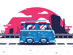
Flat design refers to the style of the interface design. The two-dimensional effects are used with some addition of bright colors. The illusion to the designs is provided by copying real-life properties in a three-dimensional view. But, then arises a question why are these flat designs are developed? So, flat designs ensure, that the designs of the website are responsive enough and are made according to the screen sizes of the device. These flat designs are based upon the content scales of the websites.
Here, the simple shapes and minimal textures are added. Additionally, if the sites load faster since, mobile devices have a bit slower internet speeds, it leads to an additional advantage in enhancing the user experience of the viewer. The perfect flat design also ensures that the noise should not be caused by the visuals that are in the form of textures and shadows. It ensures the streamlined as well as optimal use of the user interface as well as the user experience effectively and efficiently. In short, Flat design is a minimalistic design is an approach that mainly emphasizes usability.
Flat designs mainly focus on featuring clean, open spaces, crisp edges, slight bright colors, and two-dimensional illustrations. It can also be said that flat designs do not inculcate unnecessary use of styling elements like that of gradient, textures, drop shadows. In fact, it involves real-life characters.
Importance of Flat Design:
> Flat designs ensure readability and ease of access to website content. The designs are simple enough for the users to use the content regardless of desktops or mobile devices. Here, the designers use flat designs in a simple manner and use minimalistic icons to make the reader grasp the provided concept.
> As we have already seen that flat designs are all about sober and bright colors. The addition of illustrations makes it a bit more communicative. The fonts being used here are mostly in sans-serif, and the usage of complex images is replaced with minimalistic icons, vectors, and typography.
> Flat designs often involve the usage of single contrasting colors.
> Flat designs ensure the loading of the webpage in the given span of time. Here, a touch of gradients and skeuomorphic properties add to the low resolution of images.
> The on-time loading of the website takes place when the flat web page consists of vectors or code-based graphics, which in turn would contribute to making them work for the developers easier. Additionally, the page that loads on time improves the ranking of the webpage and leads to a hike in the revenue as well.
What is Minimalistic Design?

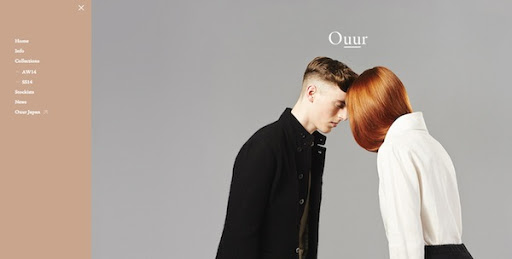
Minimalism is that art concept that describes the content in such a way that it embodies the phrase “less is more”. It can be said that minimalism is the design or art that occupies the smallest range of colors as well as materials. In simpler words, design or art uses very simple shapes and forms.
Importance of Minimalistic Design:
> The negative space looks perfectly overwhelming. Here, in this case, the use of negative space is empty spaces between visual elements.
> High contrasting palette provides luxury and a modern look and feels to the website. This makes the site more and more informative and readable. While this factor still depends upon the wish and will of the website.
> Typography remains dramatic to influence the decisions of the targeted audience.
Flat Design or Minimalistic Design: Which One is a Better Option?
> Flat design is much easier to maintain and update option.
> The minimalistic website often occupies less code and this ensures the increased performance and ranking of the site.
> The flat design provides more bold, subdued, and appealing icons, colors, and fonts.
> The minimalistic design offers an enhanced user experience. Here, the main focus is the content.
> Flat designs are soothing to the eyes and the readability of the texts is great.
> Minimalistic designs are often visually appealing.
