
Hello Everyone,
We are covering Tability.io for our feedback round. Here are a few suggestions to improve the current version of the landing page UI/UX:
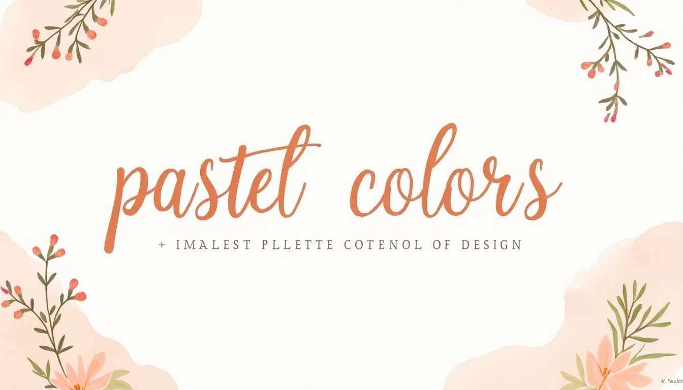
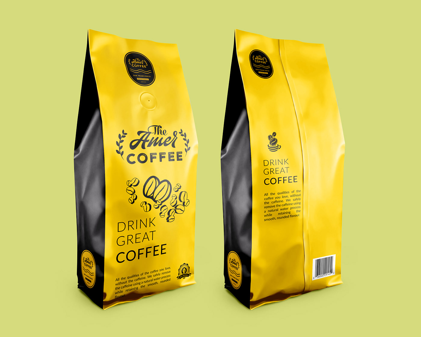
- Wonderful logo & the style of graphics used on the landing page. However, I do feel that you are not using the style to maximize it. Basically, use the empty spaces to do more stuff. I’ve done something for reference. (Reference Image Attached #1)
- The header image should be a little on top.
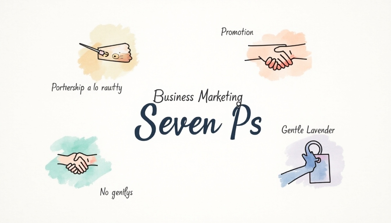
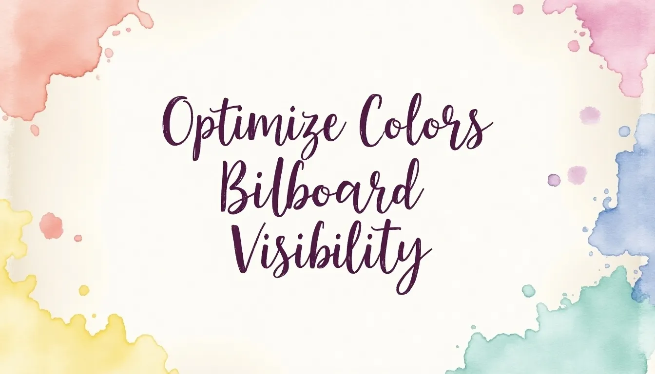
- Not sure if green is the right color for the landing page. Try playing with other colors to make the website look more interesting. (Reference Image Attached #2)
- Difficult to understand how does the product work on the landing page. You have very well explained on how it is helping me and my business but it would be great if you could share real screens of the app as well on the landing page so I can make out how it looks like.
- I see that you have a different pricing page, which is fine. But maybe you can also include it at the end of your main landing page so that people know that they are signing up for a free package and what does a paid package looks like.
- In the footer, along with the icon of the logo, mention the name of the website as well. People can easily get confused if the product is
tability ortabilify or something else. Implementing this would help with building better brand recognition by your visitors. - Since it is
an “ .io” domain you can add it to the logo to avoid letting people go to the .com domain name.


If you want Landing Page feedback for your website too. Just head over to Getfeedback and subscribe to get FREE feedback for your landing page UI/UX.
If you want Graphic Design for your website; head over to Draftss.com and get designs on a