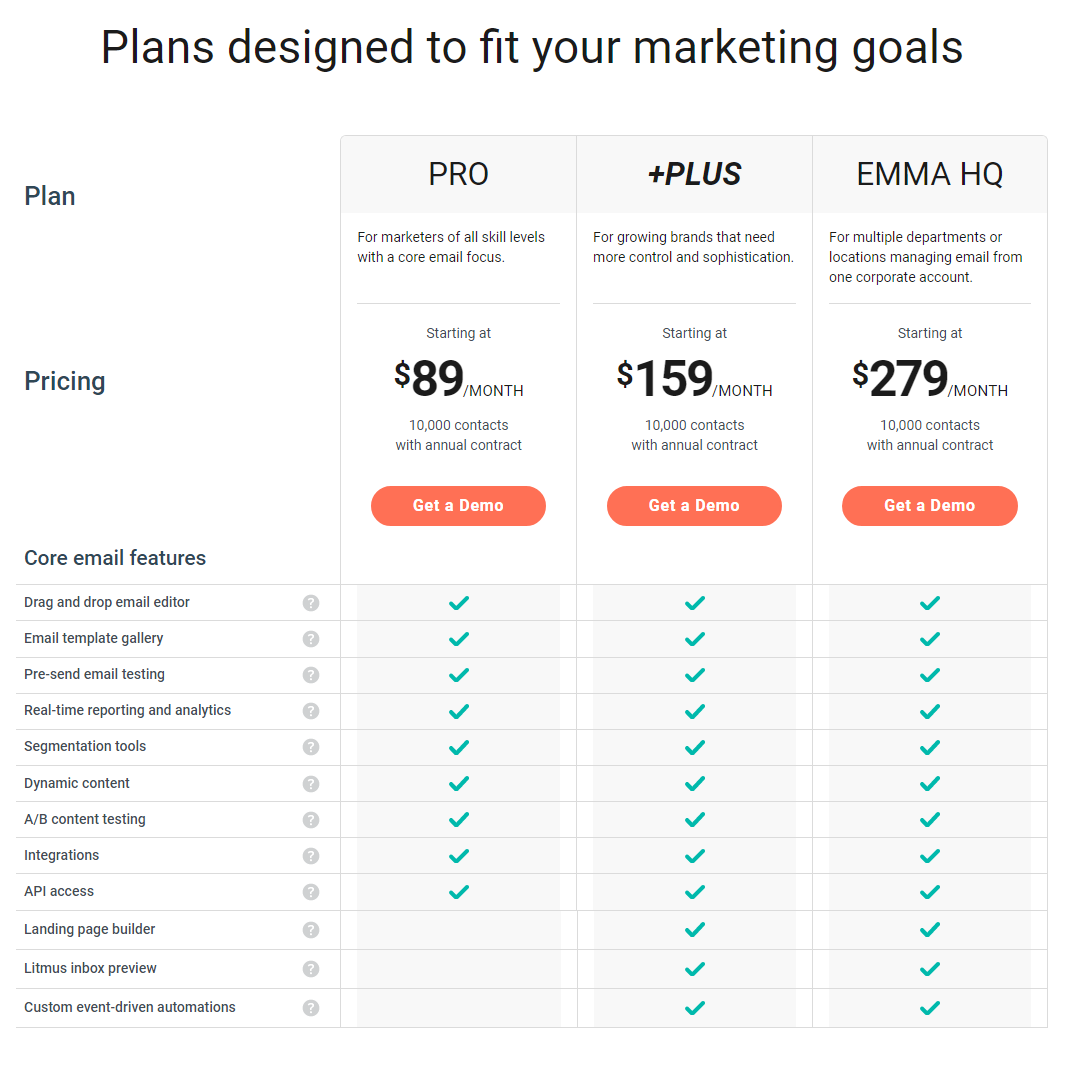
The Myemma pricing section is effective for several reasons:
- Clear Tiered Structure and Targeting:
- Distinct Tiers: The “PRO,” “+PLUS,” and “EMMA HQ” tiers are clearly defined and visually separated, making it easy to compare options.
- Target Audience Descriptions: Each tier is accompanied by a concise description of its ideal user, helping potential customers quickly identify the most suitable plan.
- Transparent Pricing and Value Communication:
- Clear Price Points: The prices are prominently displayed for each tier, with clear “/MONTH” indicators.
- Contact Limits: The “10,000 contacts with annual contract” message clarifies the included contact limit.
- “Get a Demo” Buttons: Clear and prominent buttons encourage users to take action.
- Emphasis on Feature Differentiation:
- Feature Lists: Detailed feature lists for each tier allow users to easily compare functionalities and understand the added value of higher-tier plans.
- Feature Progression: The lists show a clear progression of features, with higher tiers offering more advanced capabilities like API access, landing page builder, and custom automations.
- Visual Clarity and Organization:
- Clean Layout: The layout is clean and organized, making it easy to read and understand the information.
- Consistent Formatting: Consistent formatting across tiers enhances readability and makes comparisons easier.
- Checkmarks: Checkmarks are used effectively to highlight included features.
- Focus on Core Value:
- Email Marketing: The emphasis on email marketing features highlights the core value proposition of the platform.
- Scalability and Control: The varying feature sets across tiers demonstrate the platform’s suitability for different business sizes and marketing needs.
- Question Marks for Feature Explanation:
- Question Marks: The question marks next to certain features provide an opportunity for users to learn more about those functionalities.
- Clear Plan Names:
- “PRO,” “+PLUS,” and “EMMA HQ”: The plan names are simple and easily distinguishable.
